Article: COLOR GUIDE
COLOR GUIDE
Choosing the perfect Hermès bag color is one of the biggest dilemmas.
With so many shades to choose from, you might wonder which color suits you best or complements your style.
We’ll walk you through Hermès’ signature colors, comparing their unique vibes and sharing styling tips. Find the perfect Hermès shade that matches your personal color! 😊
Since the complete color collection is extensive, we’ll introduce key representative shades from each color family and highlight their unique charm.
(Colors are presented in the following order: White - Yellow - Orange - Red - Pink - Purple - Blue - Green - Neutral - Gray.)
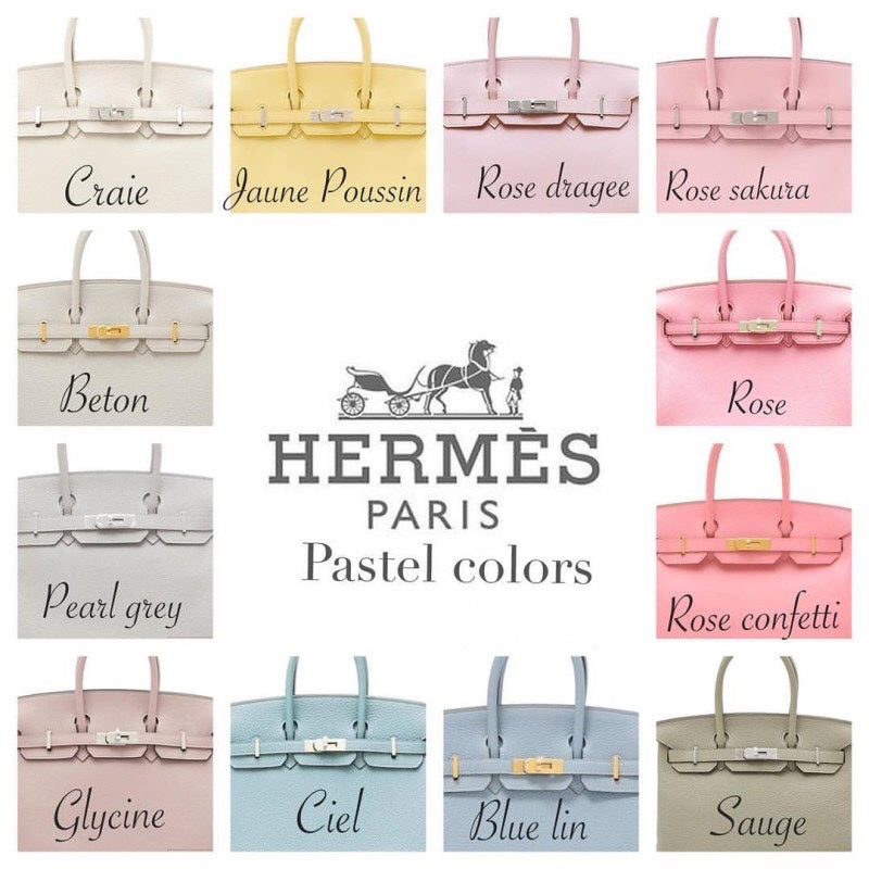
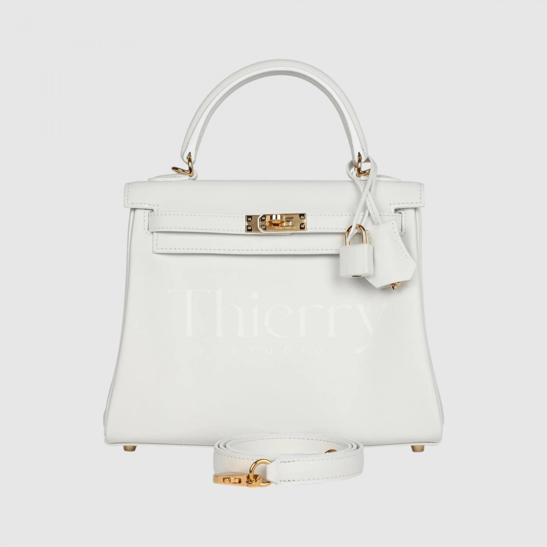
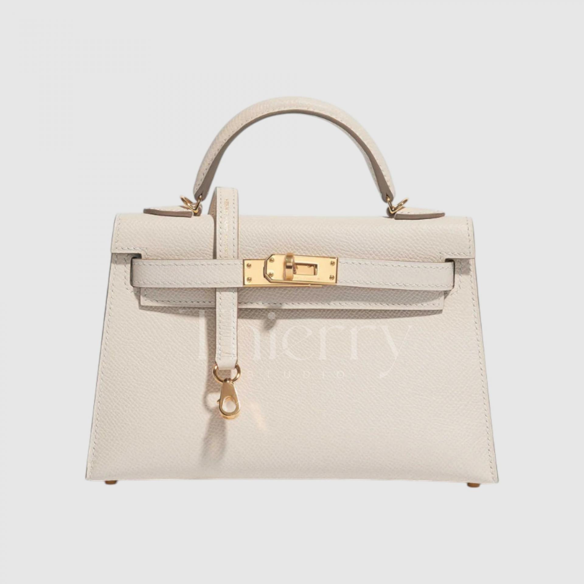
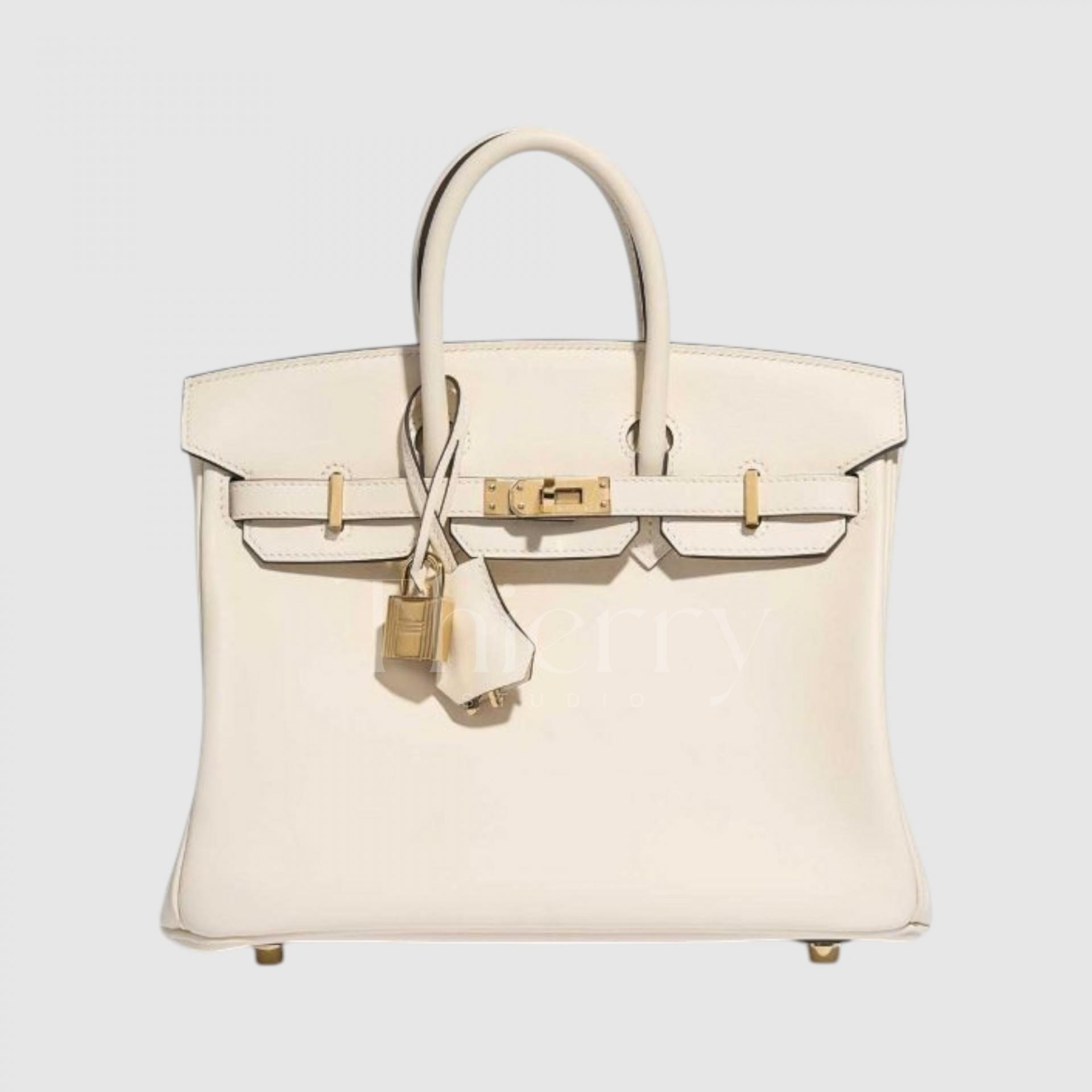
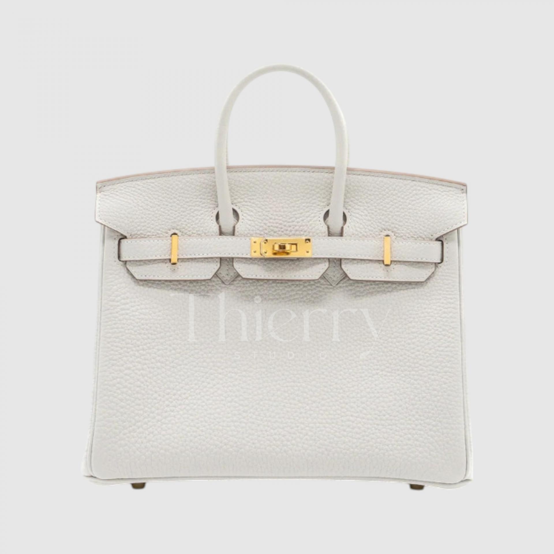
Blanc (white)
Also known as "Blanc" or simply "White," this shade holds the No. 01 color code, making it the very first in Hermès' extensive color lineup.
It is the purest and brightest white—a crisp, cool-toned shade that exudes elegance and sophistication.
What makes Blanc White unique? One distinct feature sets it apart: if you take a closer look at the padlock, you'll notice that its exterior is wrapped in matching white leather—a subtle yet luxurious detail exclusive to this shade.
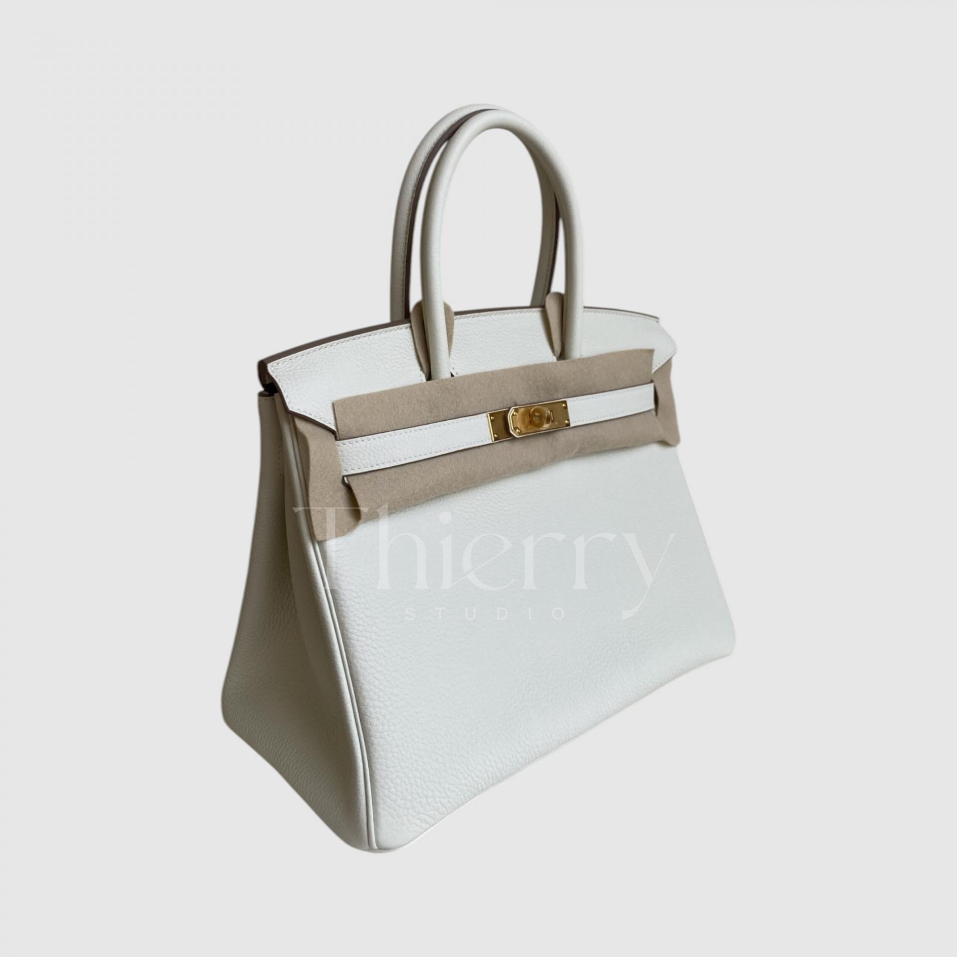
Mushroom
Mushroom, introduced in 2022, is a warm blend of beige and gray, reminiscent of its namesake.
While it belongs to the white color family, Mushroom is the deepest and most beige-toned among them, offering a richer and more grounded take on white. It exudes warmth and sophistication, making it a versatile and timeless choice.
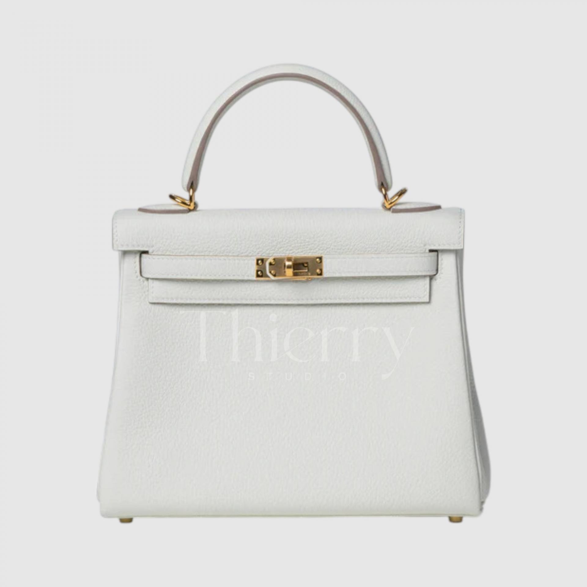
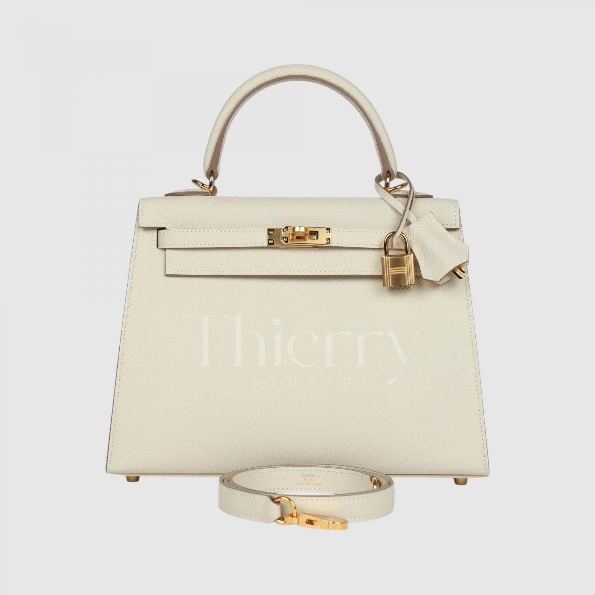
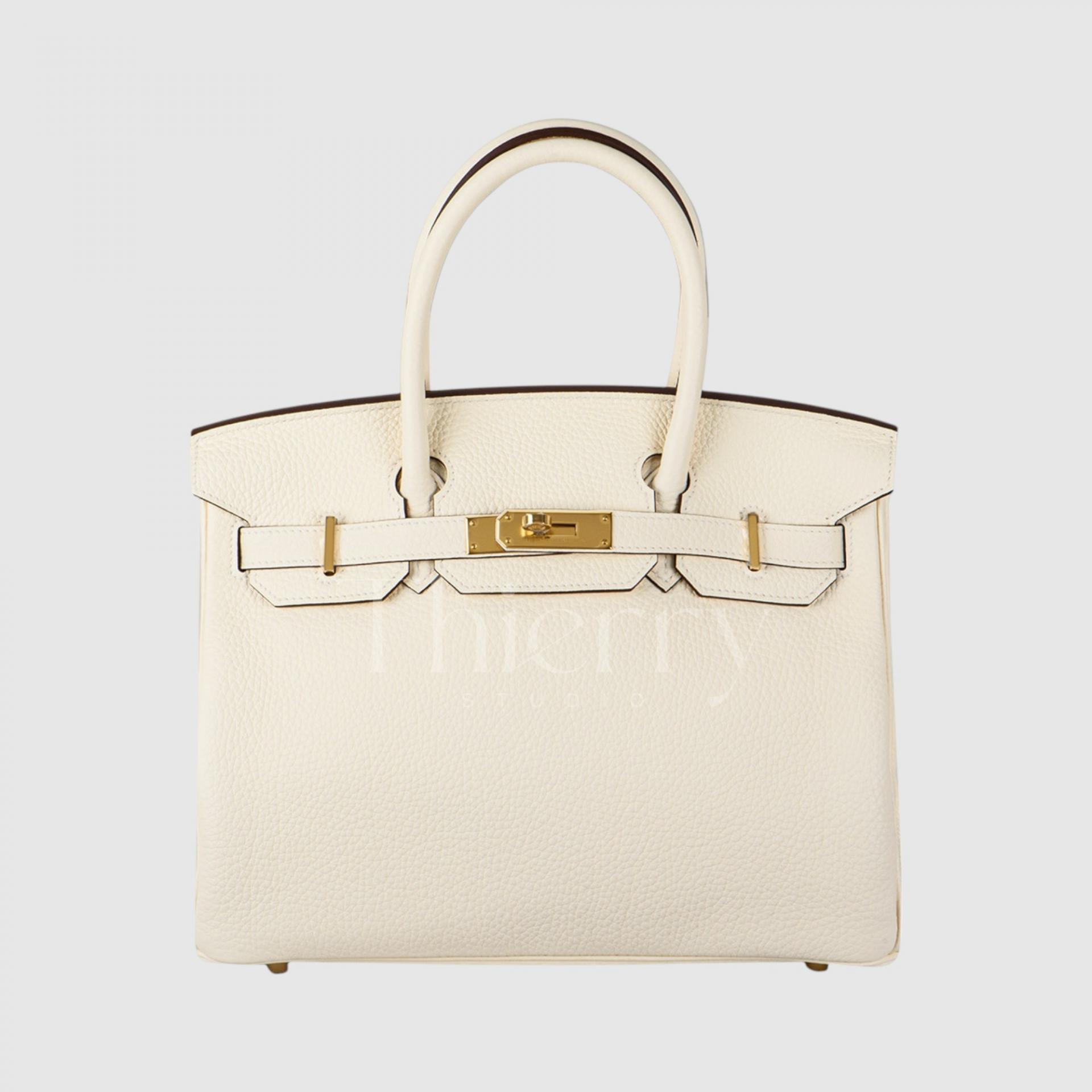
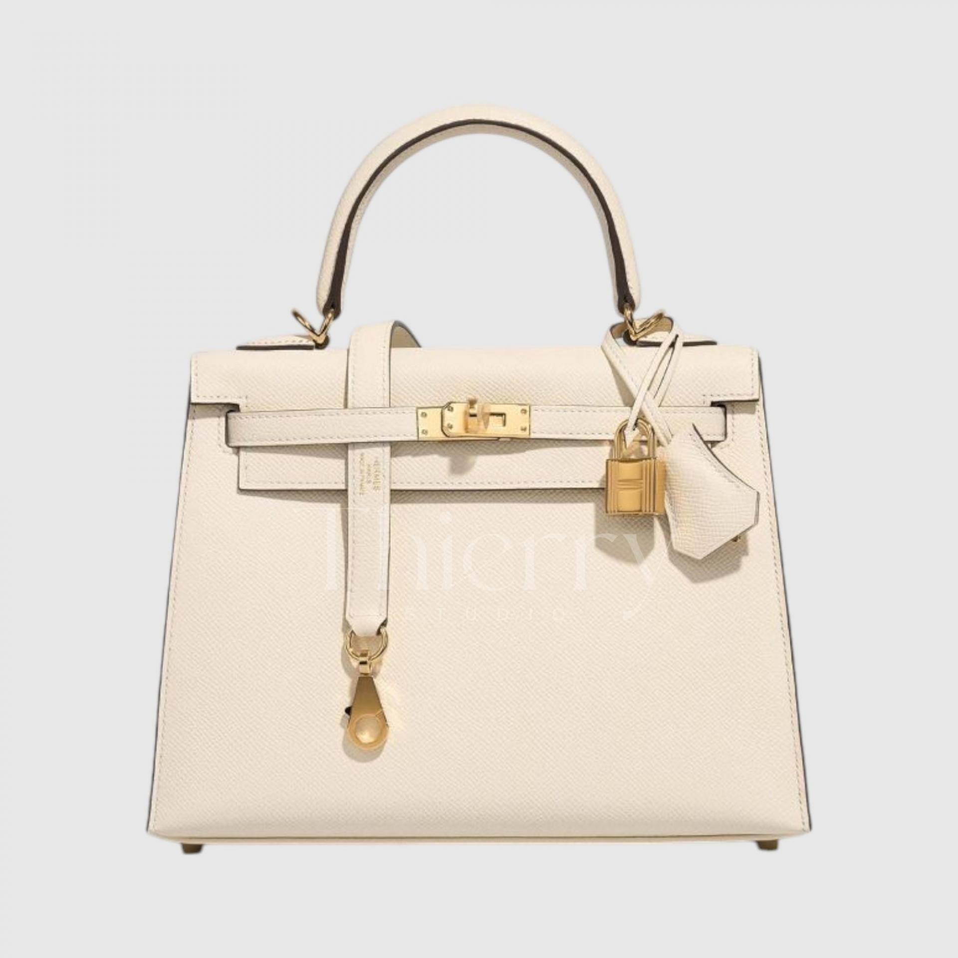
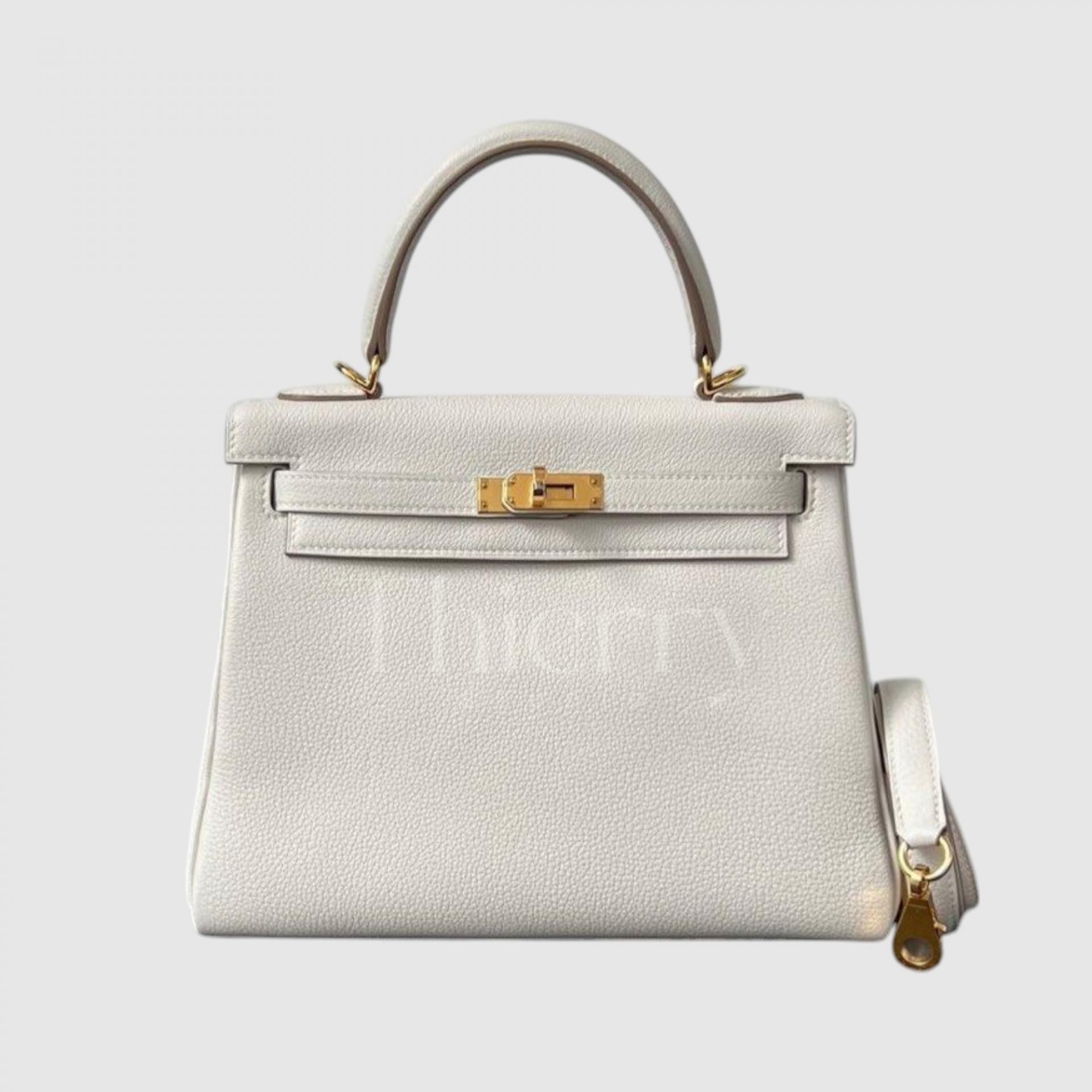
Craie
"Craie" means "chalk" in French, perfectly capturing its soft, elegant cream or off-white tone.
Versatile and effortlessly chic, Craie is considered one of Hermès’ classic colors, consistently produced year after year and highly valued in the resale market. It is especially sought after in the Birkin 25 model.
Craie needs no introduction. 😊 Alongside Black, Gold, and Etoupe, it stands as one of the most beloved neutral shades.
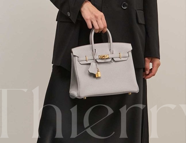
Béton
"Beton," meaning "concrete" in French, is the coolest and most urban-inspired shade among the four white-based colors.
Unlike other whites, Beton leans heavily toward gray, evoking the sleek, industrial feel of cement or concrete walls. While it doesn’t appear overly harsh, it has minimal creaminess, offering a crisp and sophisticated aesthetic.
Compared to Craie, Beton has a stronger gray presence, and unlike Nata, it lacks warmth, leaning towards a distinctly cool tone.
It's the perfect choice for those who love a minimalistic and modern style. :)
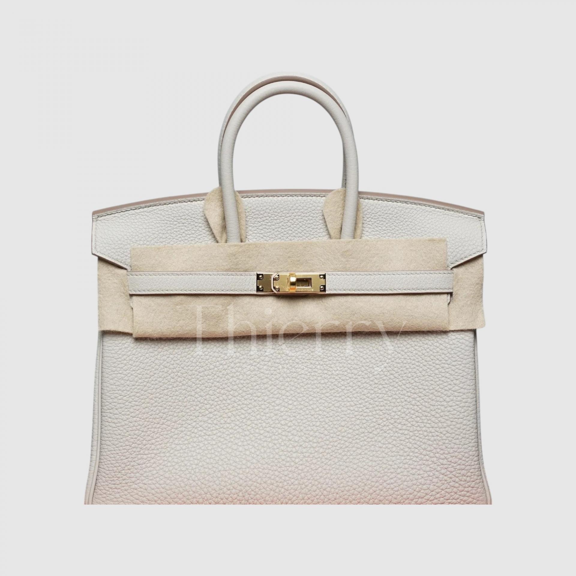
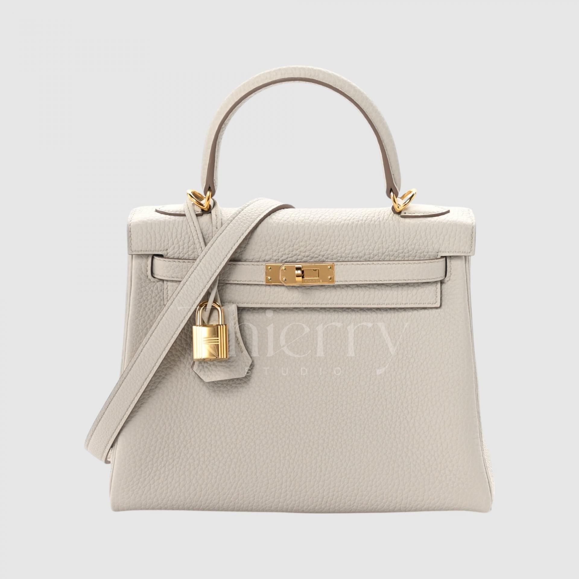
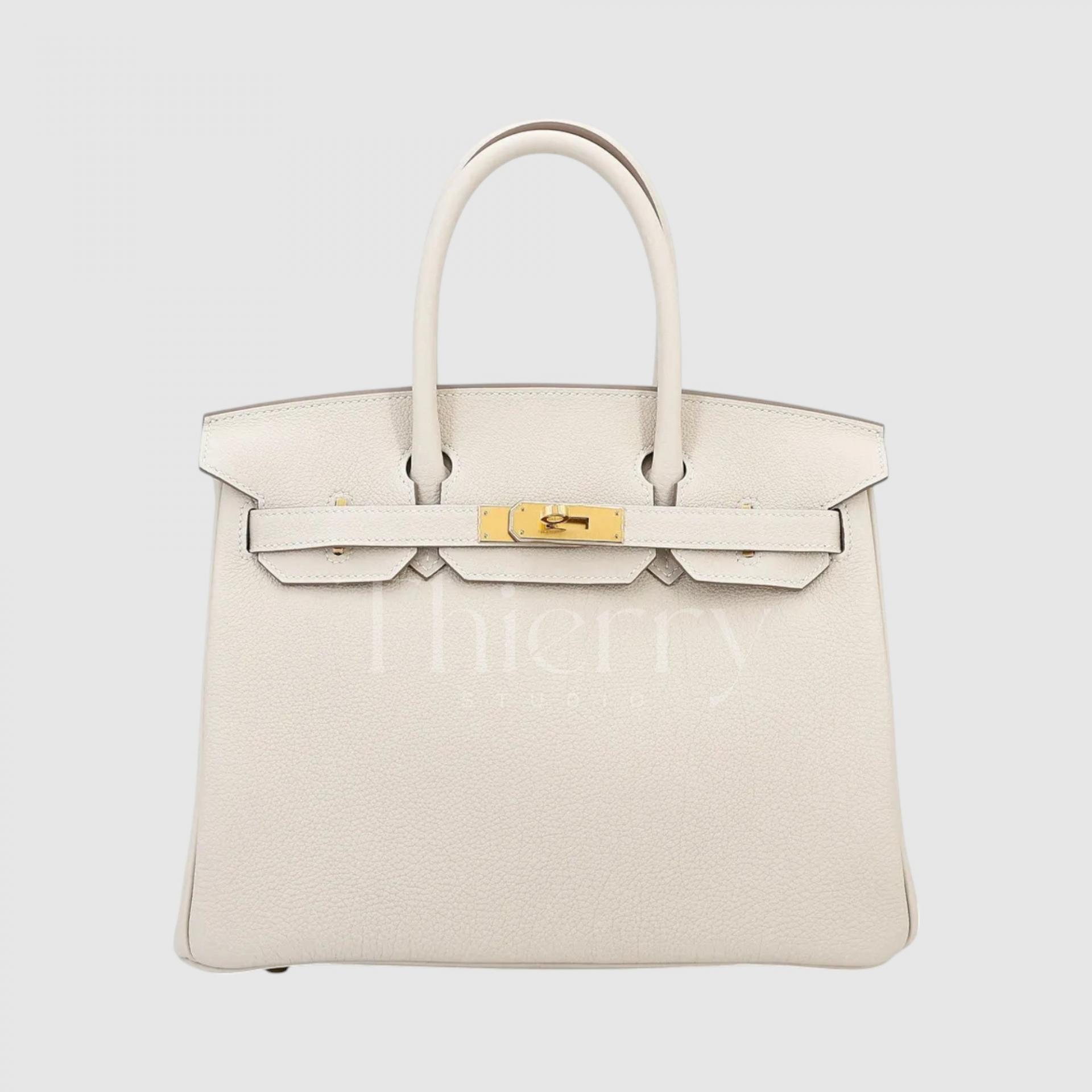
NATA
"Nata," derived from the Spanish word for "cream," is characterized by its warm, creamy ivory tone.
Positioned between creamy beige and white, Nata exudes a soft, sun-kissed milky-white hue.
With a subtle hint of yellow, it creates a gentle and classic aesthetic, making it an excellent choice for those seeking a warm yet bright shade. Reminiscent of a vanilla milkshake, Nata is perfect for adding a touch of warmth and elegance to any look.
While all white-based bags pair effortlessly with any outfit, let's dive deeper into their unique styling potential:
-
White, Craie, and Nata complement clean summer looks or monochrome outfits (styling with a single color tone) beautifully, enhancing a fresh and polished aesthetic.
-
Beton, with its cool-toned modern vibe, pairs best with gray and black ensembles, creating a sleek, urban look.
-
Mushroom, with its warm beige undertones, blends seamlessly with beige and brown outfits, bringing out a natural and earthy elegance.
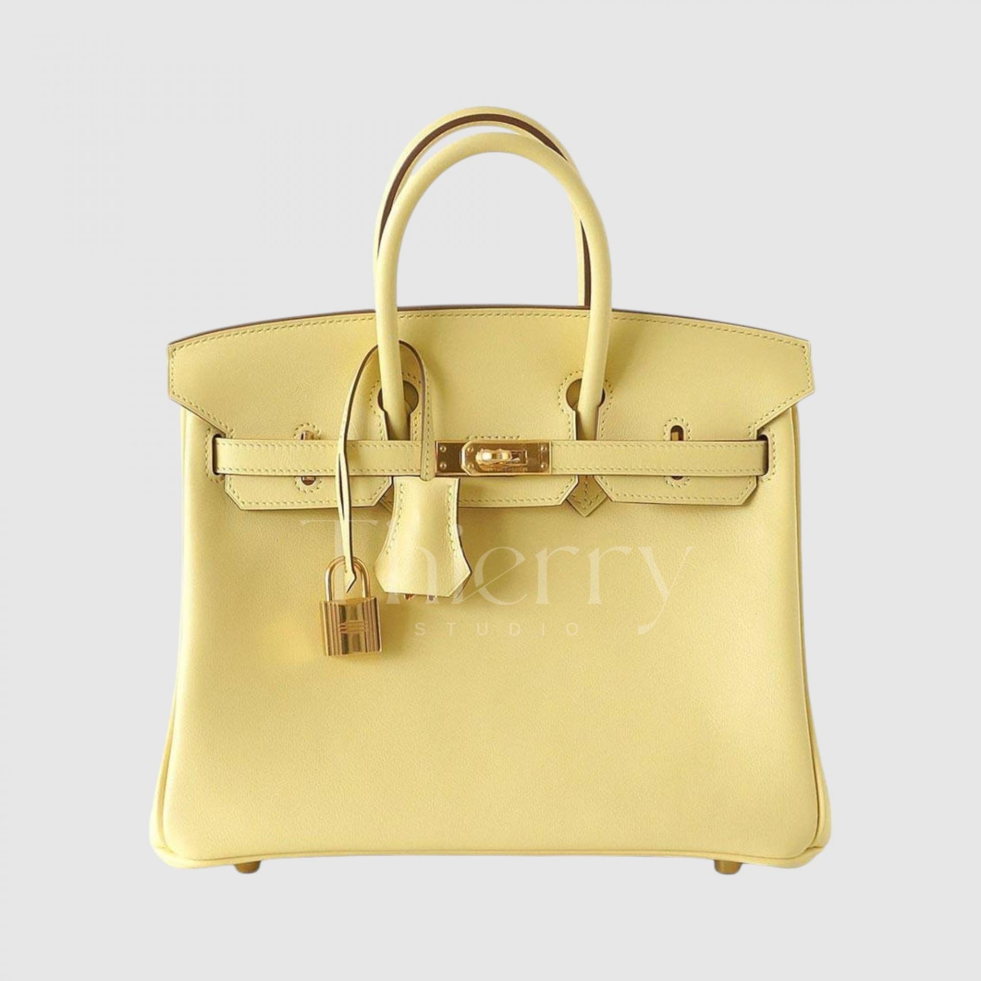
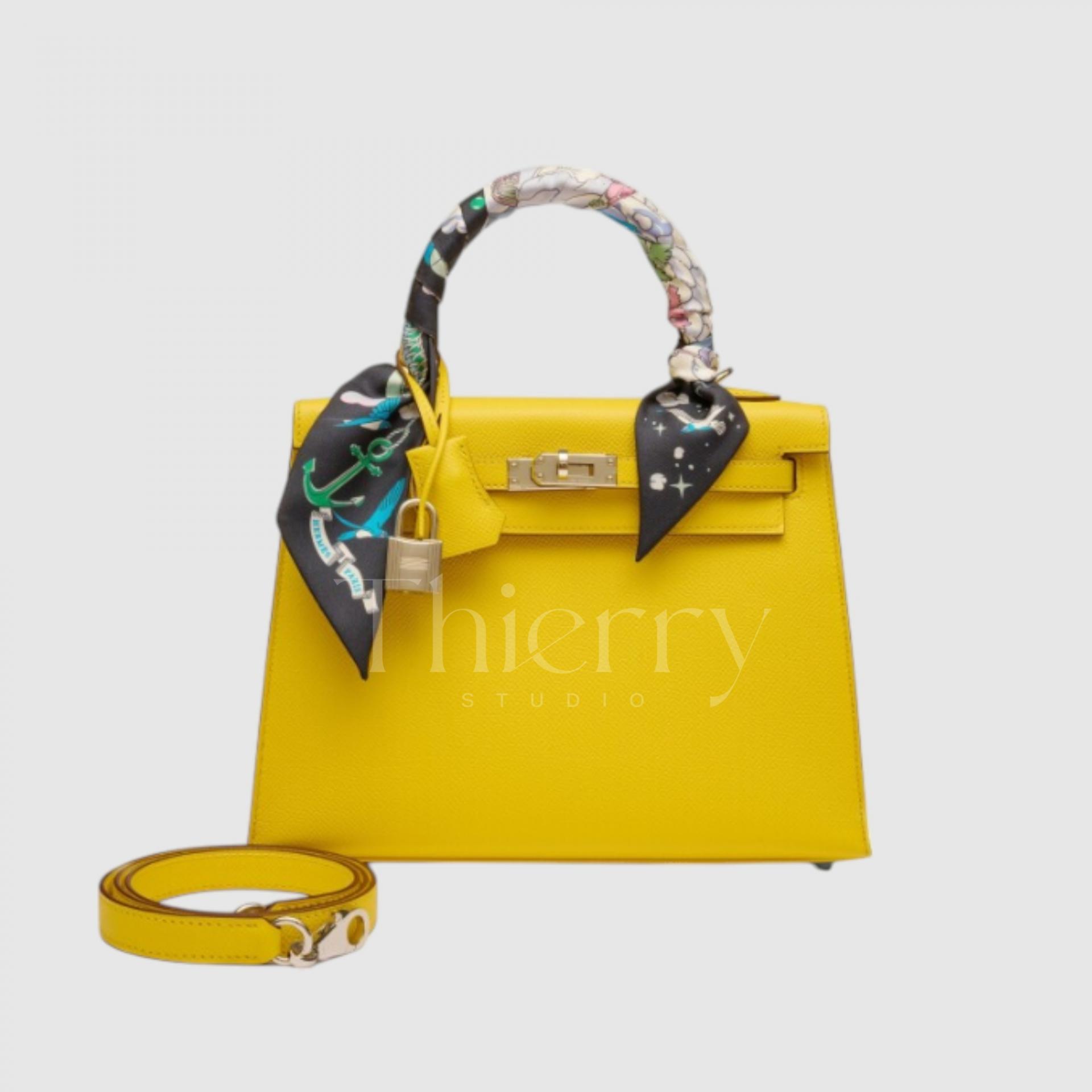
Jaune Poussin
"jaune poussin" is a soft pastel yellow, often described as ‘chick yellow’ or a gentle eggshell shade.
Among the yellow tones, it is one of the lightest, with low saturation, making it a subtle yet charming accent color.
Its delicate pastel hue makes it perfect for pairing with light tweed jackets or white dresses in spring, adding a fresh and cheerful touch to any outfit.
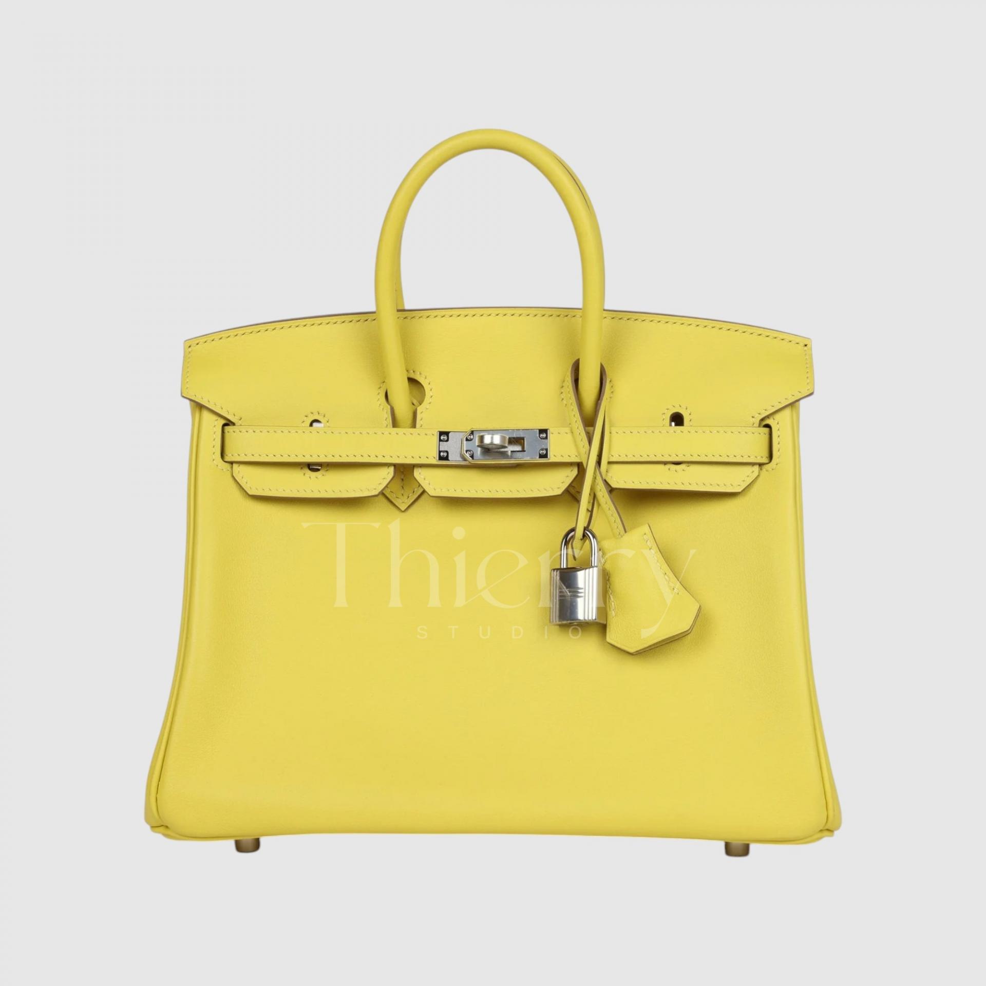
Lime
"Lime," introduced in 2011, is a bright yellow with a hint of green, much like the fruit itself.
With a fluorescent lemon-yellow undertone, it boasts high saturation and a cool tone, making it a refreshing and eye-catching color.
While both are in the yellow family, Jaune de Naples leans warmer with a golden hue, whereas Lime has a crisp, greenish tint, creating a striking contrast between the two.
This shade shines as a statement piece—pair it with a simple white t-shirt and jeans for a trendy, energetic look, or use it as the perfect accent for summer vacation outfits. It also complements a crisp white shirt beautifully. 😊
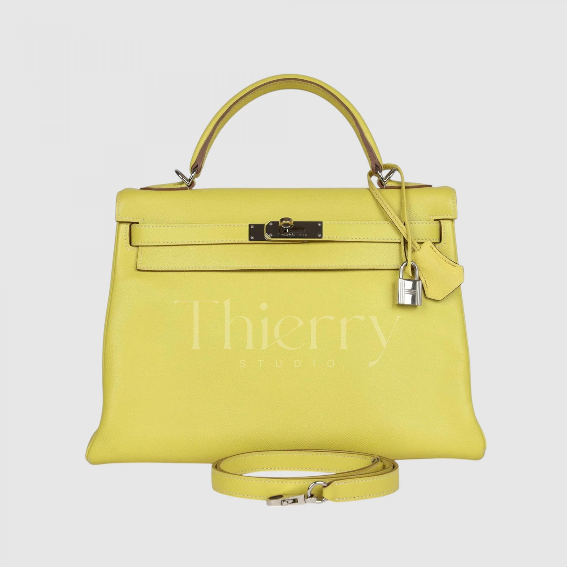
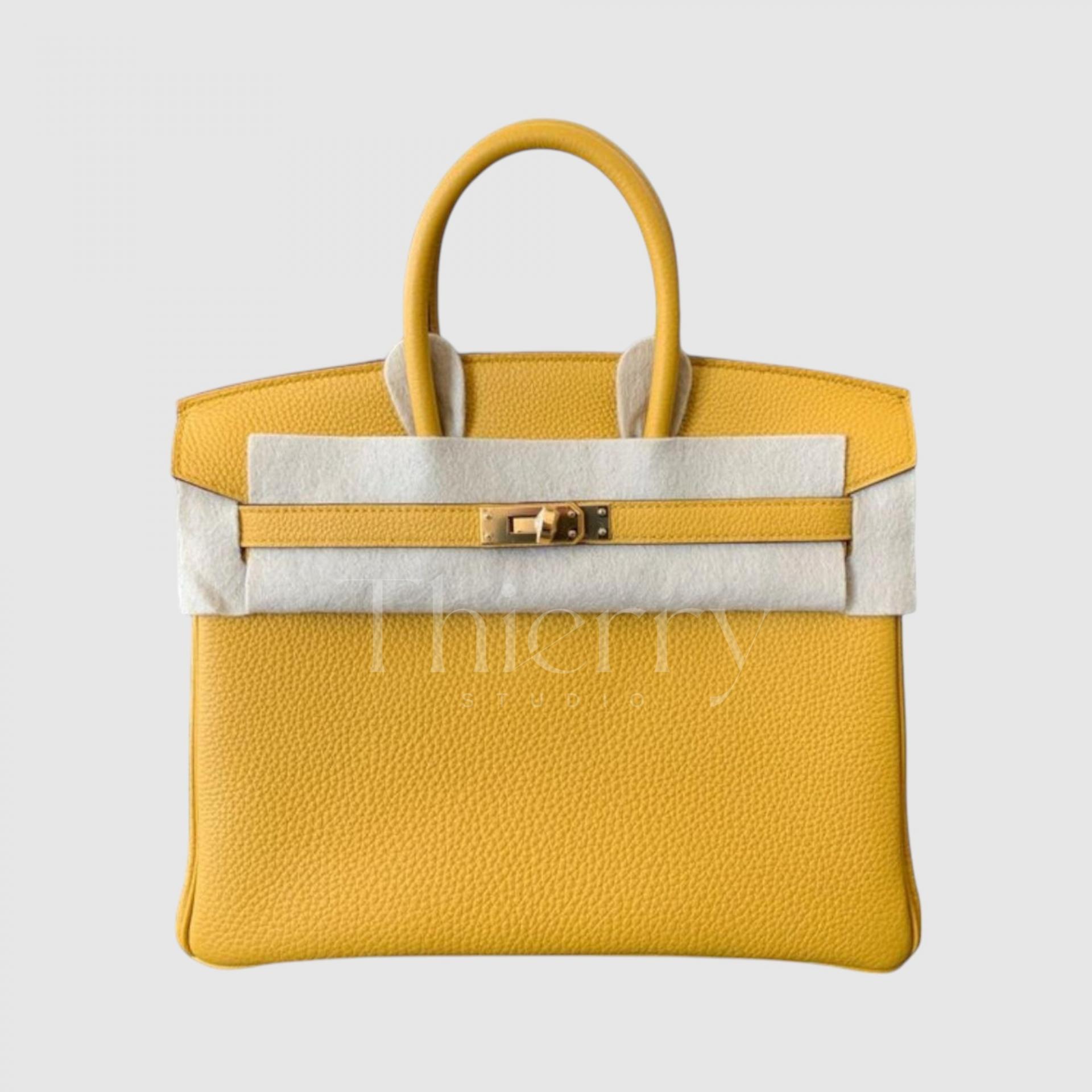
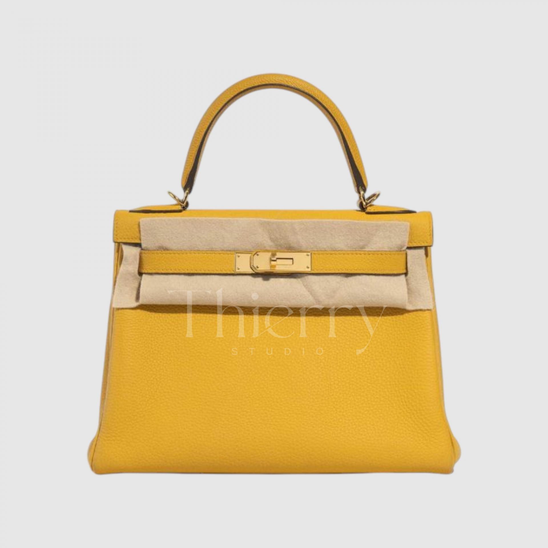
Jaune de Naples
"Jaune de Naples" is a richer and more vibrant pastel yellow.
While similar to Jaune poussin in its soft yellow tone, it carries a bit more energy and warmth, almost as if infused with sunlight.
With a subtle orange undertone, it leans warmer than Jonquille, making it an excellent choice for pairing with ivory and beige outfits to create a sophisticated yet radiant look.
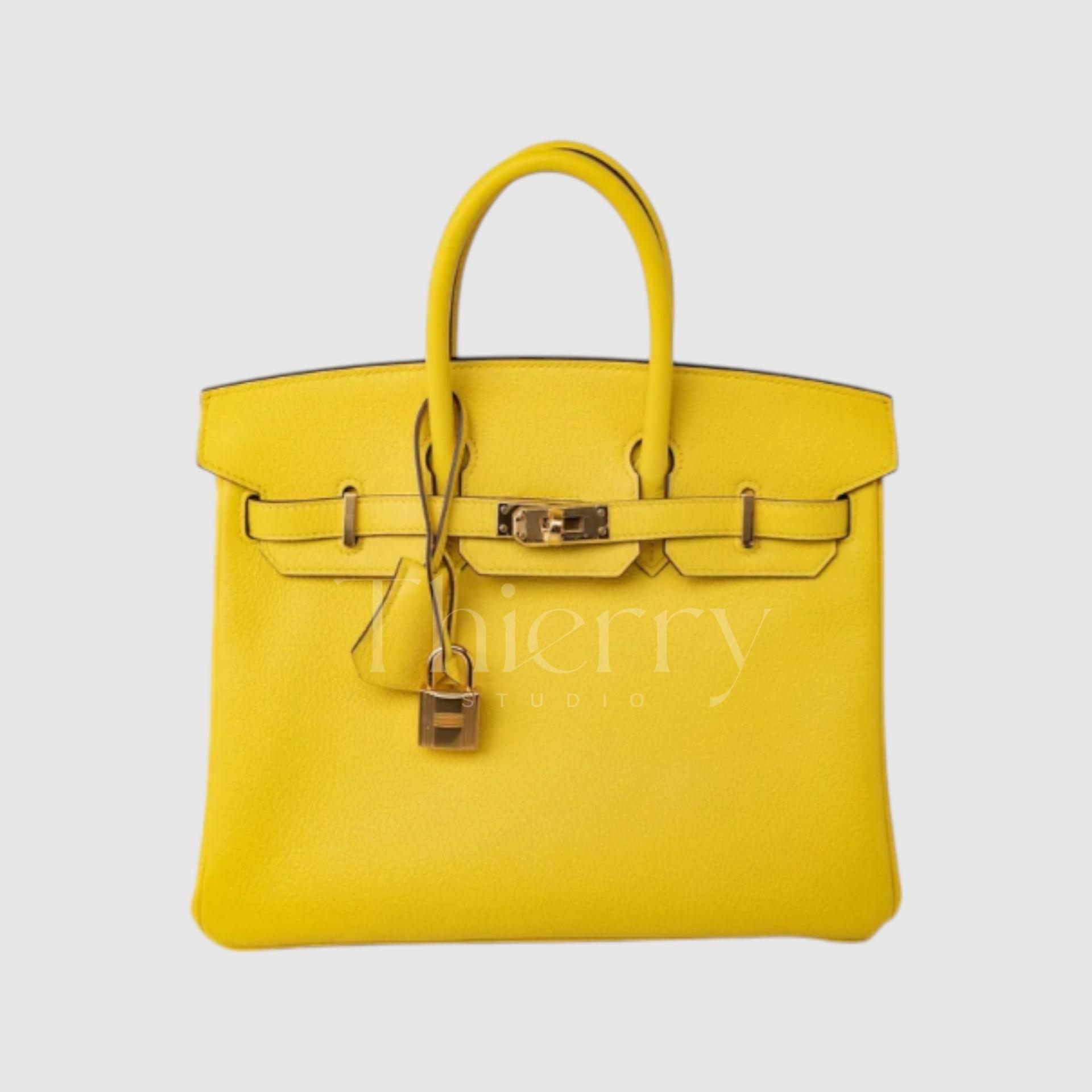
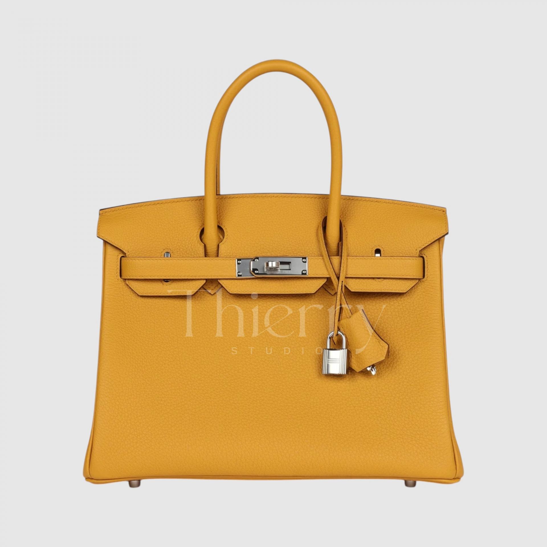
Jaune Ambre
"Jaune Ambre," introduced in 2018, is a striking yellow reminiscent of the gemstone amber ("ambre" in French).
This bold, sunlit yellow carries a hint of orange, giving it a rich, golden depth.
While highly saturated, it has a slightly muted tone, allowing it to pair beautifully with brown and khaki outfits, creating a harmonious and sophisticated look. This shade perfectly embodies Hermès' timeless elegance, making it an absolutely stunning color in person. 😍
Overall, the yellow family follows a simple rule:
The lighter the shade, the cuter and more casual it feels.
The deeper the shade, the more luxurious and sophisticated it appears. 😊
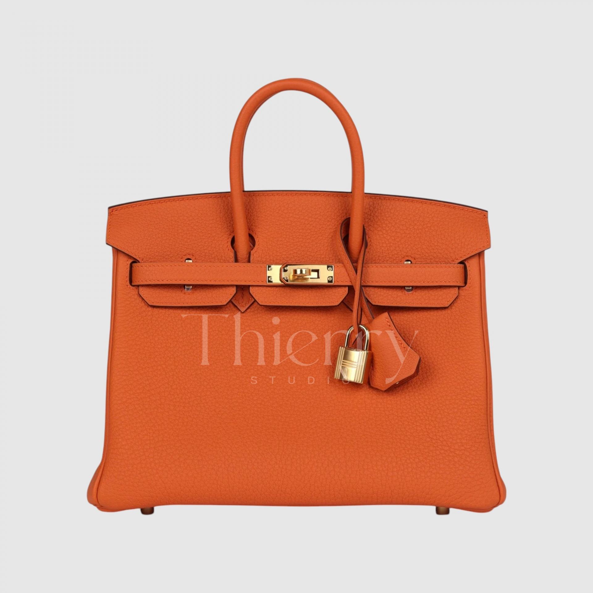
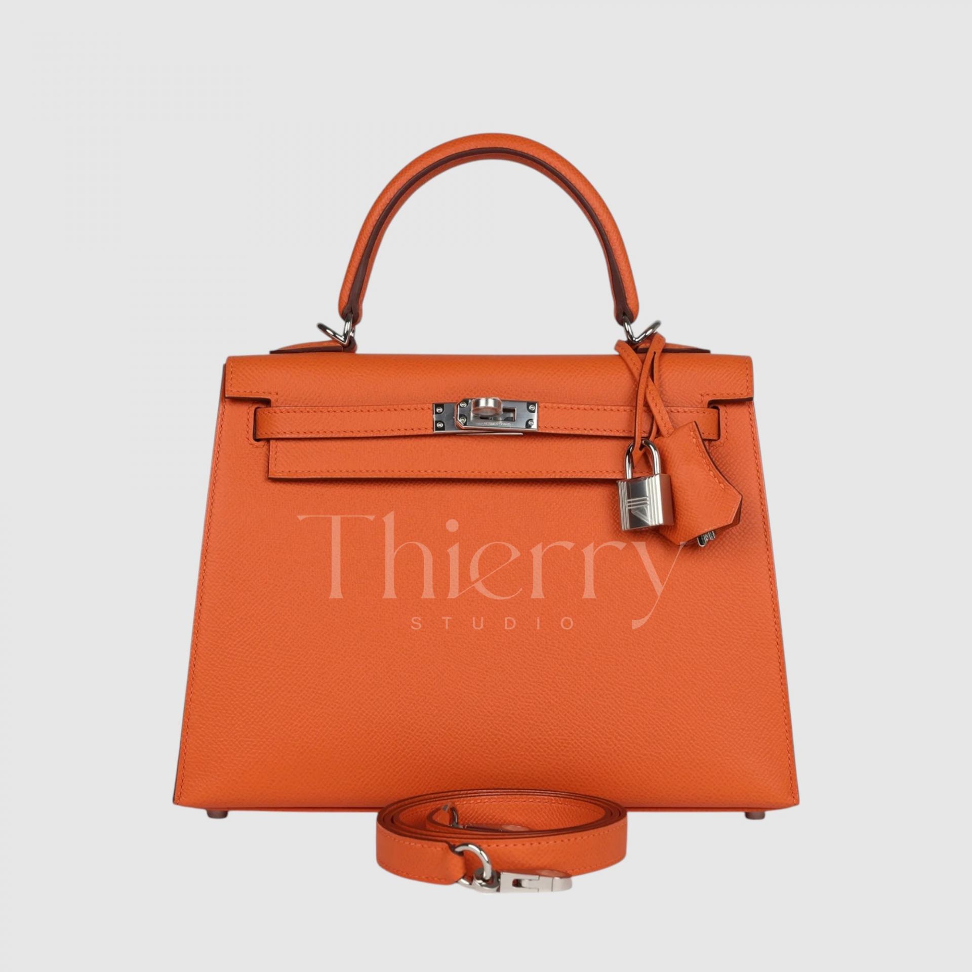
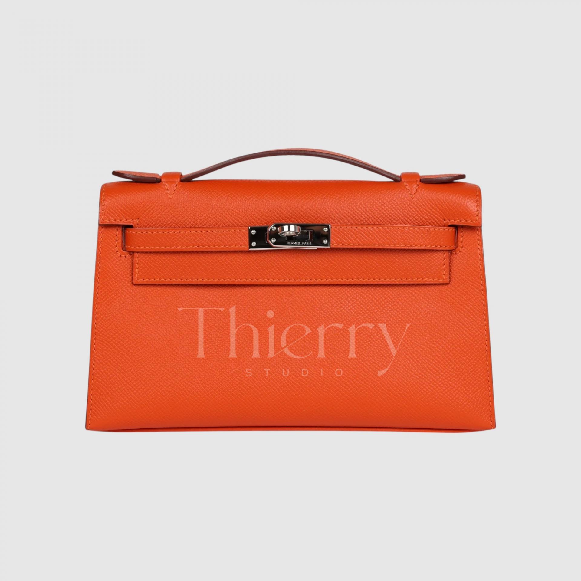
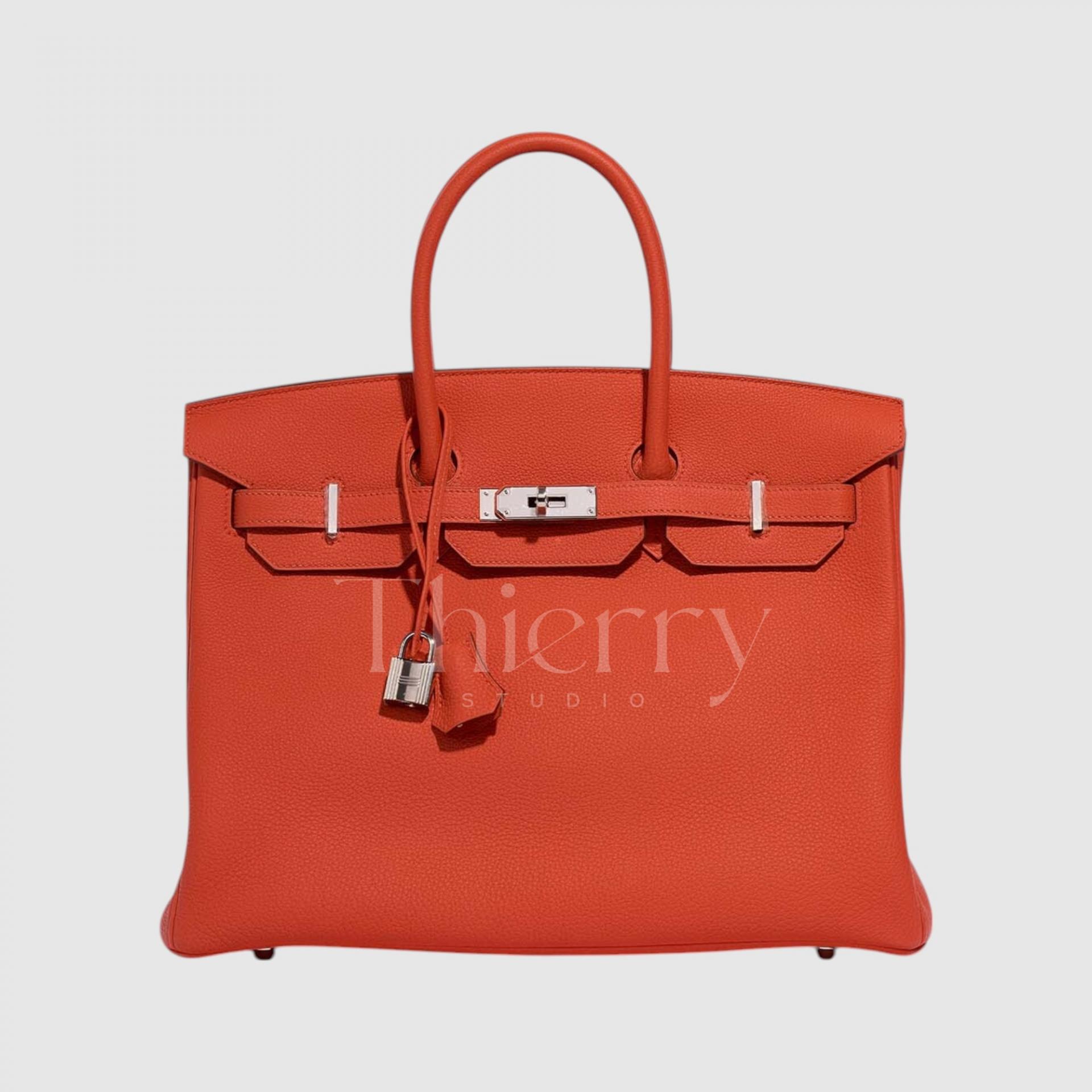
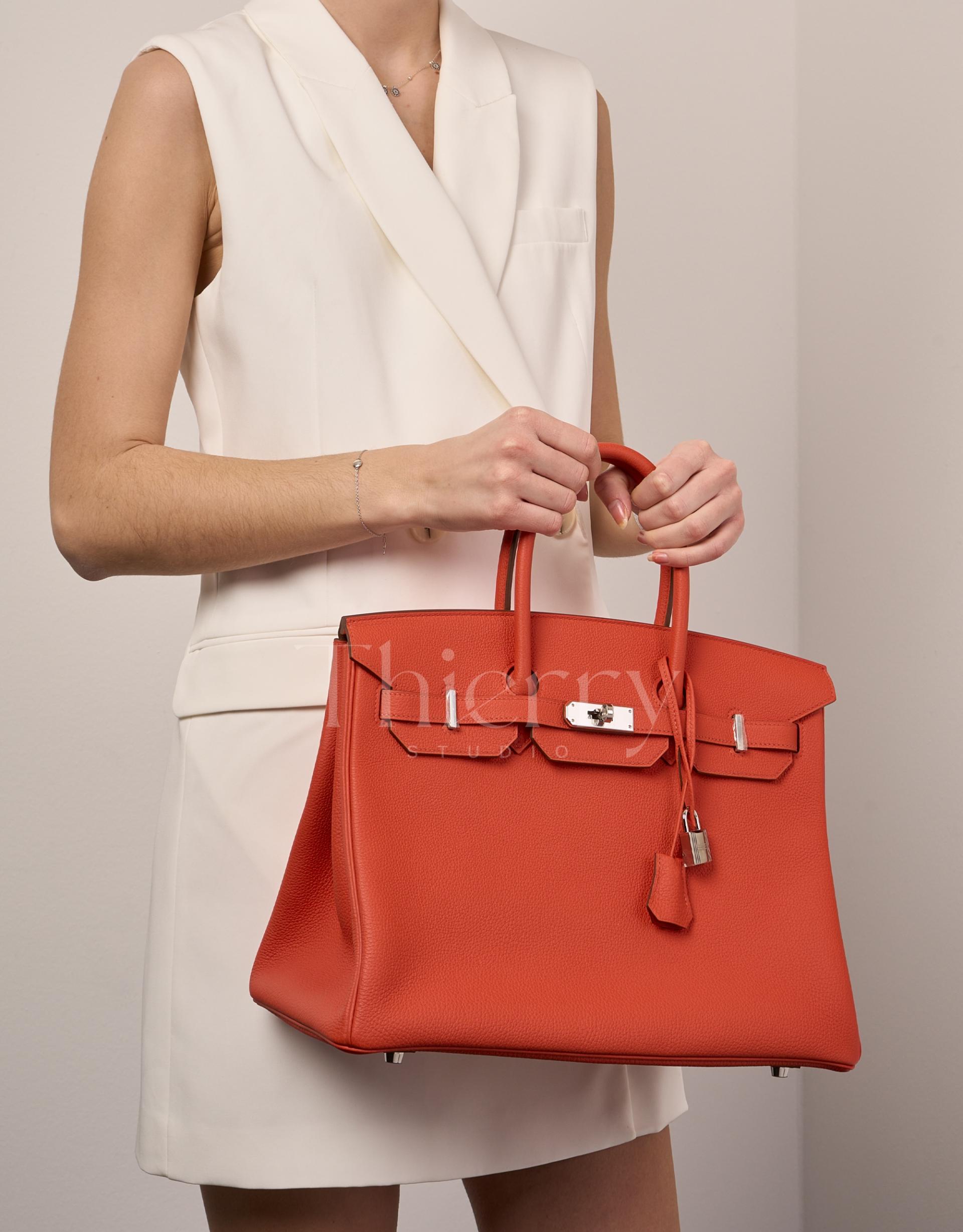
Orange H
Hermès Orange is a classic, vibrant shade that perfectly matches the brand’s signature box color.
Positioned between yellow and red, it has a bright tangerine hue, making it an excellent statement color for various outfits.
It adds a lively touch to navy, white, and beige ensembles and pairs beautifully with patterned accessories like Hermès scarves for a chic and harmonious look. 😊
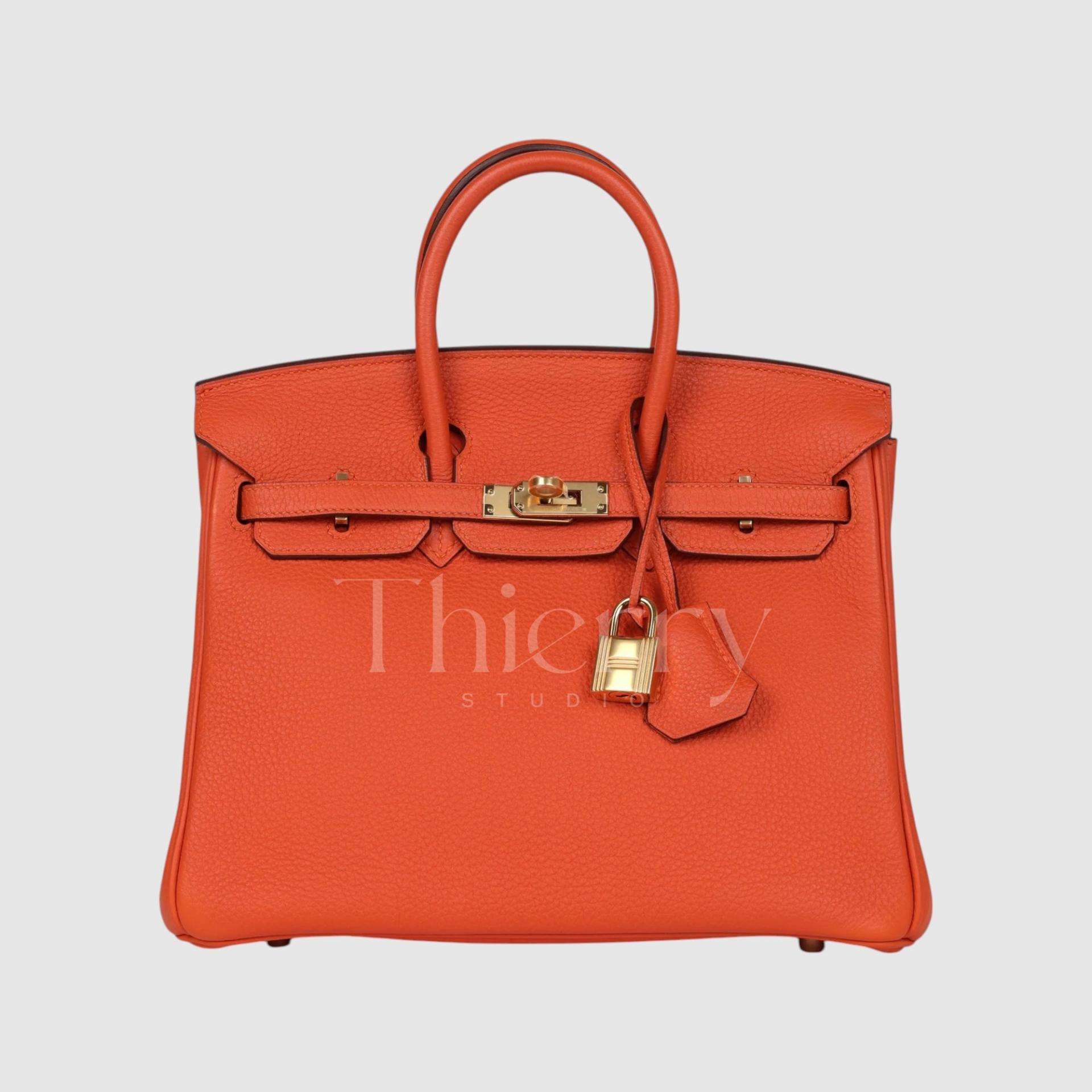
Feu
"Feu," introduced in 2009, is an intense, fiery orange that burns brighter than the classic Hermès Orange.
With higher saturation and a pure, vivid orange tone, it lacks red or pink undertones, making it the ultimate bold and energetic shade.
A Feu-colored bag instantly brightens the face and serves as a striking statement piece. Given its vibrant nature, it pairs beautifully with all-black or all-white outfits for a bold contrast, or it can add a lively touch to a casual denim-and-tee look, creating a stylish and modern vibe. 🔥
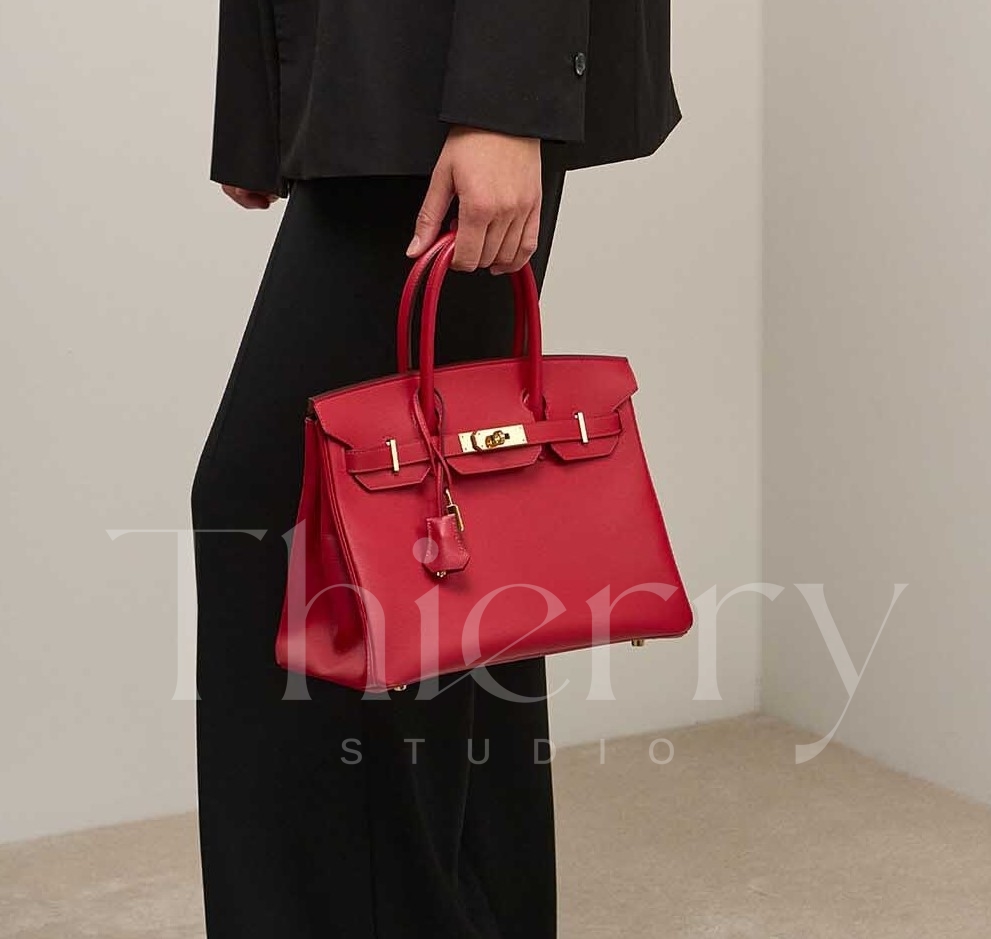
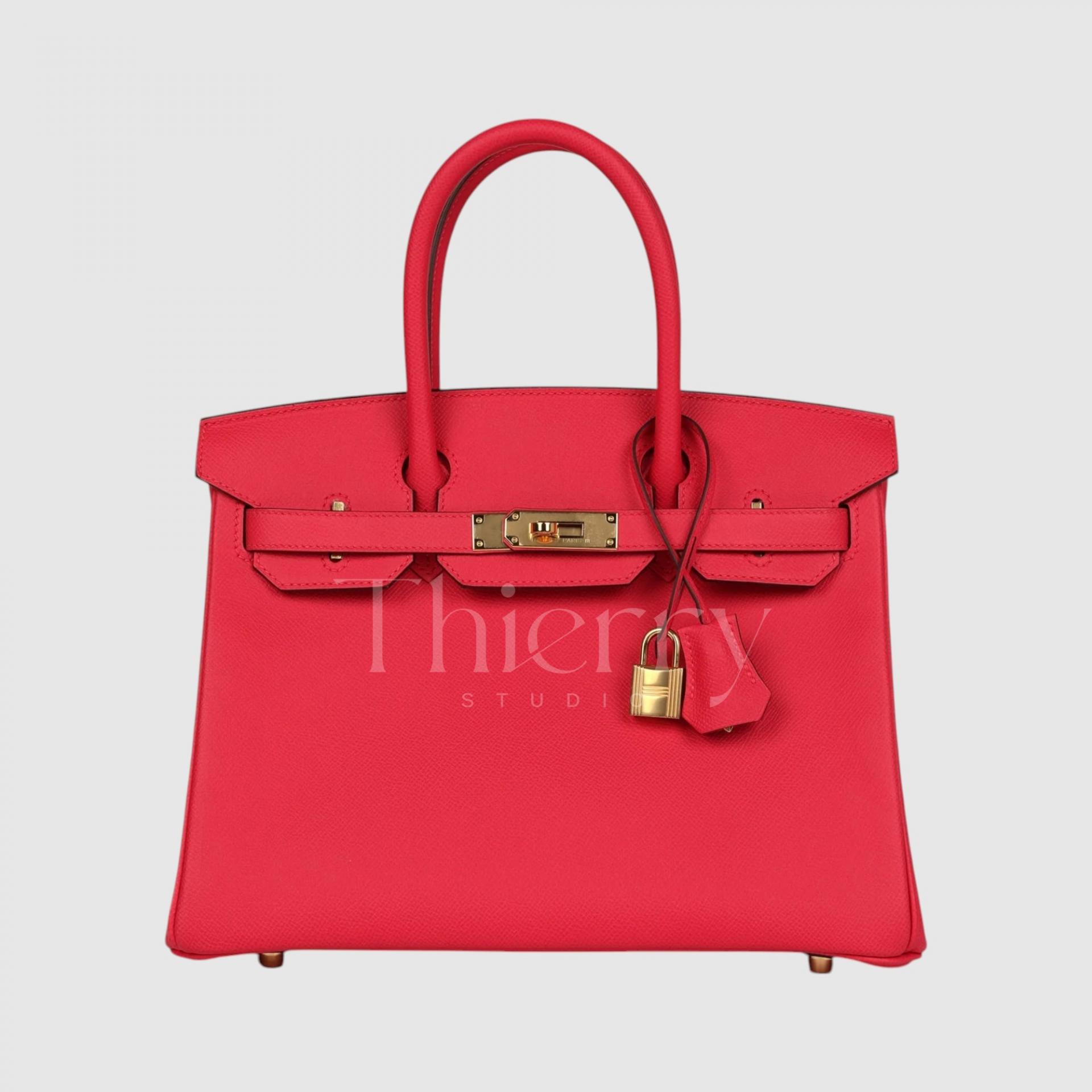
Capucine
"Capucine," introduced in 2012, takes its name from the vibrant red-orange Capucine flower.
Sitting between orange and red, this lively shade can be best described as a bright coral red.
With a hint of orange, Capucine exudes energy and radiance, making it the perfect statement color for summer dresses and casual outfits. It also pairs seamlessly with other Hermès orange-toned accessories, creating a cohesive and stylish look. 🌺✨
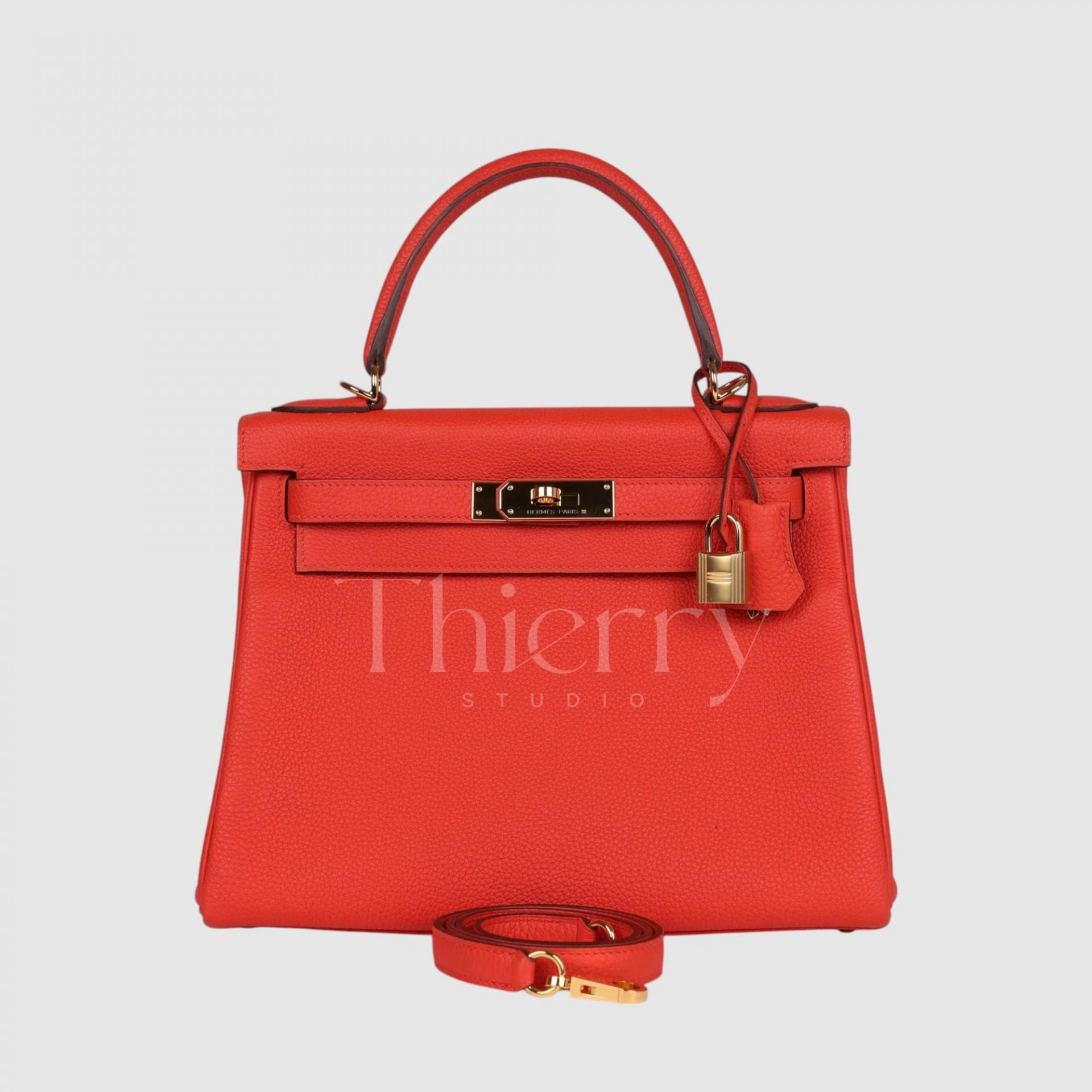
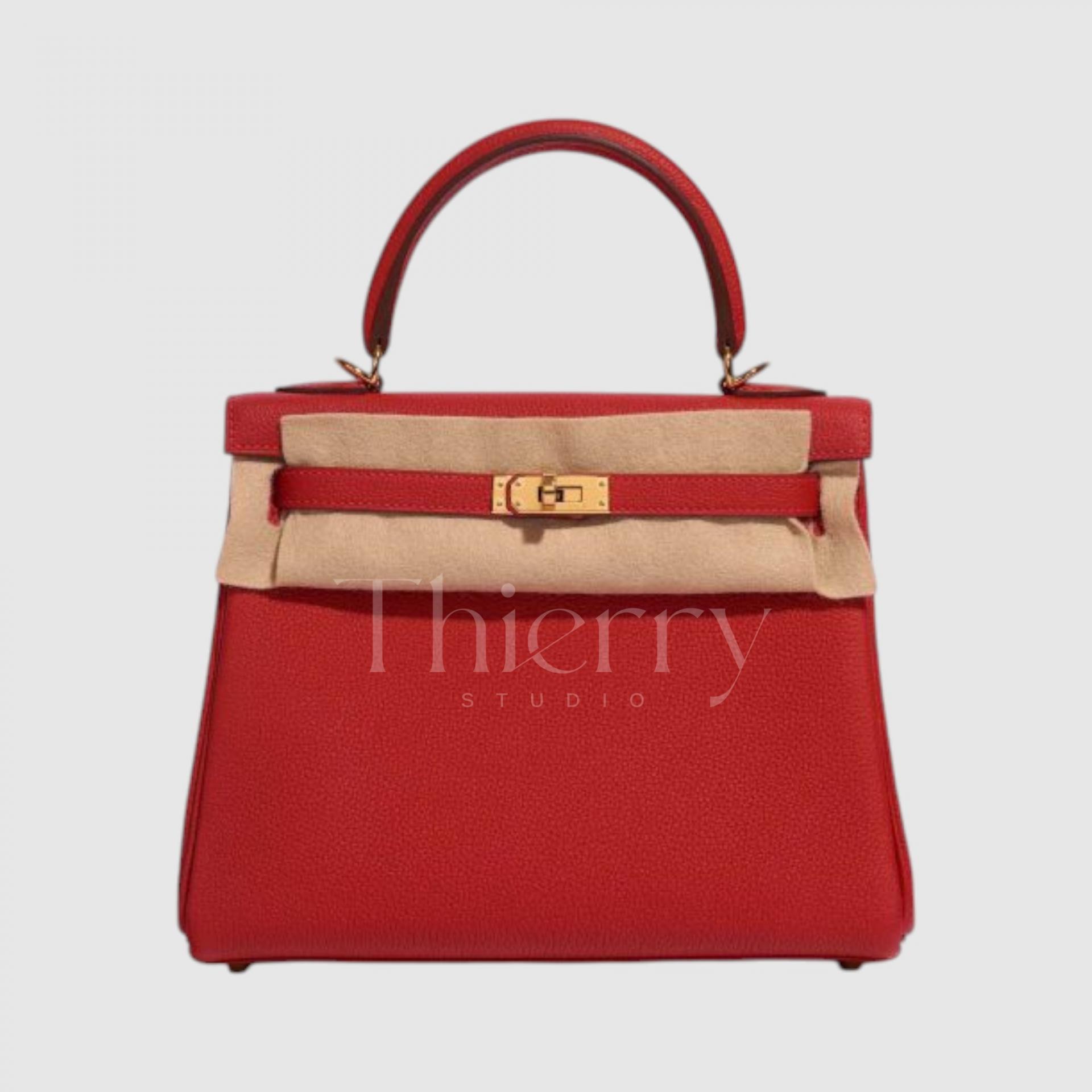
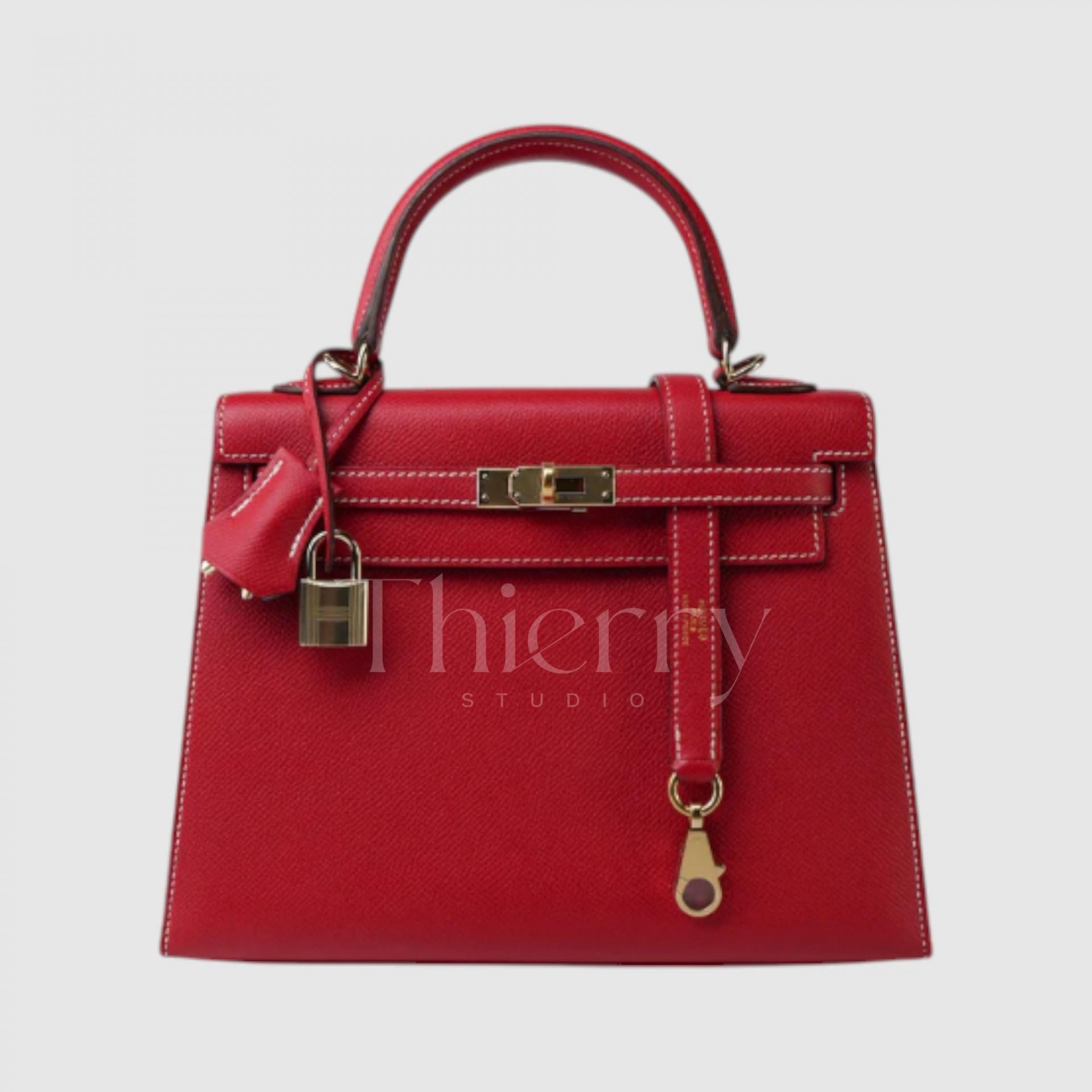
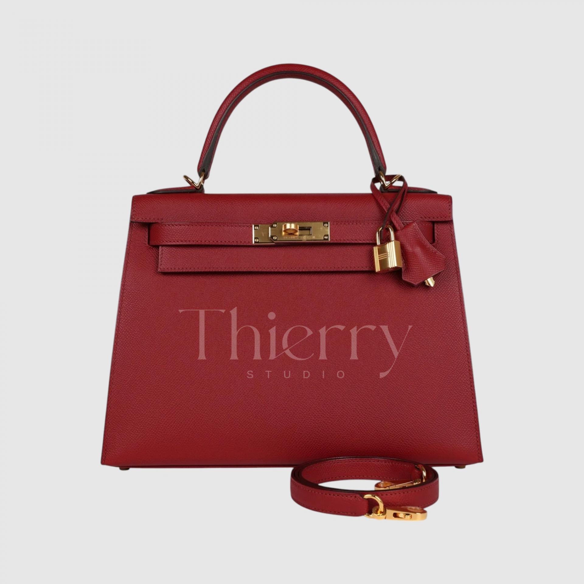
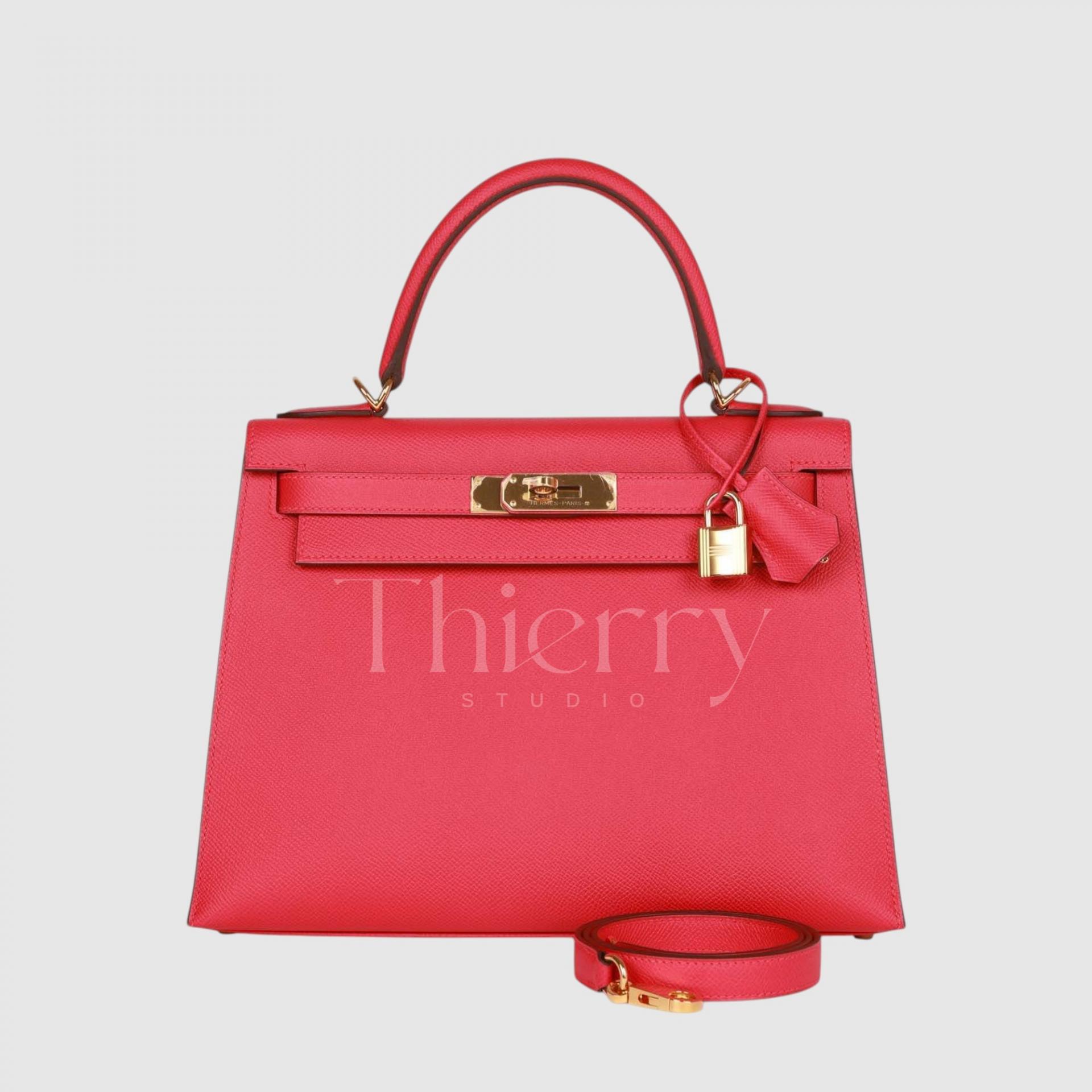
Rouge Casaque
"Rouge Casaque" is one of Hermès’ classic reds—a bold, pure red with striking vibrancy.
Since its debut in 2012, it has remained a beloved shade, embodying the elegance of a true red. Unlike warm reds with orange undertones, Rouge Casaque is a cool-toned red with a subtle blue undertone, making it crisp and refined.
Like most reds, it serves as a powerful statement color, effortlessly elevating any outfit. It adds a sophisticated accent to black-and-white monochrome suits and pairs beautifully with denim or navy ensembles for a chic, French-inspired look. ❤️✨
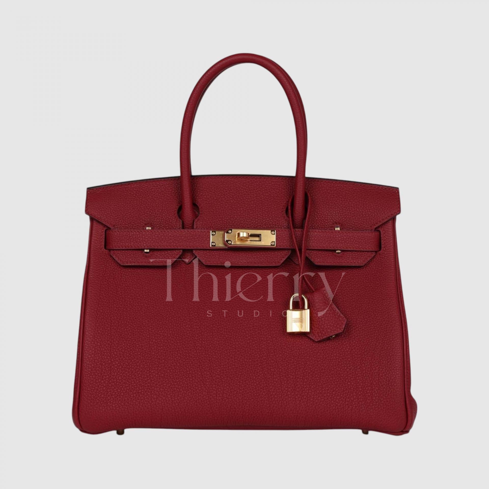
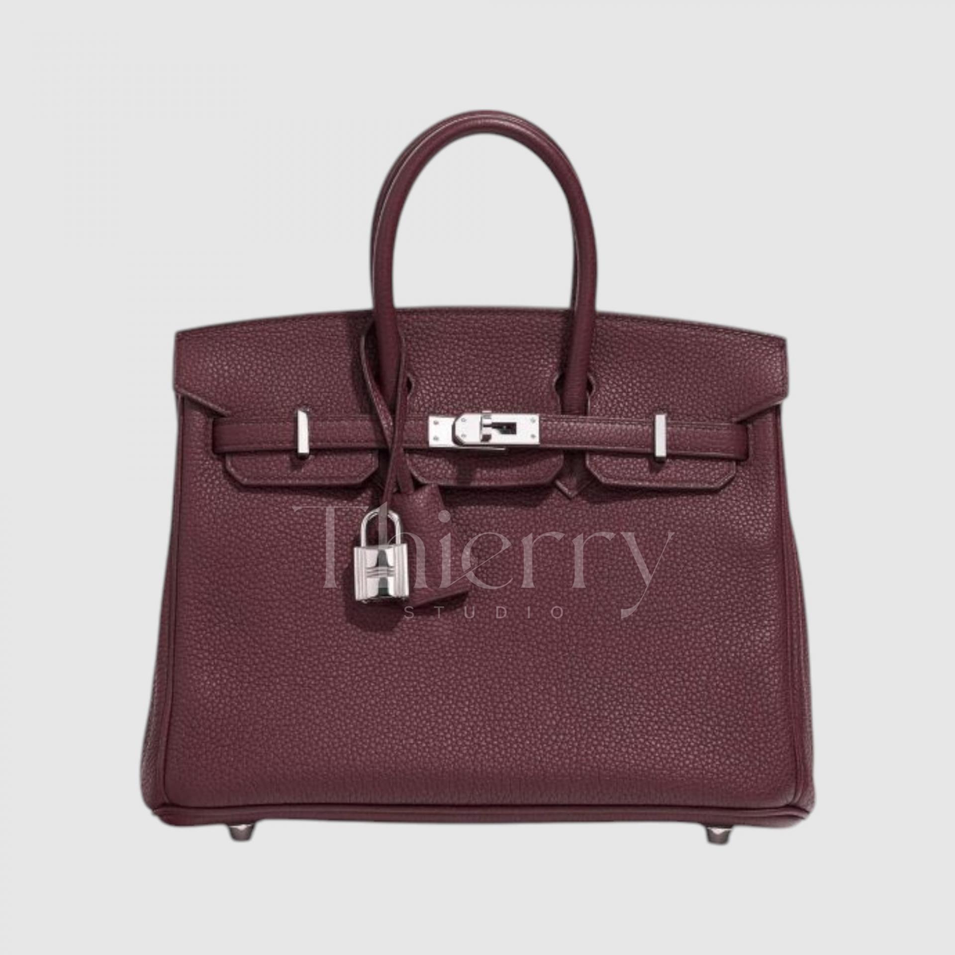
Rouge Grenat
"Rouge Grenat," meaning "garnet red," is a deep, sophisticated shade inspired by the rich tones of garnet gemstones.
Darker than other reds, this wine-colored hue carries a subtle purplish undertone, exuding an air of elegance and refinement.
Thanks to its depth, Rouge Grenat pairs beautifully with formal attire and is especially stunning during fall and winter, complementing coats and structured outerwear effortlessly. It works well as a subtle yet luxurious color accent and looks exceptionally refined when styled in a tone-on-tone ensemble with deep browns or burgundy hues. 🍷✨
From a styling perspective:
-
Capucine is the brightest and most playful of the three, making it a lively statement piece for everyday looks.
-
Rouge Casaque is a timeless, classic red—bold yet versatile, perfect for both casual wear and dressier, formal occasions.
-
Rouge Grenat is an elegant alternative for those who want a classic-colored bag without opting for black—its deep wine tone serves as a sophisticated, neutral-like shade with a unique touch.
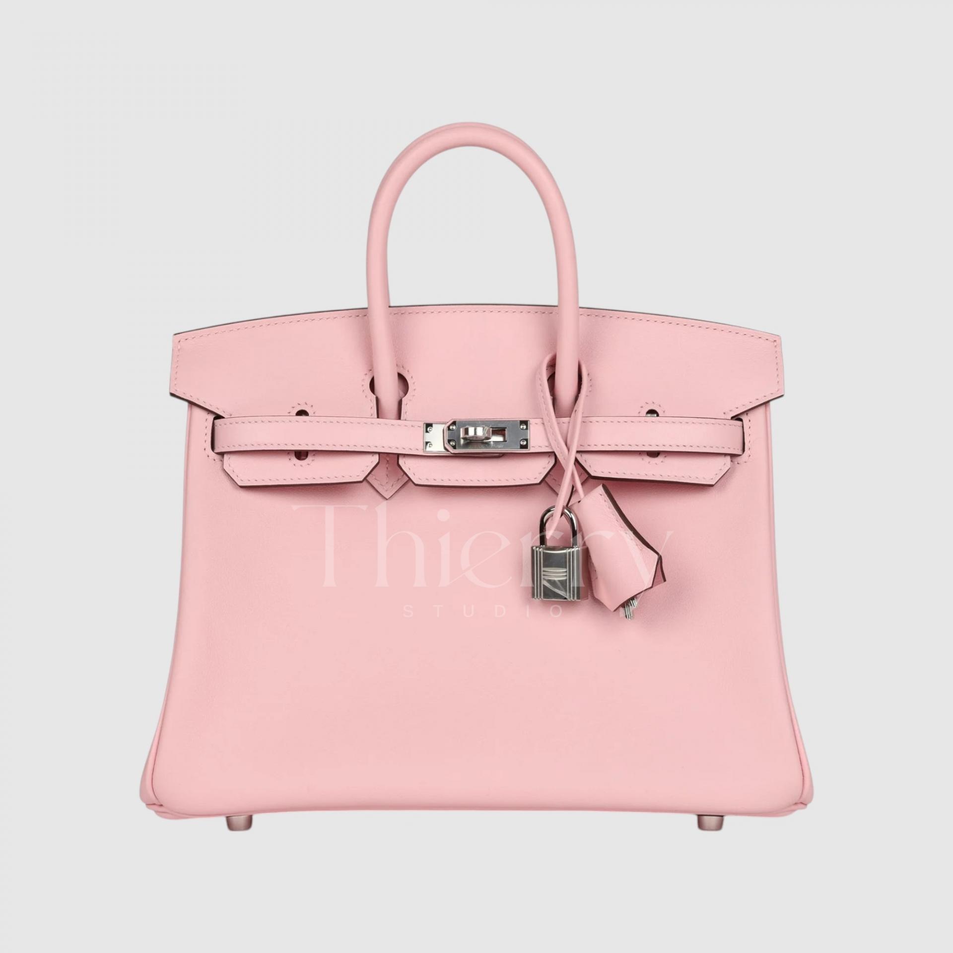
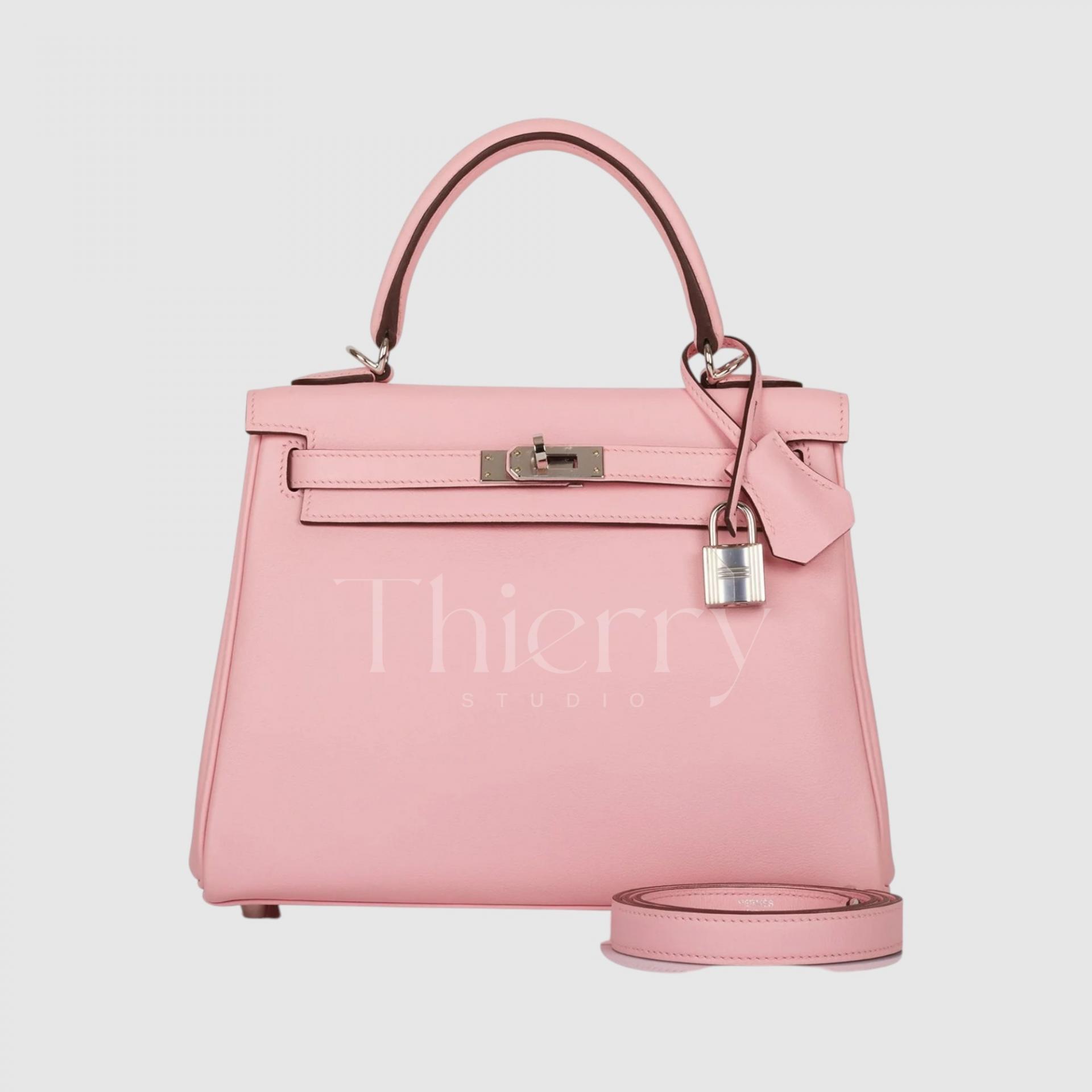
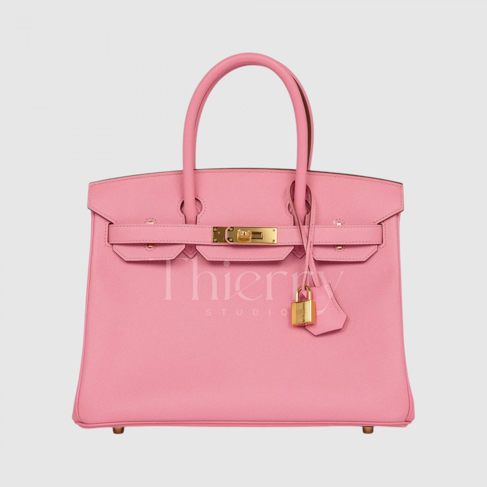
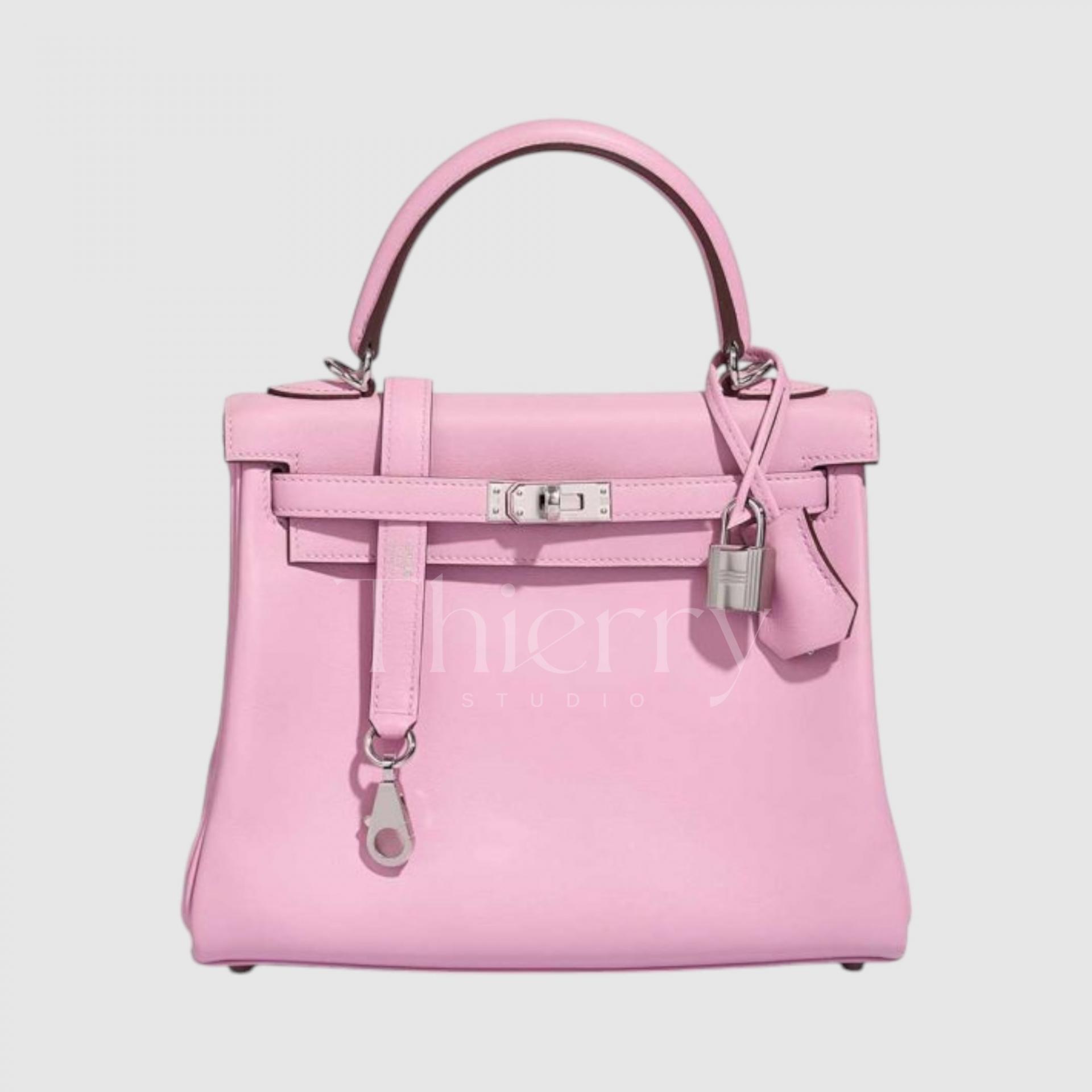
Rose Sakura
"Rose Sakura," as the name suggests, is a soft, warm pink reminiscent of cherry blossoms with a hint of apricot.
With its powdery, delicate tone, this shade exudes a graceful and feminine charm. It pairs beautifully with white or light gray, making it an excellent choice for elegant, feminine looks.
A perfect color for spring, Rose Sakura is undoubtedly one of the most beloved shades in the pink family. 🌸
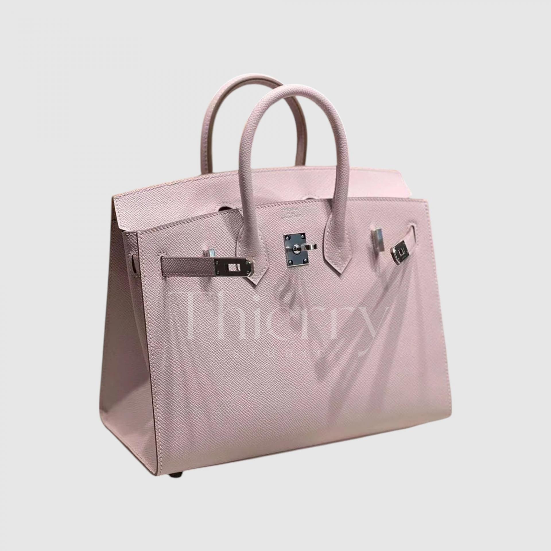
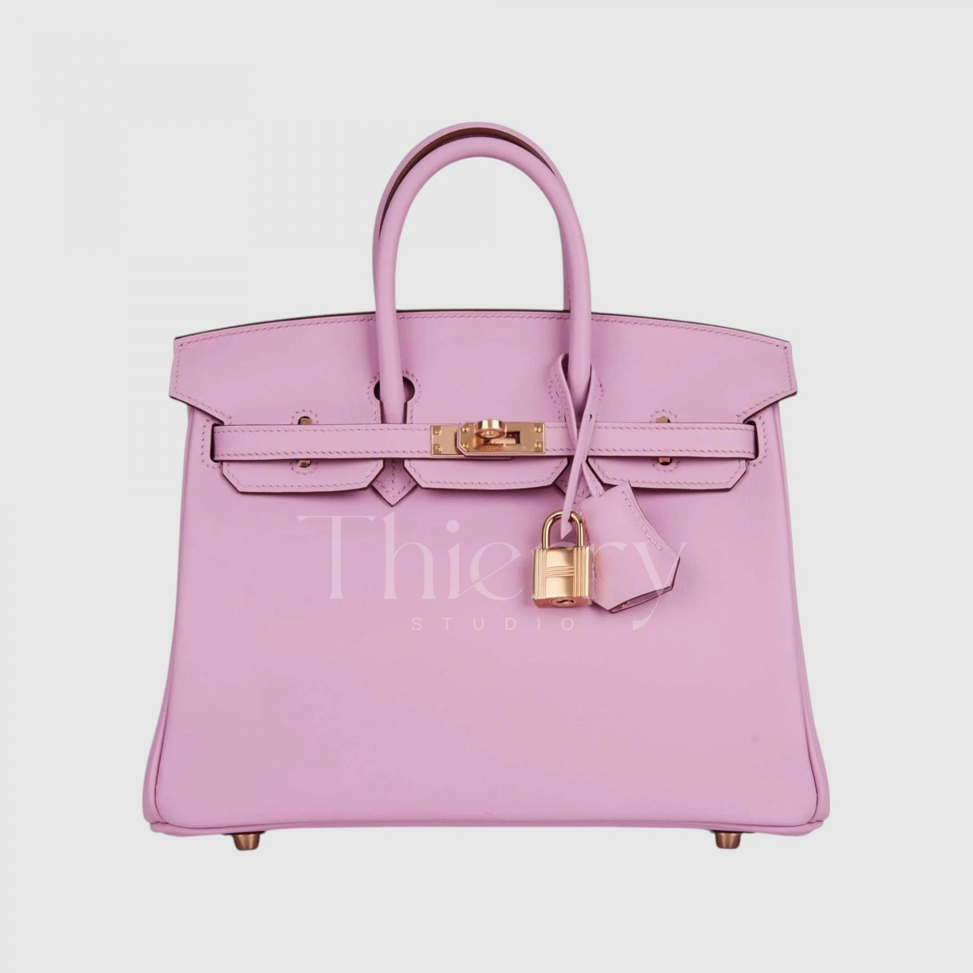
Mauve Pale
"Mauve Pale" is a soft lavender-pink with a subtle hint of lilac.
As a low-saturation, cool-toned pastel shade, it offers a refined and elegant look without being overly bold.
Pairing it with muted gray or blue tones creates a sophisticated ensemble, and its understated charm makes it a fresh yet polished choice for formal occasions—a pink without excessive sweetness, perfect for an elevated, chic touch. 💜
Rose Confetti
"Rose Confetti" is a bright pastel pink, reminiscent of playful confetti, with a hint of bubblegum pink.
While it’s not overly saturated, its cheerful and eye-catching nature makes it a perfectly vibrant yet soft statement color.
Pair it with beige-toned two-piece outfits or sky-blue ensembles for a fresh and lovely look. This shade adds a delightful, youthful charm to any outfit! 🎀✨
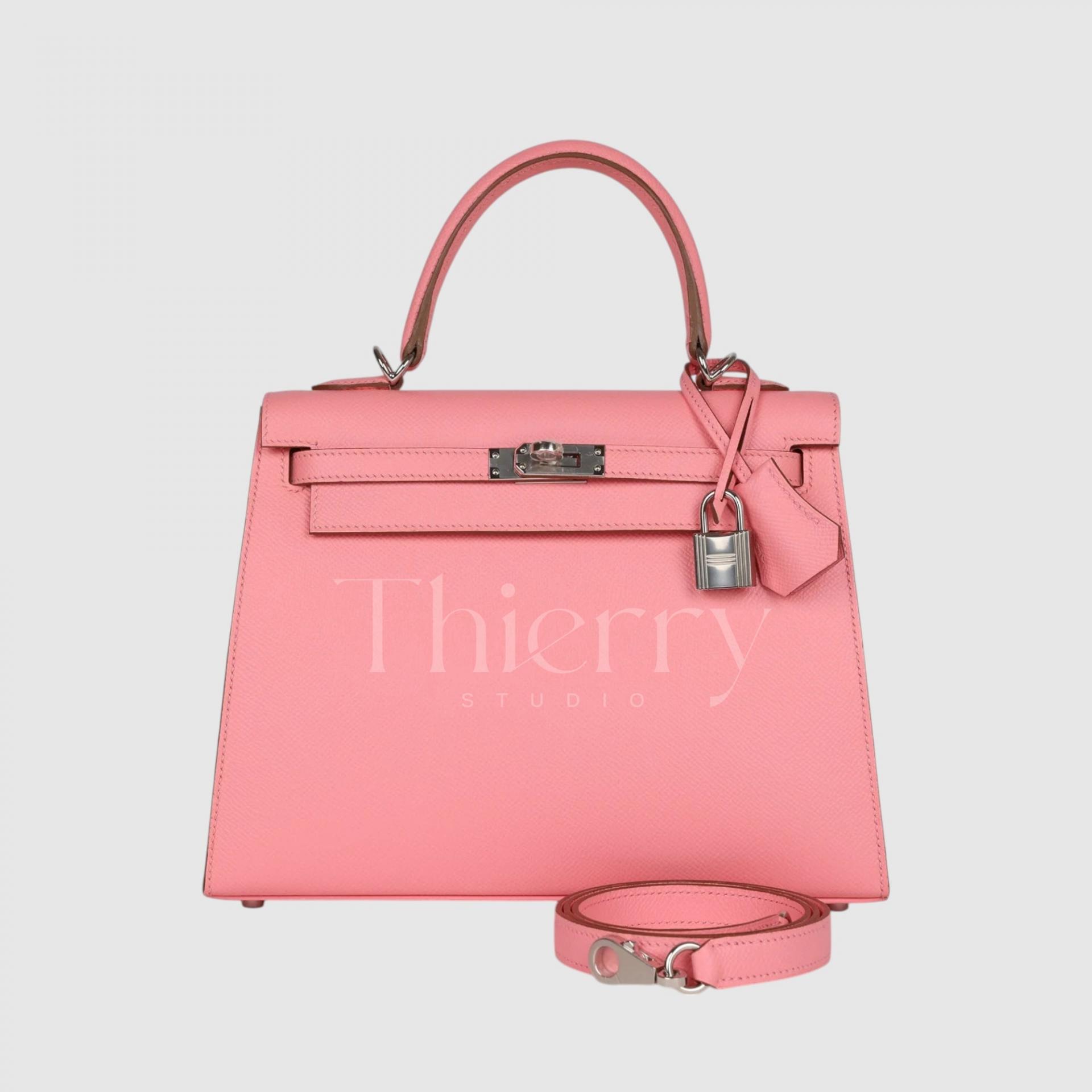
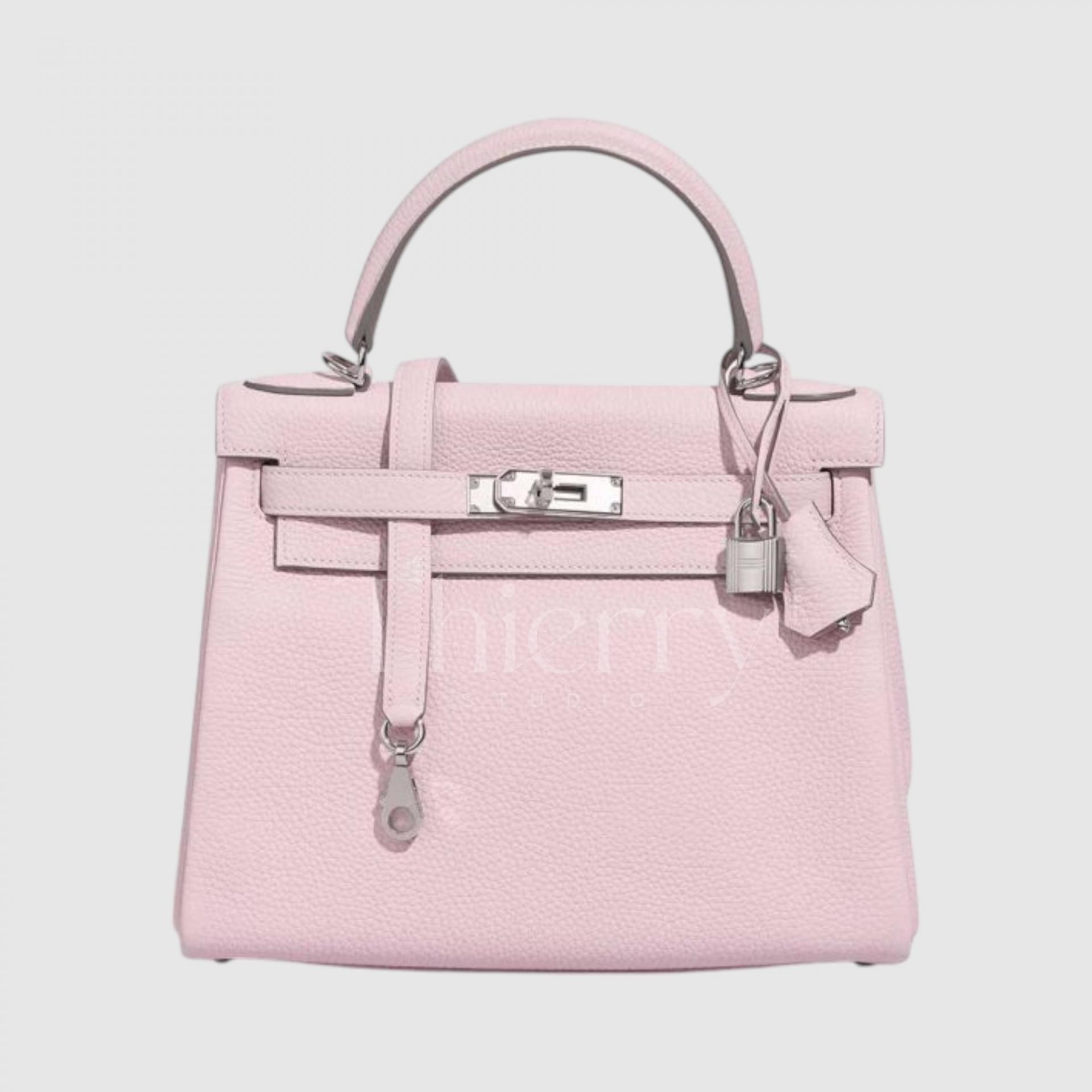
Rose Azalée
"Rose Azalée" is a vivid, cool-toned coral pink, reminiscent of azalea blossoms.
It beautifully balances warm coral and cool pink undertones, creating a bright and energetic hue—one of Hermès' most popular pink shades.
Despite having no fluorescent tones, Rose Azalée is bold and striking, making it a stunning statement color for any outfit. It pairs especially well with white and gray monochrome looks, adding a fresh pop of color, or blends effortlessly with neutral tones like navy and beige for a chic, balanced ensemble. 😊
Mauve Sylvestre
"Mauve Sylvestre" is a soft lilac-pink with a hint of warmth, creating a delicate yet refined "purple-pink" hue.
Compared to Mauve Pale, it has a higher saturation and more pink undertones, making it a richer and warmer pastel shade.
Thanks to its unique, mystical glow, it serves as an elegant statement color for simple outfits. It also feels more sophisticated and luxurious than lighter pink shades like Rose Sakura or Rose Confetti, due to its slightly deeper tone. 💜
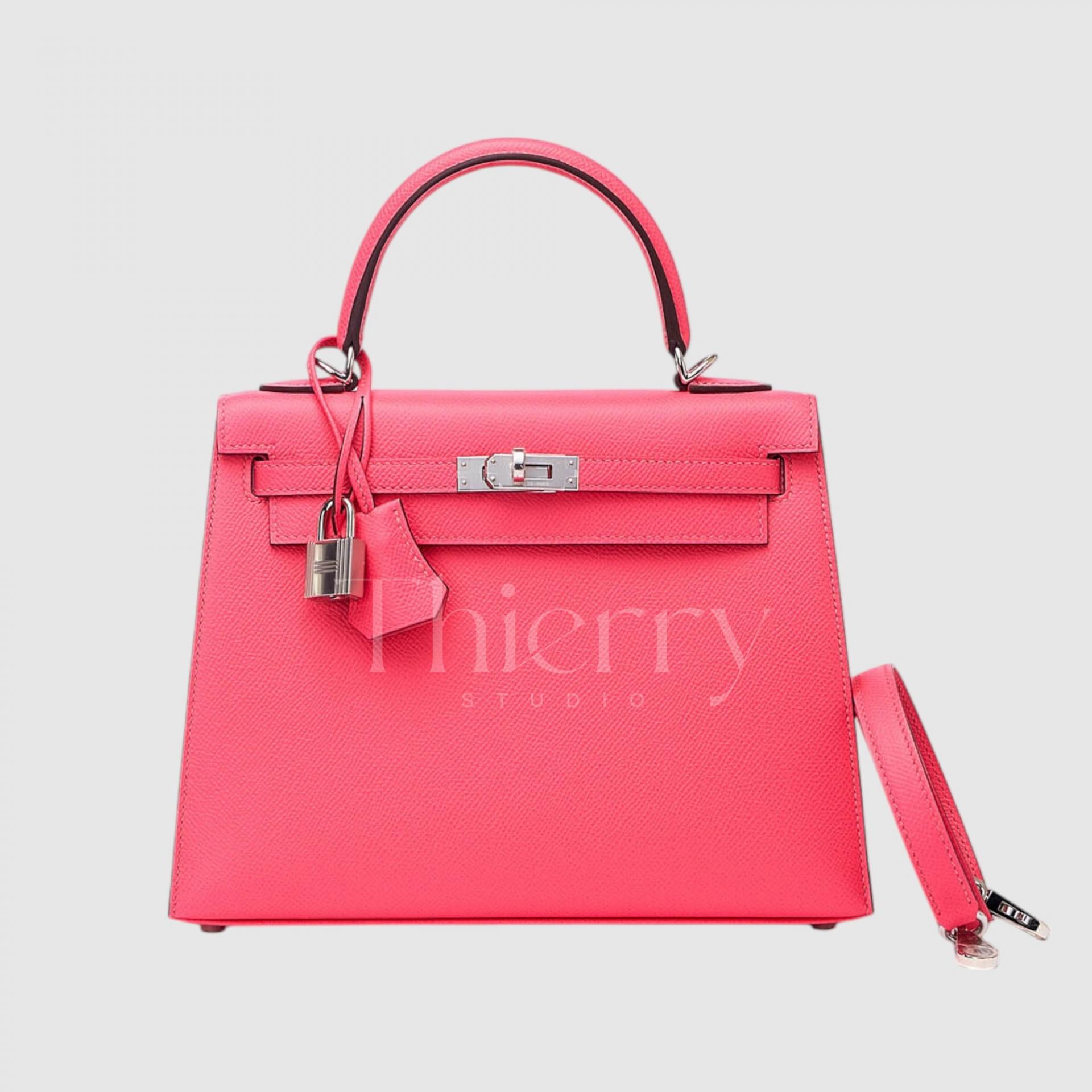
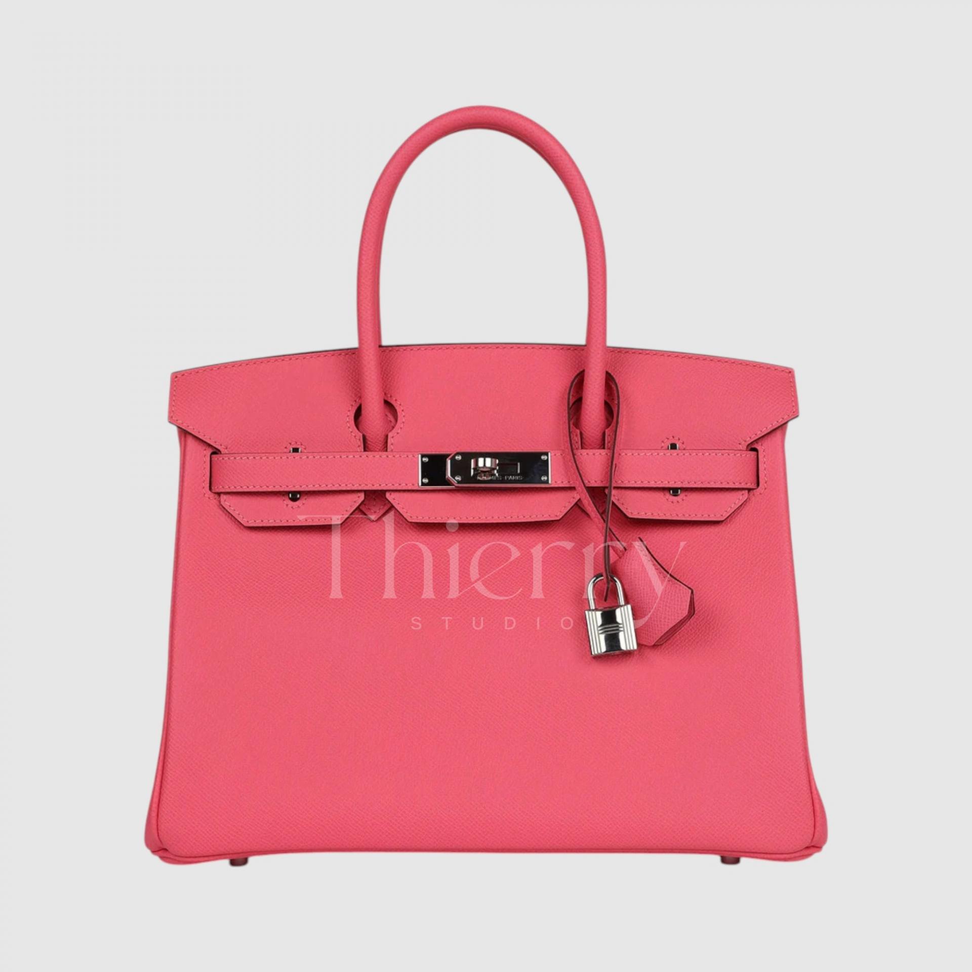
Rose Extrême
"Rose Extreme" lives up to its name—an intense, high-saturation deep pink that demands attention.
As a bold statement color, a Rose Extreme bag instantly becomes the focal point of any outfit. It pairs beautifully with all-black or all-white ensembles, adding a chic, sophisticated touch.
Surprisingly, this shade also complements playful streetwear, bringing a fun and energetic vibe. With a hint of red undertones, it carries a touch of maturity, making it an excellent choice for evening party looks or pairing with a feminine silk dress for an extra touch of elegance.
In person, this color is absolutely stunning and incredibly captivating. 😎🔥
Soft shades like Rose Sakura, Rose Confetti, and Mauve Pale add a romantic touch to bright spring and summer dresses or skirt looks.
On the other hand, bolder hues like Rose Azalée and Rose Extreme serve as striking statement colors, pairing best with simple, monochrome outfits for a daring and sophisticated contrast. 🎀
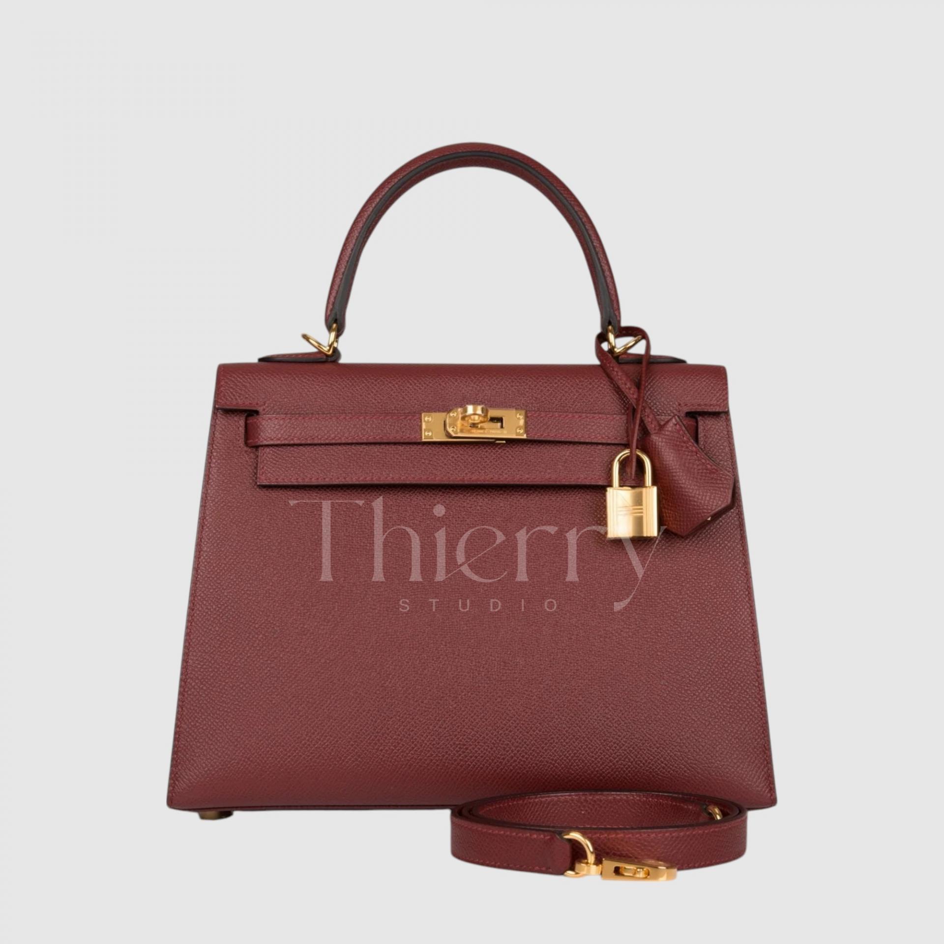
Rouge H
"Rouge H" is one of Hermès' most iconic and timeless colors, a deep and refined reddish-brown that has been used since 1925.
With a wine-toned red infused with subtle brown undertones, it can appear almost brown under dim lighting, exuding a classic and sophisticated charm.
True to its name, inspired by the Hermès initial "H," this shade symbolizes heritage and elegance. When paired with gold hardware, its warm, vintage appeal becomes even more striking, making it an exceptionally charming and distinguished color choice.
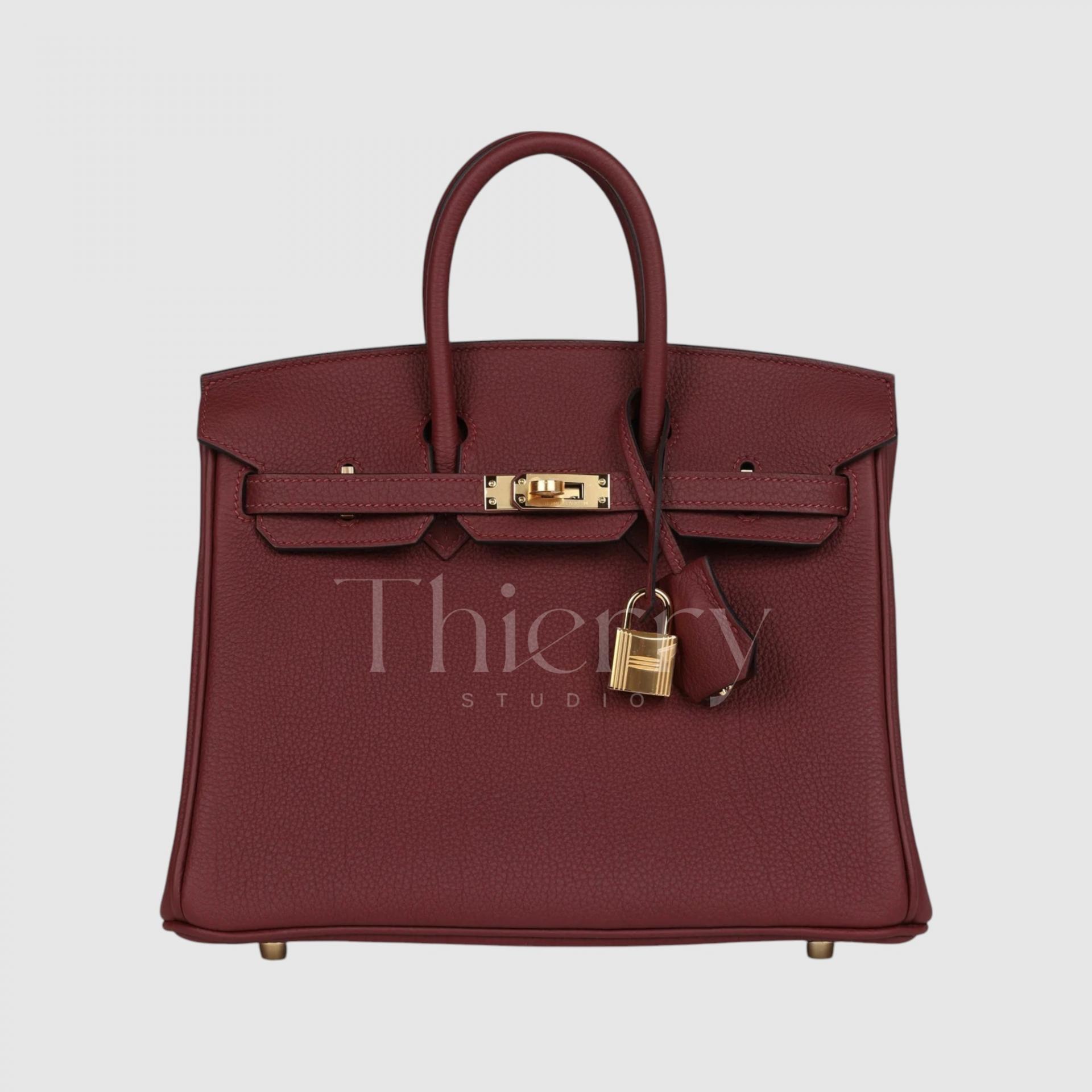
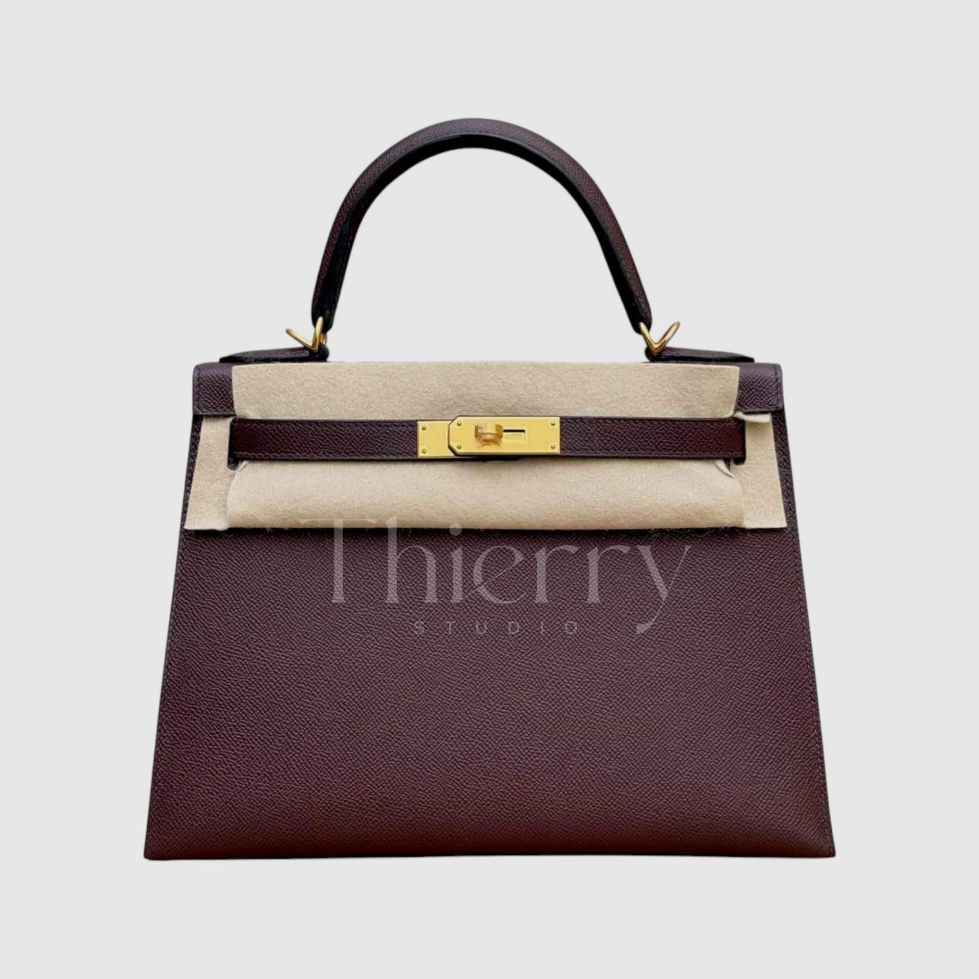
Bordeaux
"Bordeaux" is a deep wine red, inspired by the rich tones of Bordeaux wine.
While similar to Rouge H, Bordeaux leans more toward red-brown rather than purple, creating a refined and luxurious feel.
Both Rouge H and Bordeaux are dark and weighty enough to serve as sophisticated alternatives to black, making them perfect for elegant, understated styling. They work beautifully as color accents against monochrome coats in fall and winter, adding depth without being overpowering. ✨
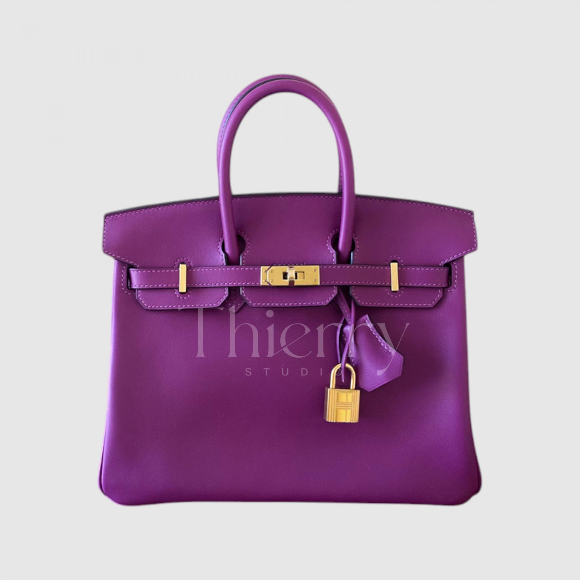
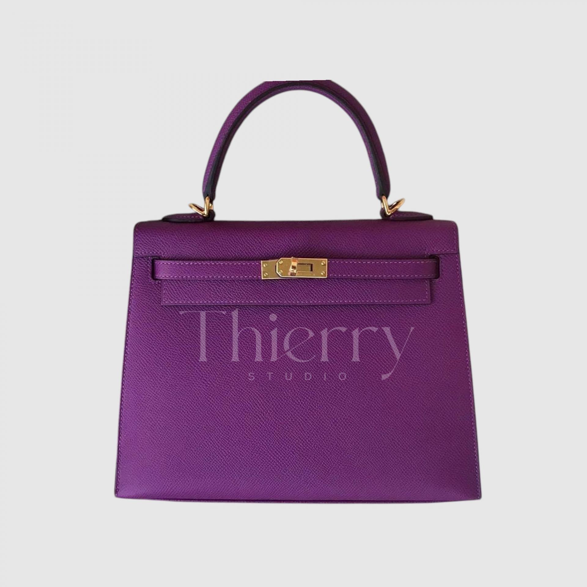
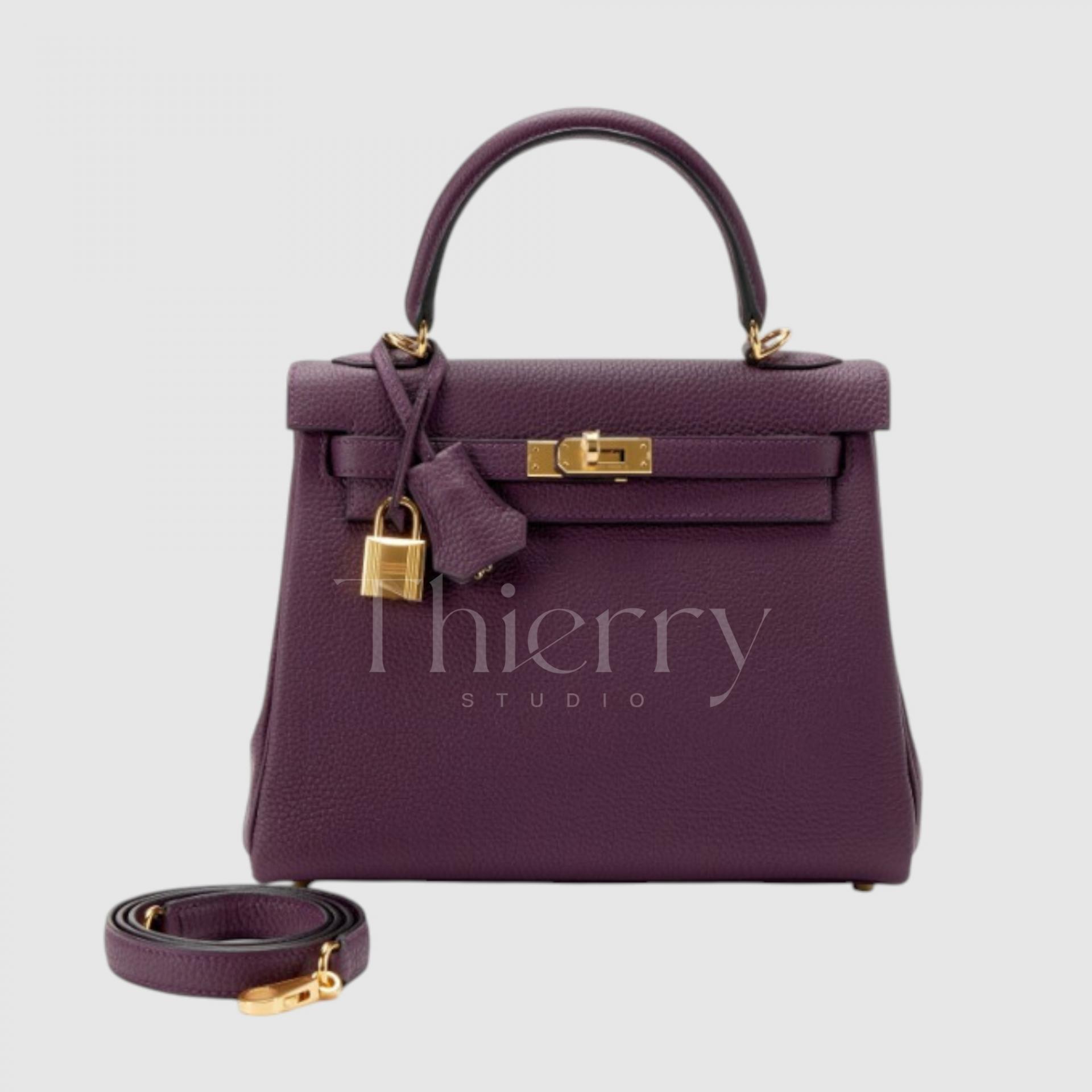
Anemone
"Anemone," introduced in 2014, is a rich purple reminiscent of eggplant flowers and skin.
Often referred to as "eggplant purple," this shade blends deep purple with a hint of red, making it one of the brighter and more vivid purples in the Hermès lineup.
Among Hermès' purple tones, Anemone is one of the most famous and sought-after colors. Under sunlight, its radiant violet hue truly comes to life, making it a fantastic choice for a bold yet not overly dark statement piece.
It works beautifully as a striking contrast against an all-black outfit or as a pop of personality when paired with a crisp white shirt and classic blue jeans.
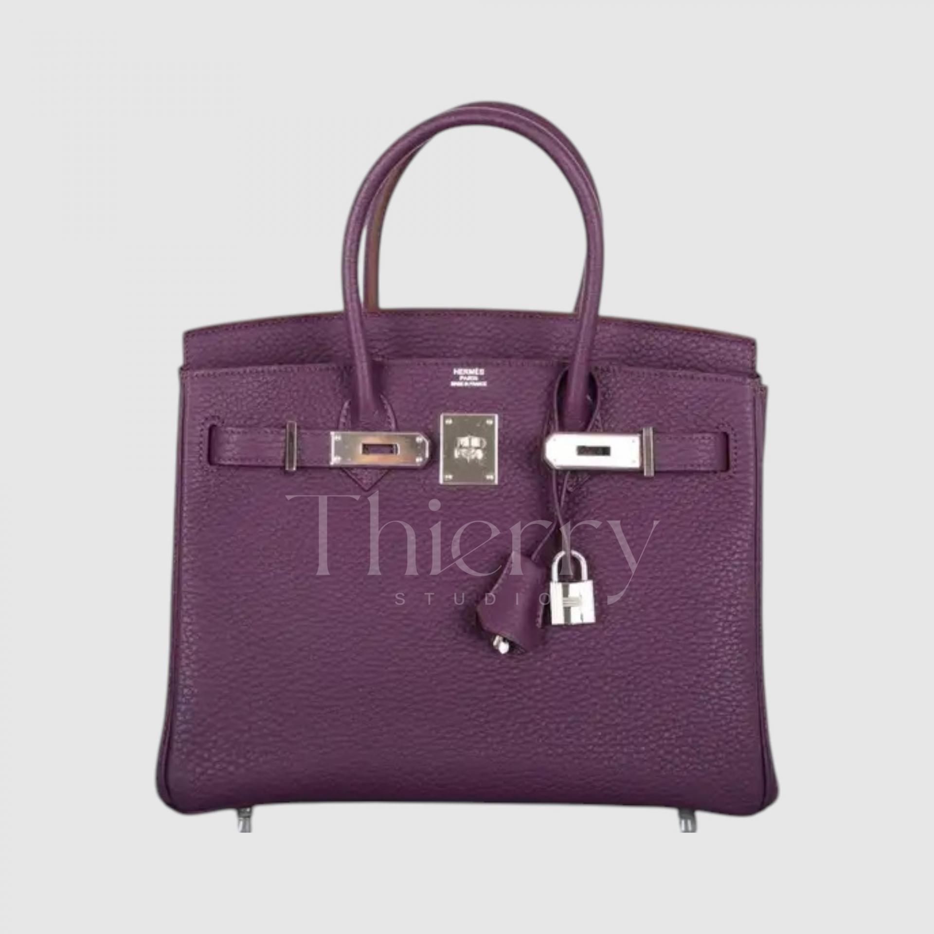
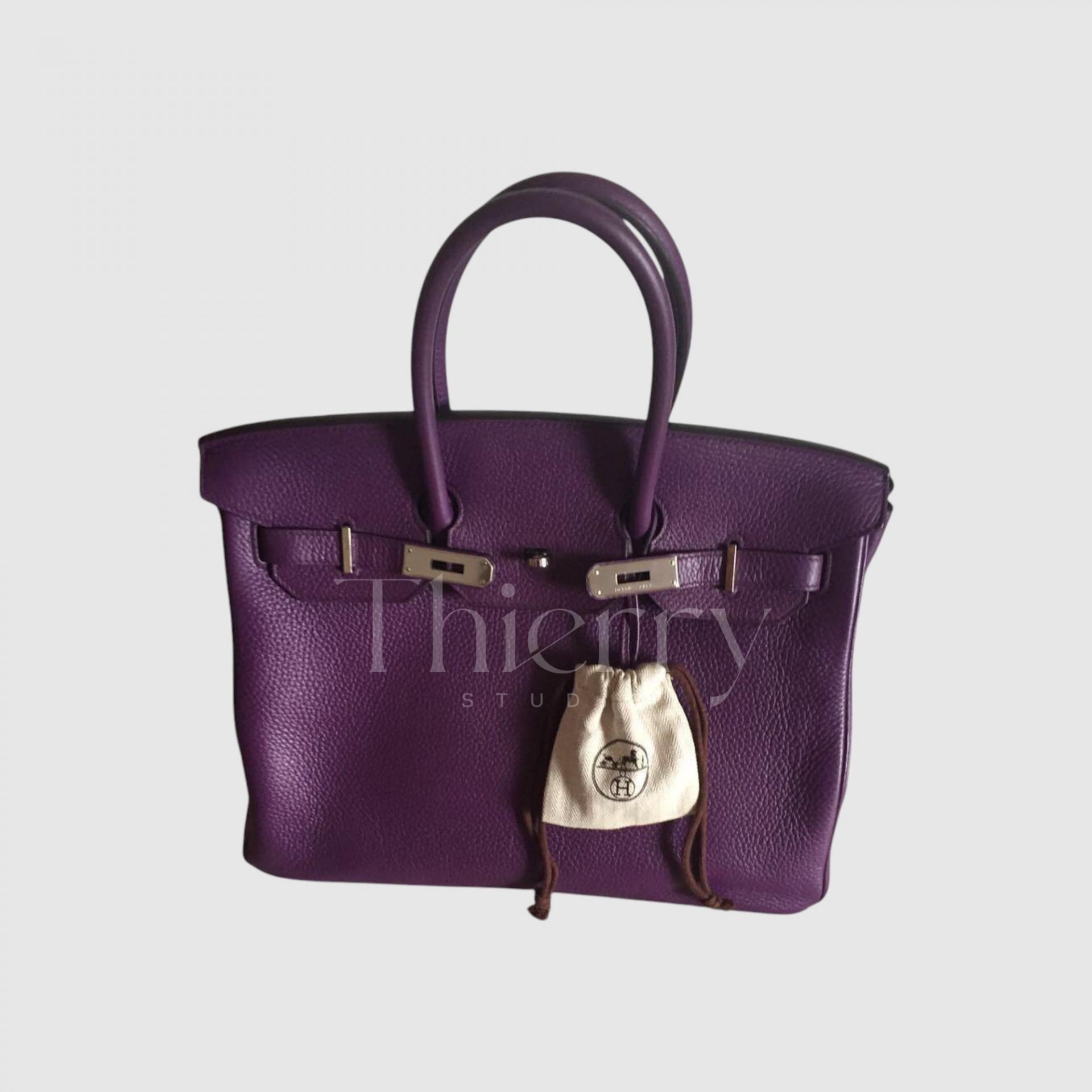
Cassis
"Cassis," introduced in 2011, takes its name from blackcurrants, reflecting its deep and mysterious purple hue.
With its rich, jewel-toned amethyst-like elegance, Cassis is a darker and cooler-toned alternative to Anemone, exuding a refined and enigmatic allure.
So deep in tone that it can sometimes appear almost black or navy from a distance, Cassis is a popular choice for those seeking a unique yet sophisticated dark-colored bag.
When paired with Hermès' classic gold or silver hardware, it enhances its luxurious and mystical charm, making it an exceptionally captivating shade.
-
Rouge H and Bordeaux, as traditional wine-toned shades, pair beautifully with formal suits and classic tweed looks, enhancing their timeless elegance. They also create a warm, harmonious balance when styled with brown-toned outfits.
-
Anemone and Cassis, with their vibrant and luxurious purple hues, make stunning statement pieces against simple outfits. For a bold and sophisticated contrast, pair them with yellow-toned accessories, creating a striking and fashion-forward look. 💜
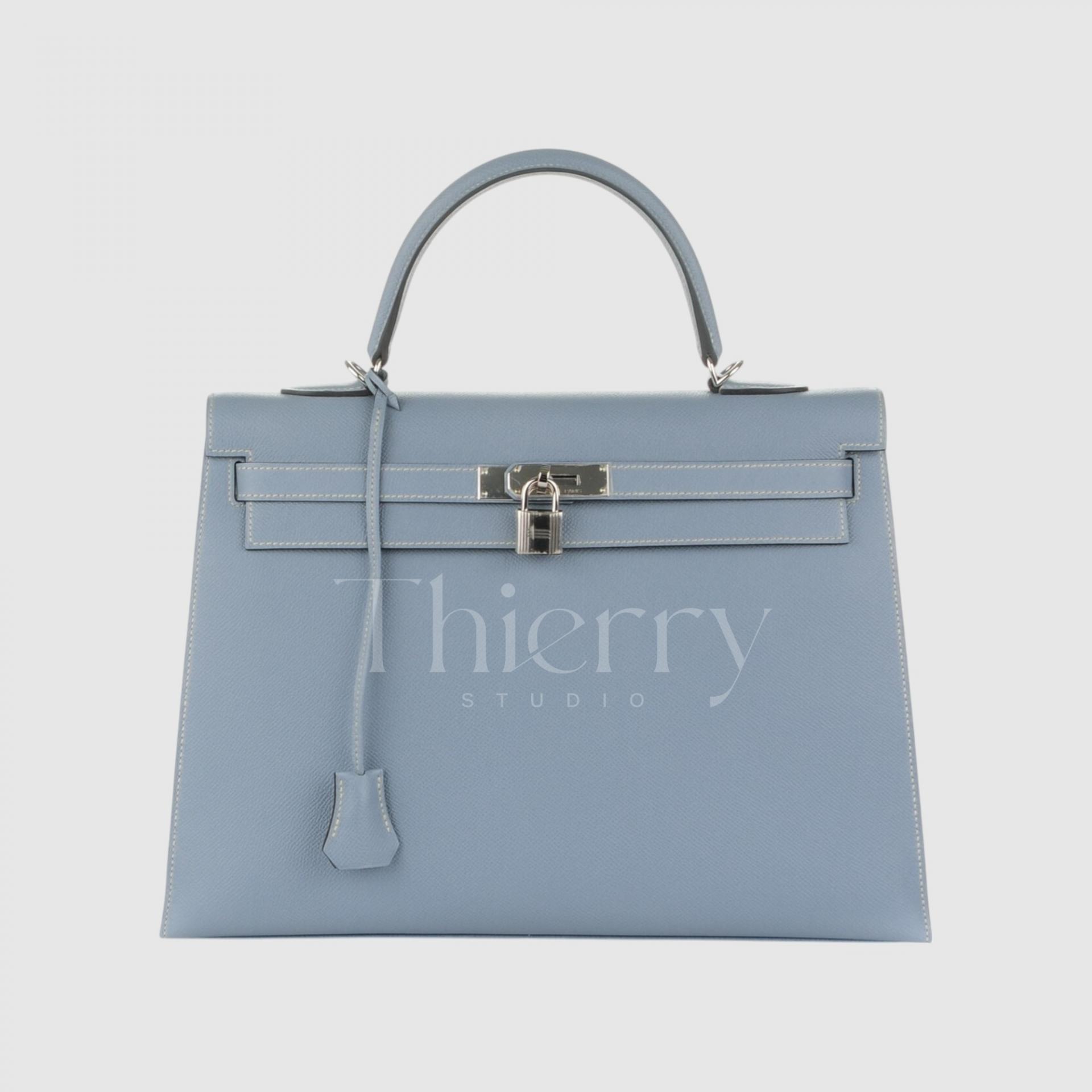
Bleu Lin
"Bleu Lin," named after linen, is a soft, muted blue with a subtle hint of gray.
Much like linen fabric, it has a gentle and understated blue tone, making it a refined and versatile pastel shade. Unlike overly bright or vibrant blues, Bleu Lin carries a muted depth, allowing it to blend effortlessly with various styles.
Its cool-toned, grayish-blue hue pairs beautifully in a tone-on-tone combination with white or beige for a fresh, airy look. It also complements denim effortlessly, creating a harmonious and natural aesthetic. 💙✨
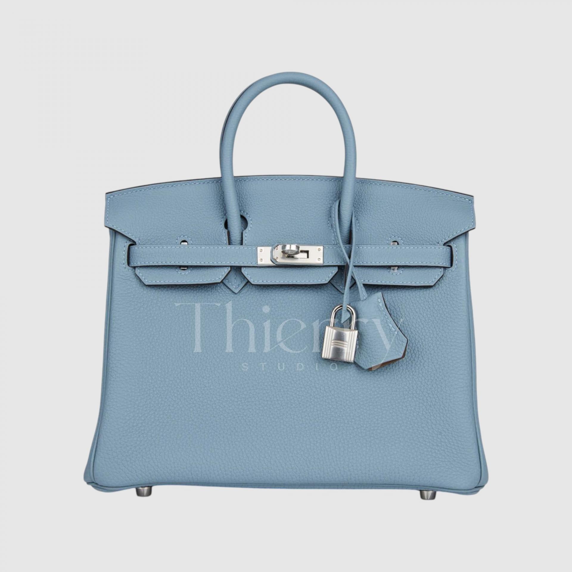
Bleu Ciel
"Bleu Ciel," meaning "sky" in French, is a bright and refreshing sky blue.
Compared to Bleu Lin, it has higher saturation and a purer blue tone, free from yellow or gray undertones, giving it a crisp and vibrant feel.
Bleu Ciel bag adds a fresh touch to navy or gray suits and enhances floral dress outfits with an airy, refreshing charm.
Personally, Bleu Ciel shines best in larger Birkin sizes, such as 30cm and above. It's famously loved by Victoria Beckham, who adored her Bleu Ciel Birkin 35. 💙✨
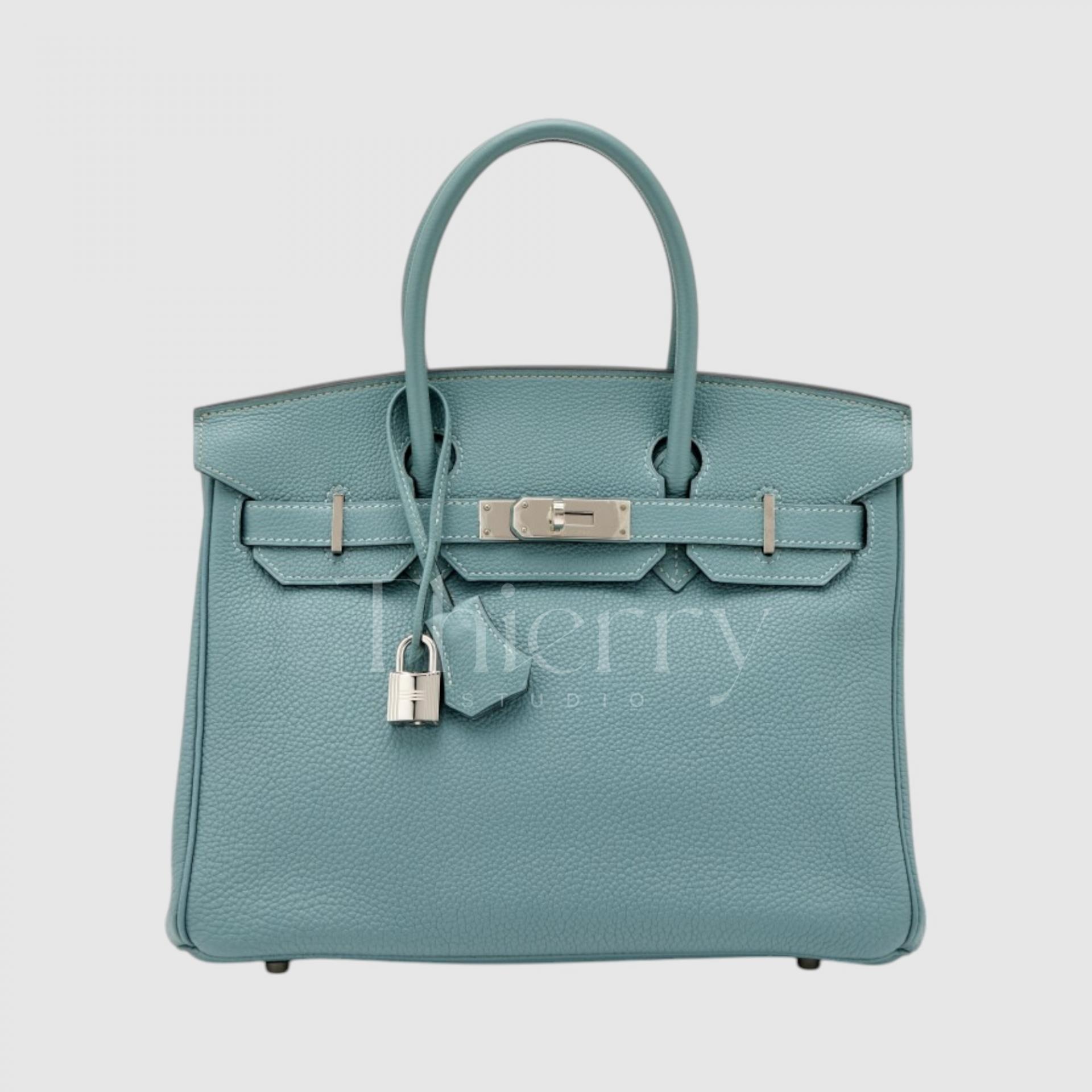


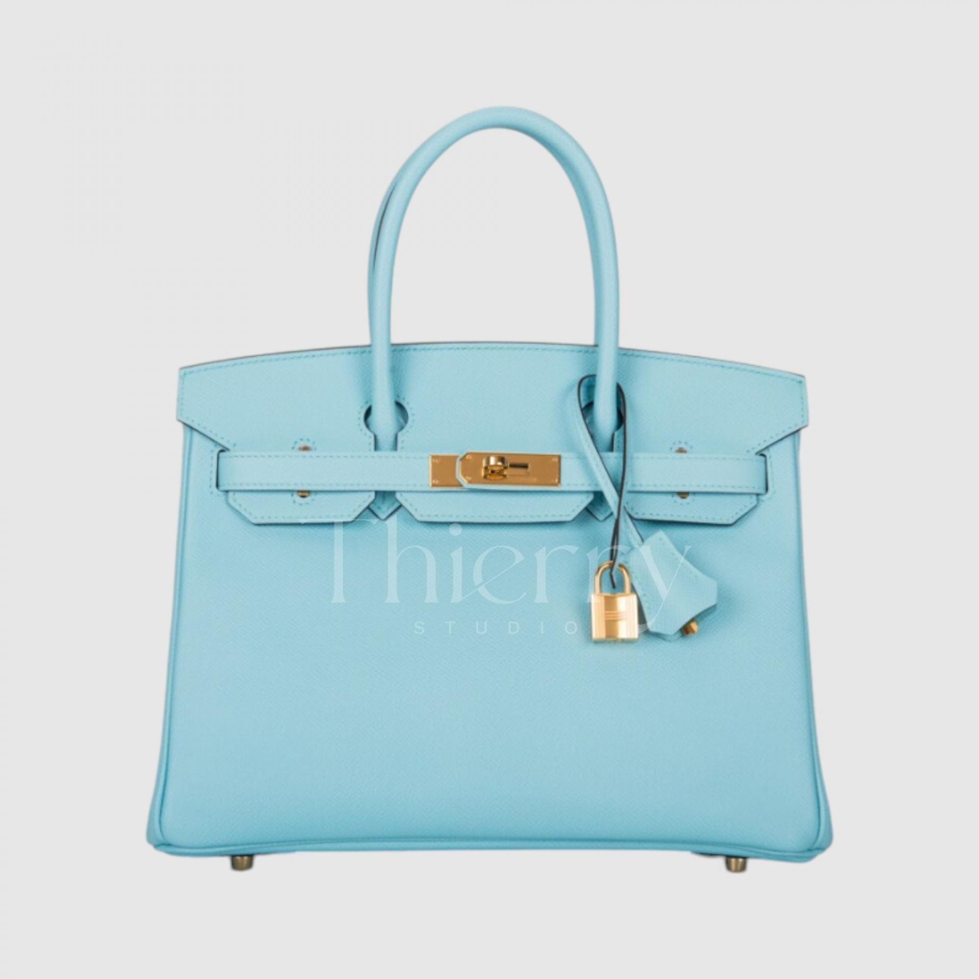
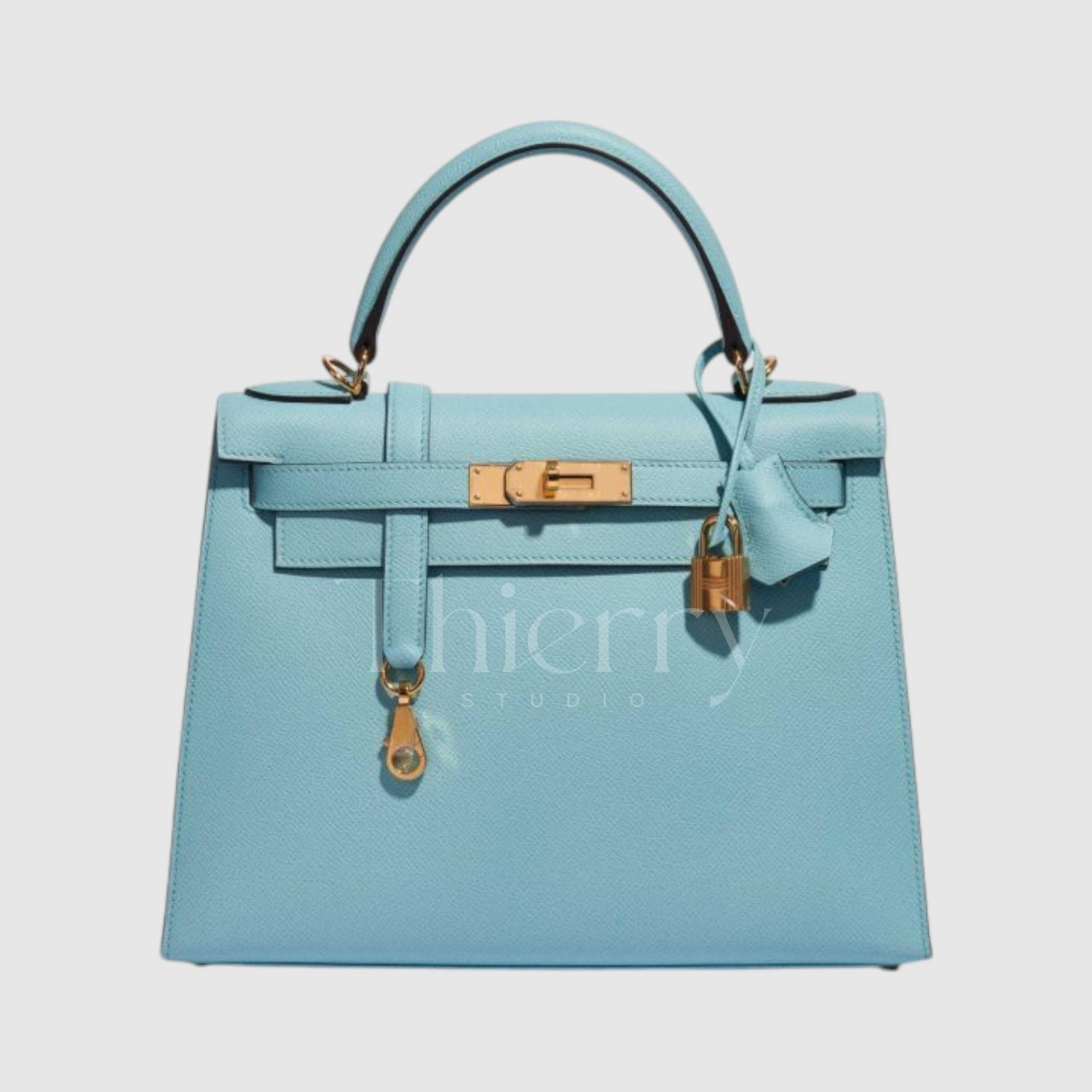
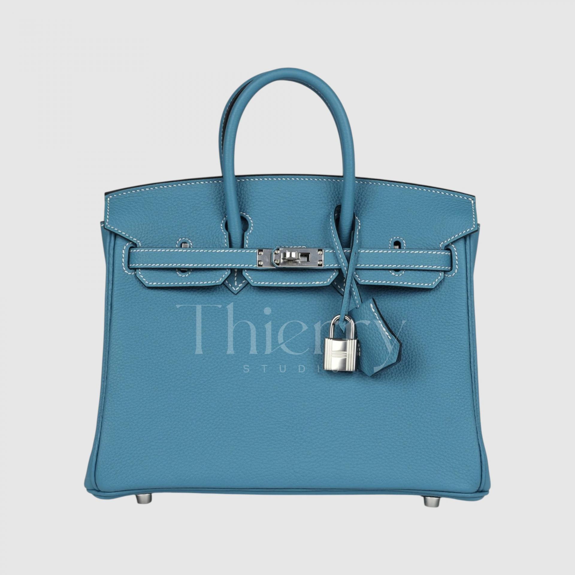
Bleu Atoll
"Bleu Atoll," introduced in 2015, is a striking turquoise blue reminiscent of the crystal-clear waters of a South Pacific coral island.
With a hint of green mixed into its vivid blue tone, this bright and bold color instantly catches the eye. 😊
A Bleu Atoll bag pairs beautifully with white linen outfits and resort wear during summer, creating a fresh and breezy look. It also adds a lively, playful touch to casual everyday outfits. 🌊✨
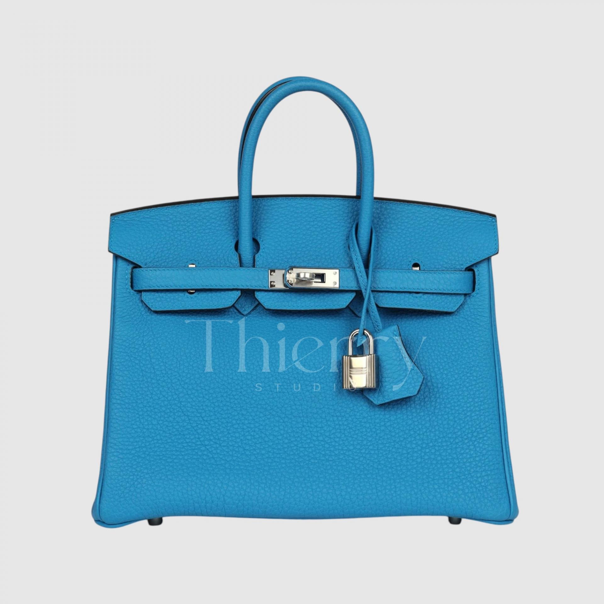
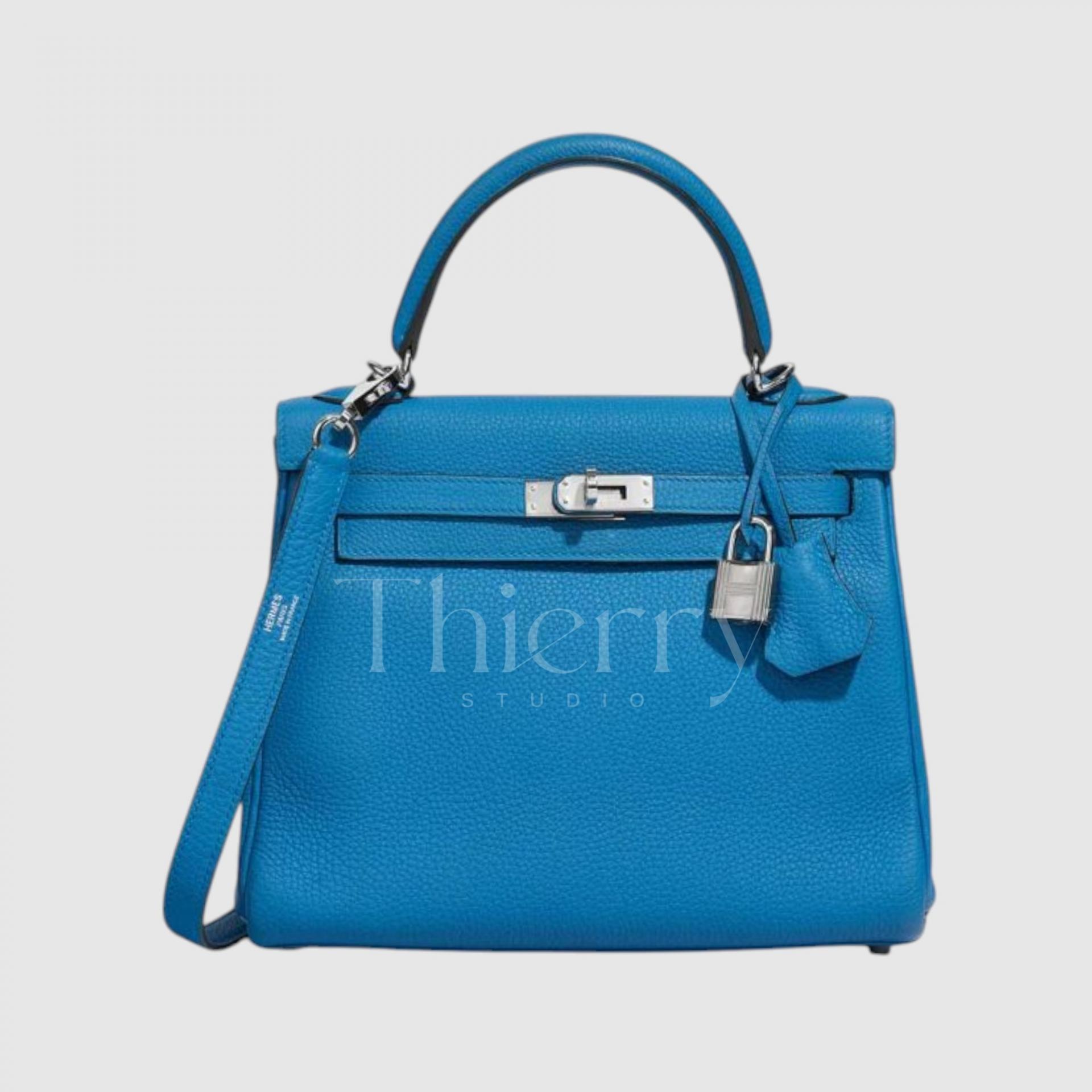
Bleu Zanzibar
"Bleu Zanzibar" is inspired by the stunning waters of Zanzibar, Tanzania, featuring a rich and vibrant turquoise-blue hue.
Slightly deeper and bluer than Bleu Atoll, it can be best described as a bright emerald blue, with the faintest hint of green adding to its exotic and eye-catching appeal.
Under bright sunlight, it appears vivid and radiant, while in indoor lighting, it takes on a more subdued and sophisticated tone, making it a versatile statement color that works beautifully year-round.
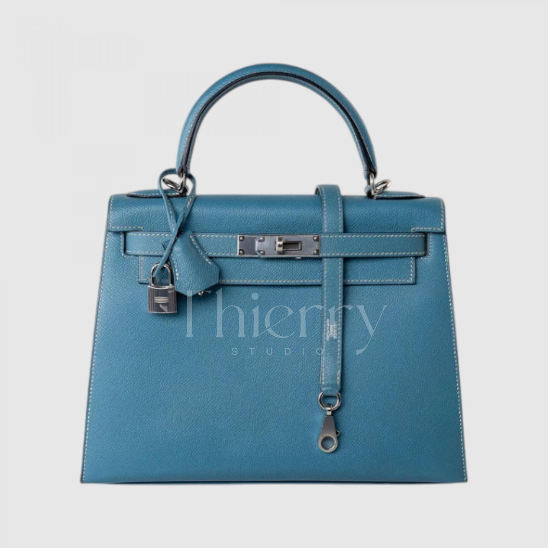
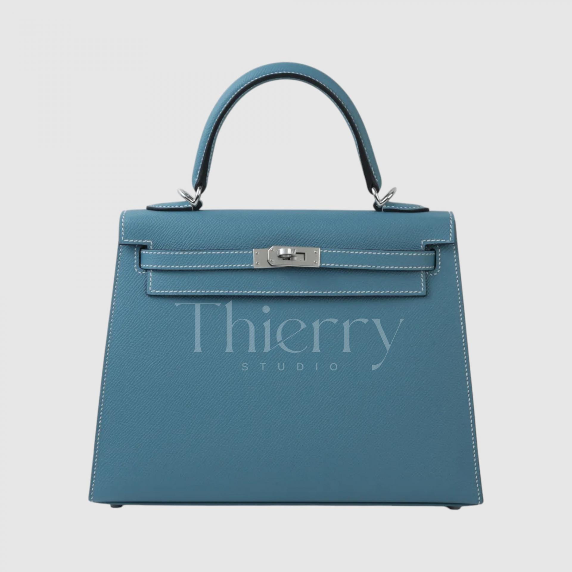
Bleu Jean
The ultimate classic in the blue family—Bleu Jean.
True to its name, Bleu Jean resembles vintage denim, featuring a medium-tone, slightly faded dusty blue. With the perfect balance of gray and blue, it’s a subtle, versatile shade that pairs effortlessly with any outfit.
This color has a casual and effortless charm, making it the perfect choice for a laid-back yet stylish look—just throw it on with a T-shirt and jeans, and you’re instantly chic. It also harmonizes beautifully with white and tan tones, making it a timeless, all-season everyday bag color. 👖✨
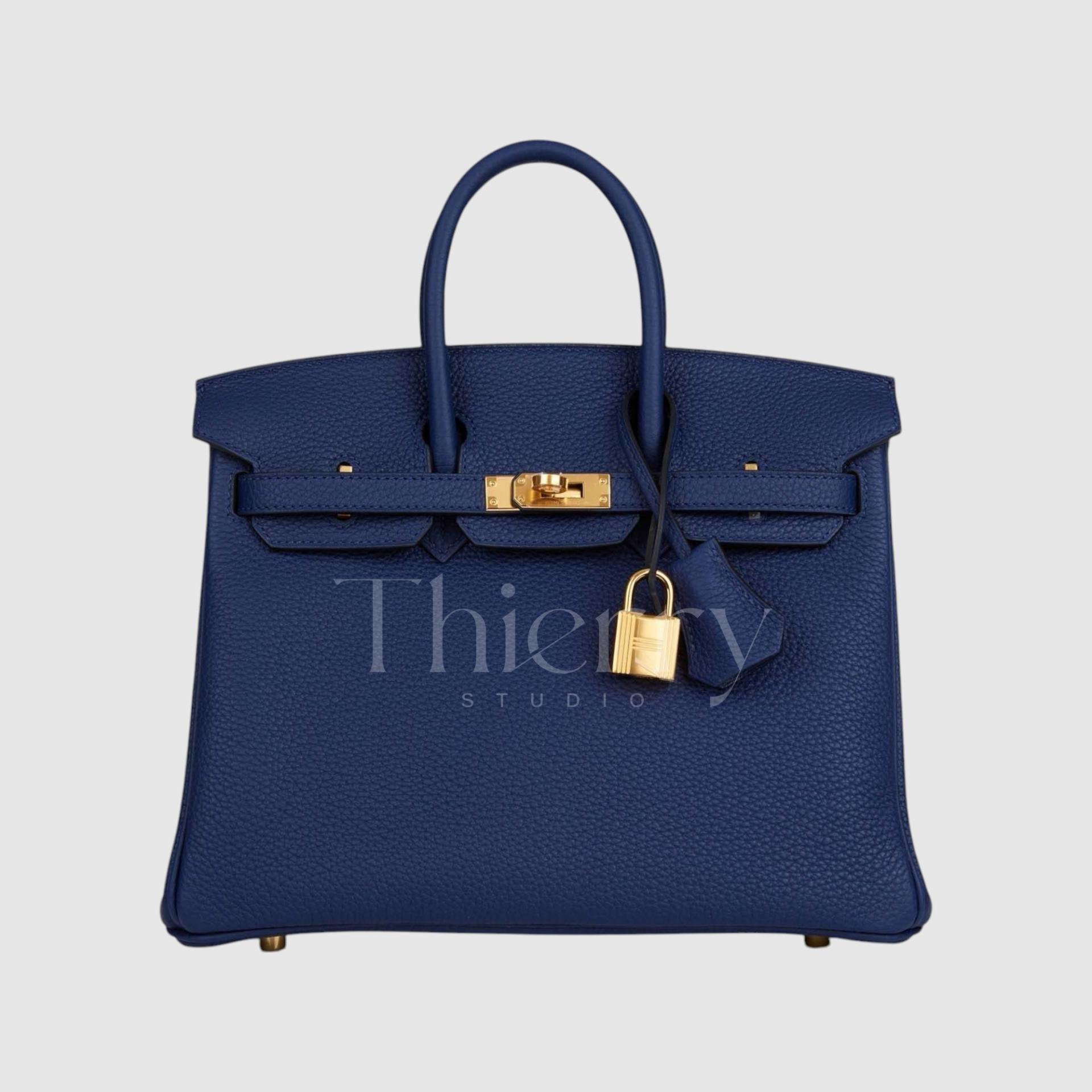
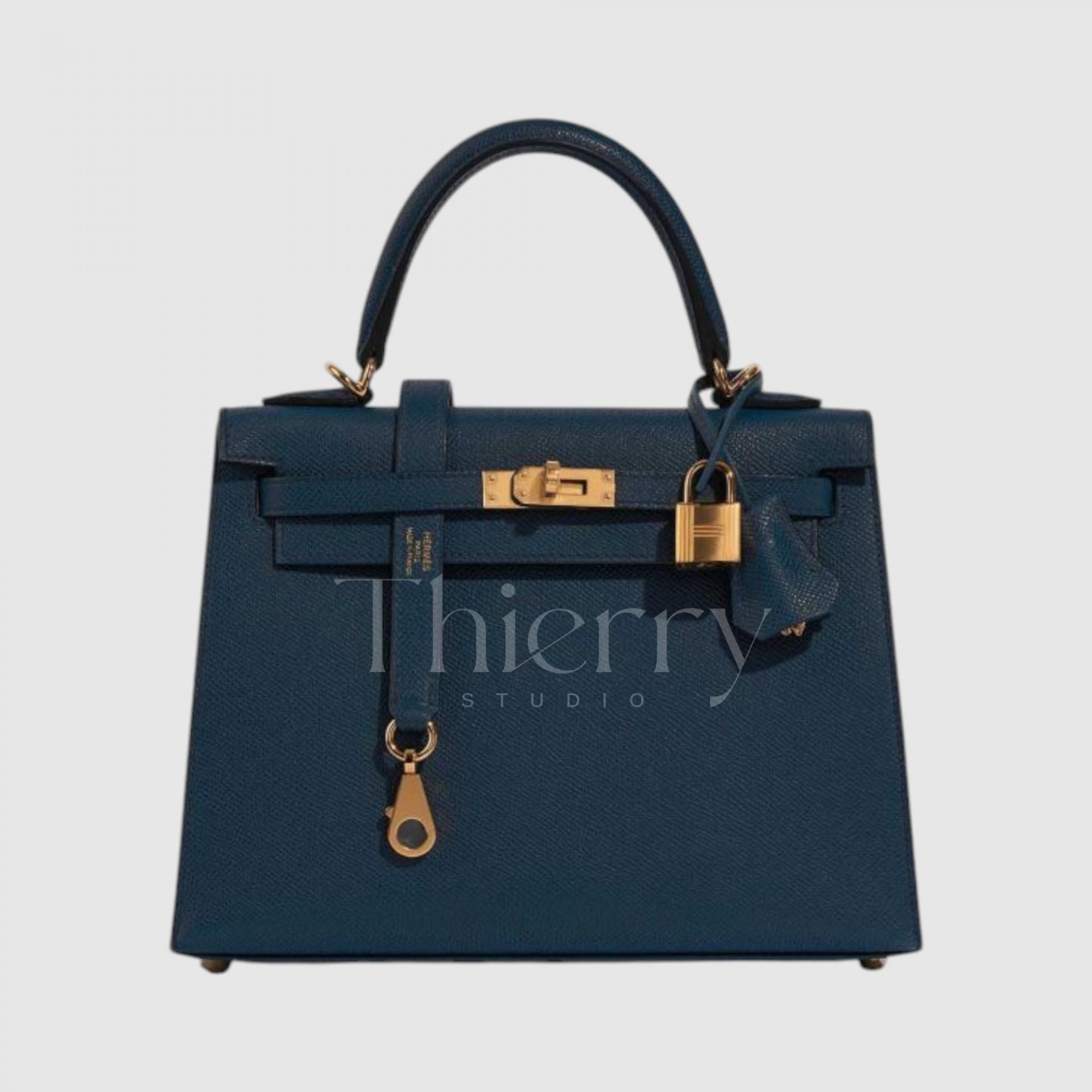
Bleu Saphir
"Bleu Saphir," named after the sapphire gemstone, is a deep, luxurious blue infused with subtle violet undertones.
This rich navy blue, with its hint of purple, exudes elegance and sophistication, and in person, it has a luminous sheen reminiscent of a night sky.
A Bleu Saphir bag pairs gracefully with evening dresses and formal attire, adding a refined touch to special occasions. For everyday wear, it serves as a vibrant alternative to black, complementing burgundy, deep green, and other rich autumnal tones to create a sophisticated seasonal look. 💙✨
Bleu de Prusse
"Bleu de Prusse" is a historic Prussian blue shade, known for its deep and rich navy tone.
This profound, dark blue carries a timeless elegance, making it a sophisticated and versatile choice for any occasion.
Though it appears cool, it is not purely cold-toned—it carries subtle hints of teal and gray, creating a complex and layered deep blue reminiscent of the Baltic Sea’s depths.
Despite being a dark blue, Bleu de Prusse pairs surprisingly well with autumn foliage tones and cozy winter knits, as it beautifully balances both warmth and coolness. This makes it a versatile dark color that transcends seasons, offering timeless elegance year-round.
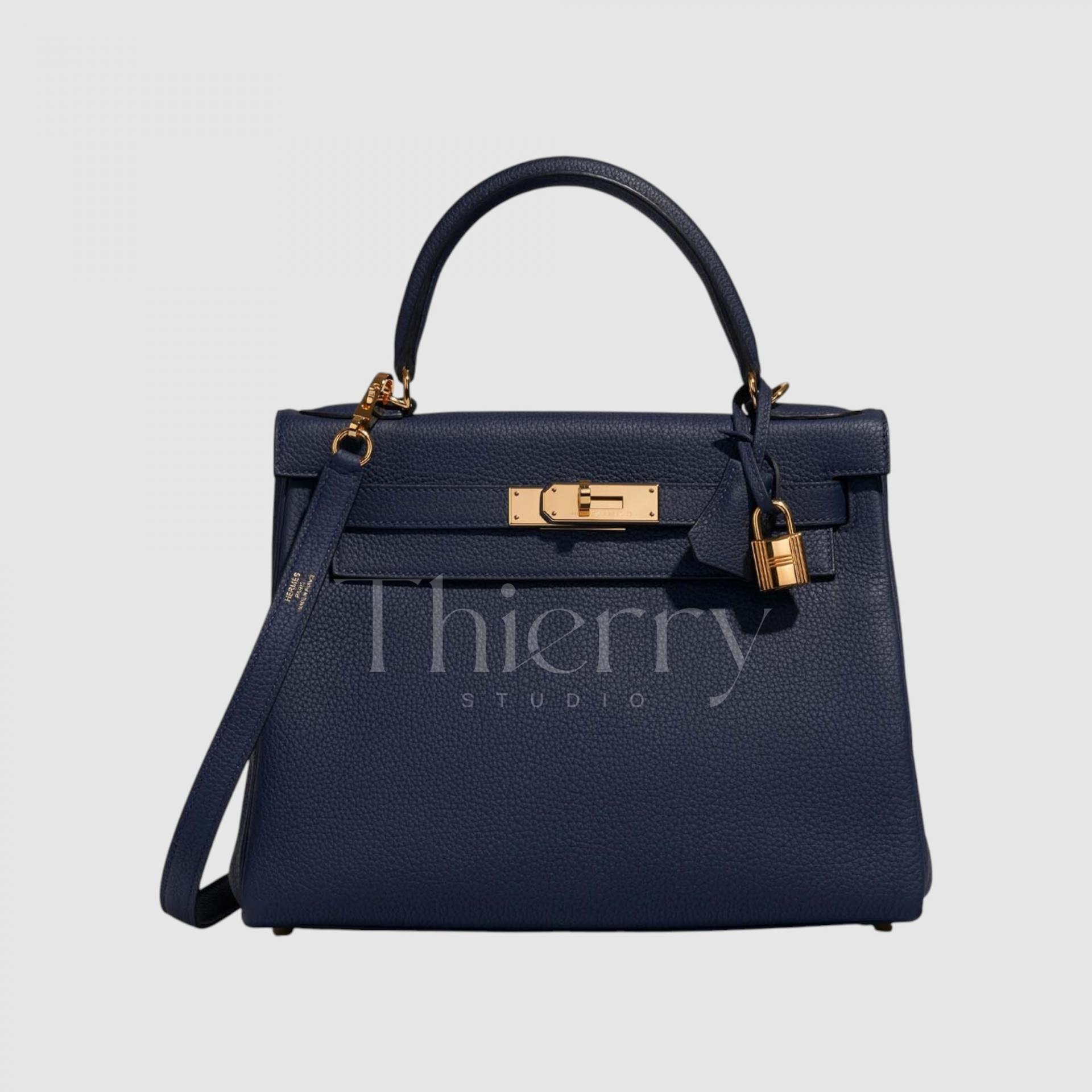
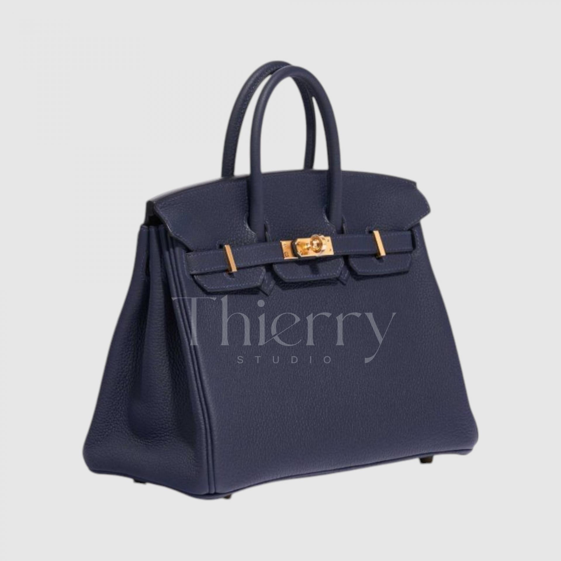
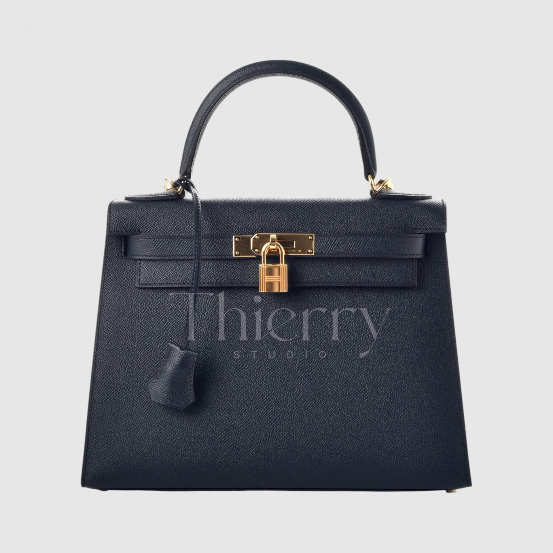
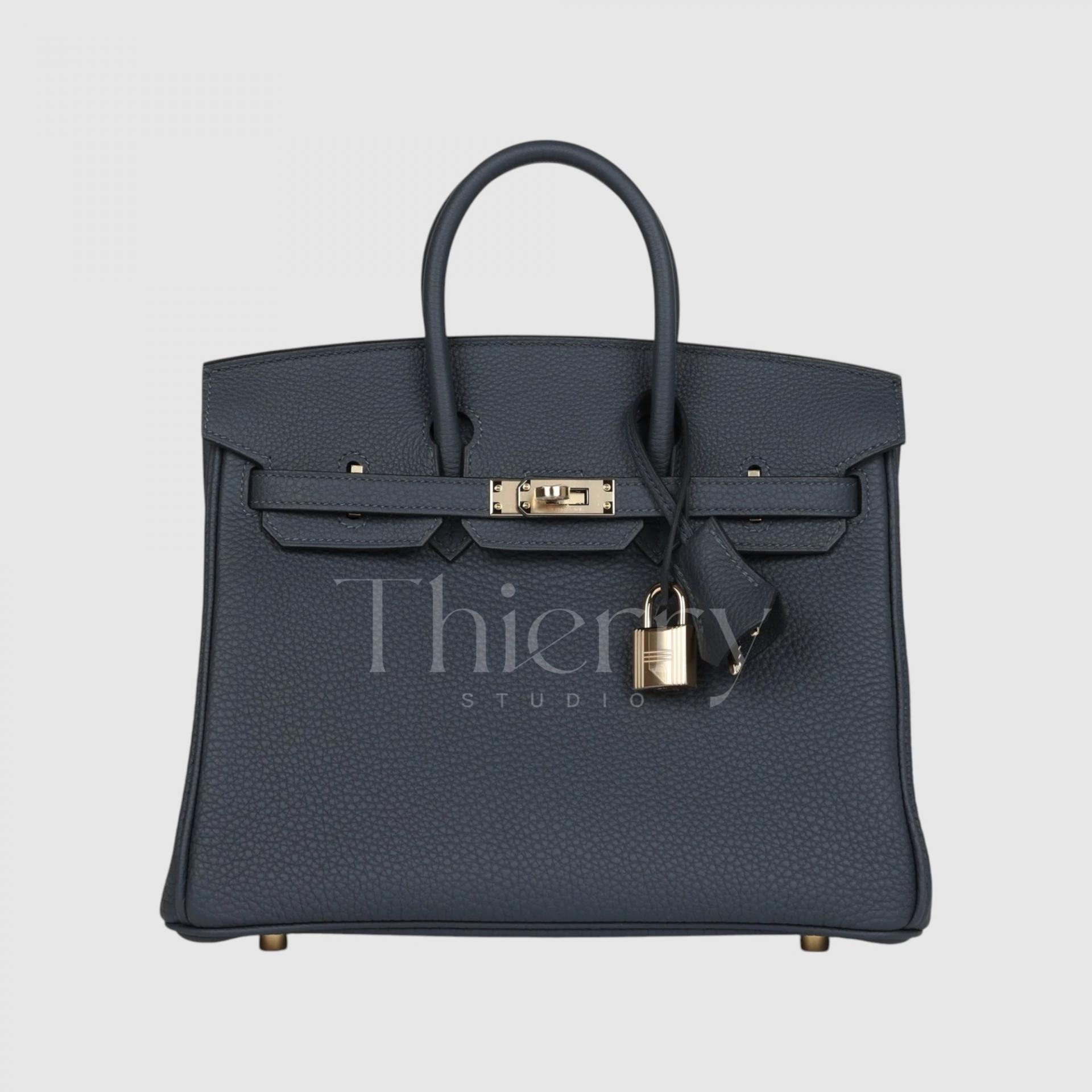
Bleu Nuit
"Bleu Nuit," meaning "night" in French, is a deep, midnight navy reminiscent of the night sky. 🌌
Nearly black in its depth, this intensely dark navy carries subtle hints of purple and black, creating an air of mystery and classic elegance.
As one of the most refined neutral shades, Bleu Nuit adds sophistication and gravitas to formal attire, making it a popular choice for suits, evening wear, and official occasions. It appears especially polished under evening lighting, enhancing its luxurious appeal.
For those who find black too predictable but don’t want an overly bold color.
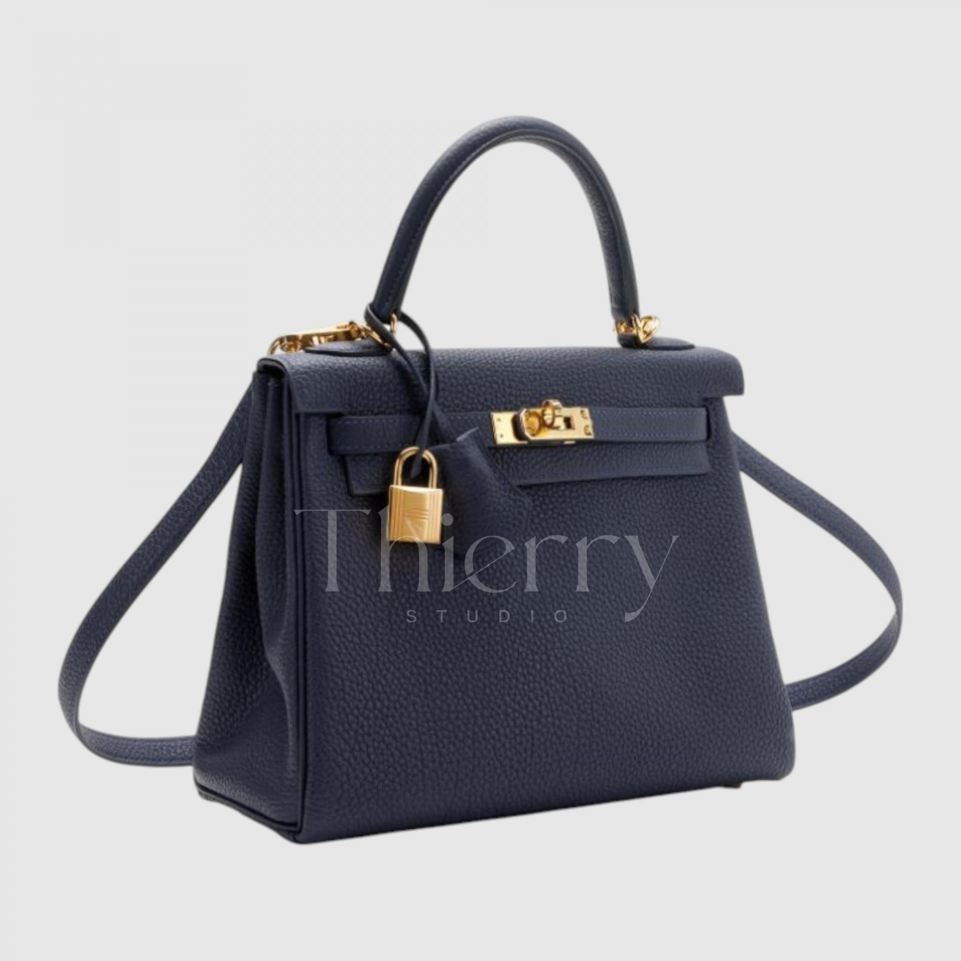
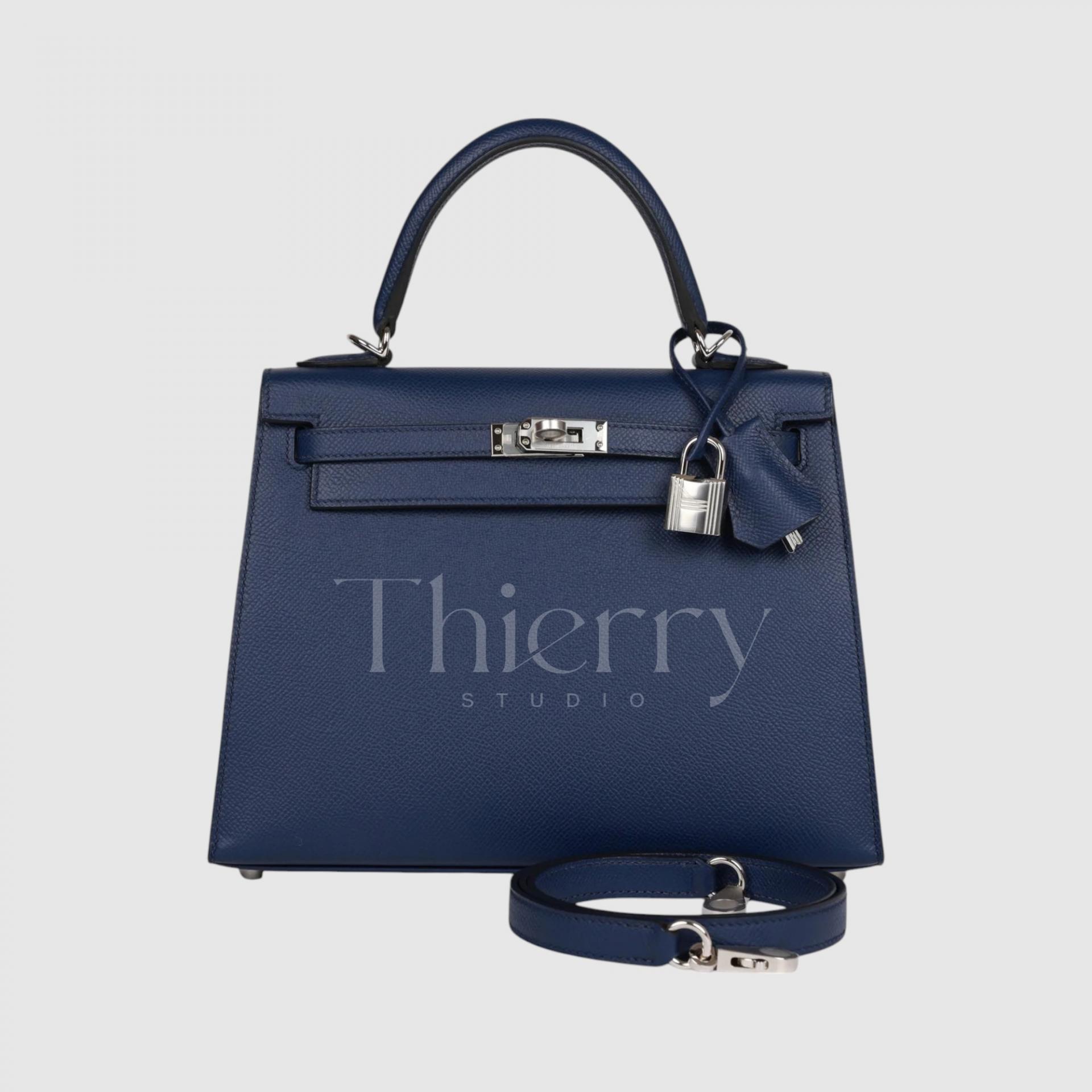
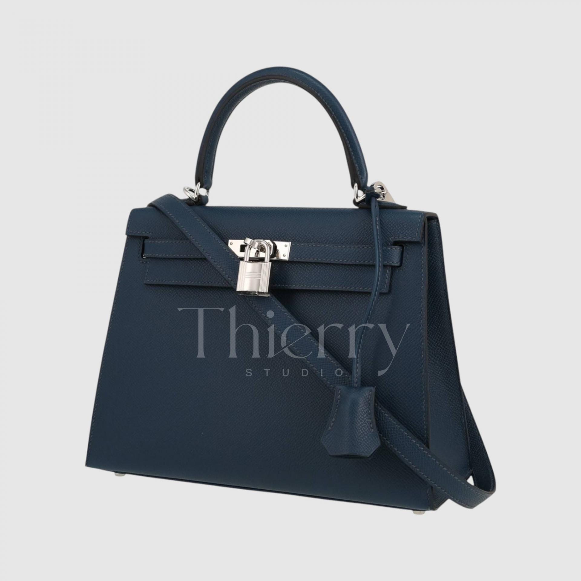
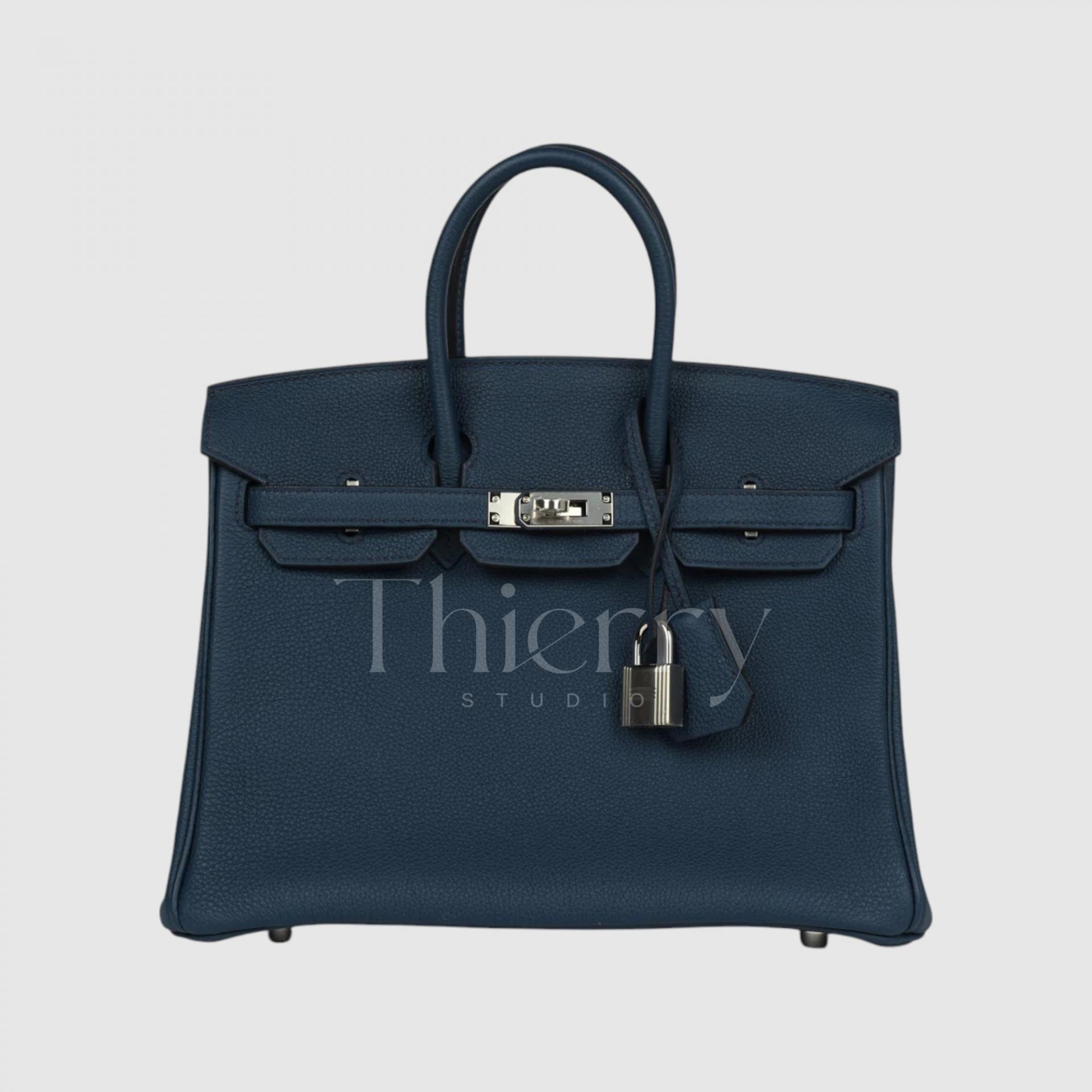
Bleu Indigo
"Bleu Indigo," like the indigo dye it’s named after, is a deep and rich navy blue—one of Hermès' timeless staple colors.
Slightly bluer than Bleu Nuit, this classic navy shade varies subtly in depth depending on the leather type, adding to its charm.
A Bleu Indigo bag lends a sense of stability and sophistication to business casual and polished looks. Its universal appeal makes it a popular unisex choice, often selected as a couple’s matching item. ✨
As seen, the blue family offers a wide range of versatility, from casual to formal, depending on brightness and tone.
-
Lighter shades like Bleu Lin and Bleu Ciel are perfect for fresh spring-summer casual looks or resort wear.
-
Vibrant hues like Bleu Atoll and Bleu Zanzibar make bold statement pieces, ideal for travel and vacation outfits.
-
Mid-tone Bleu Jean is an effortlessly stylish everyday color that blends seamlessly with various outfits.
-
Deeper shades like Bleu Saphir, Bleu de Prusse, Bleu Nuit, and Bleu Indigo fall into the sophisticated dark navy category, making them excellent choices for formal attire, adding elegance and depth. 💙✨
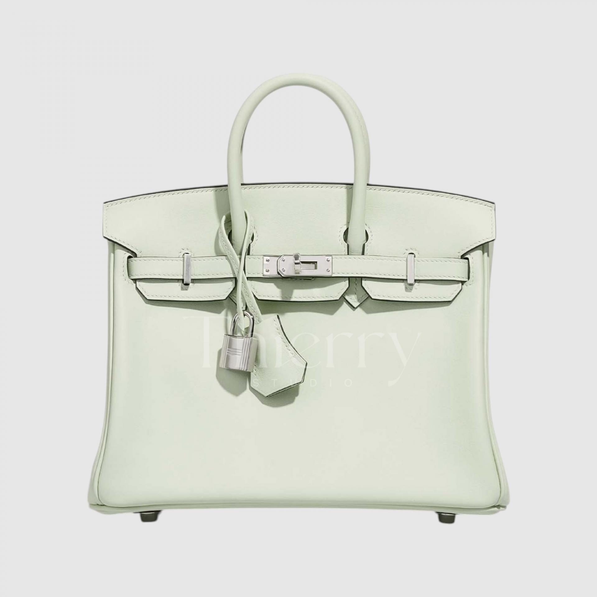
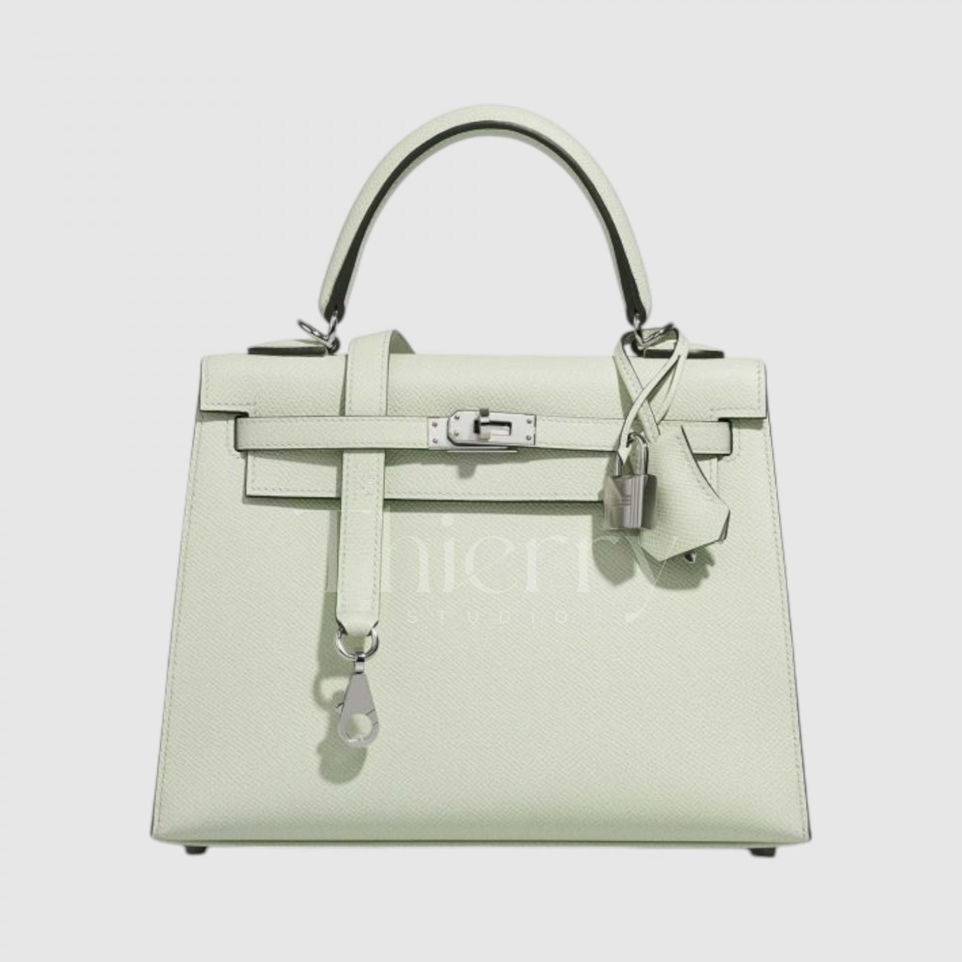
Vert Fizz
"Fizz," like the sparkling cocktail it's named after, is a refreshingly bright and zesty pale green.
With a hint of mint, this soft pastel light green is the lightest shade in the pastel mint spectrum, offering a fresh yet delicate touch that subtly enhances any outfit.
It serves as a sophisticated pastel accent when paired with white or light gray ensembles and brings a playful, lively charm to spring and summer looks. 🍃✨
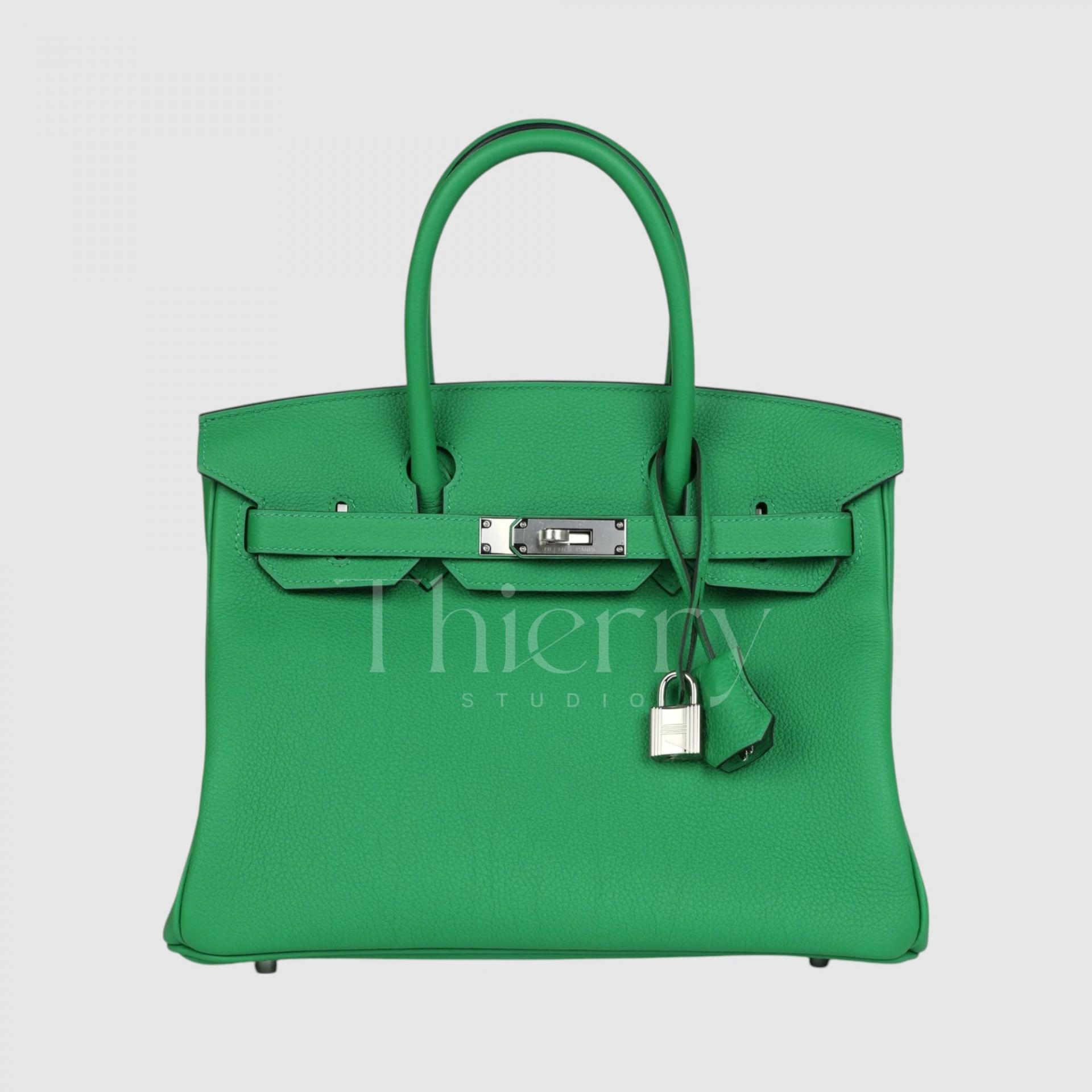
Bamboo
"Bamboo," as its name suggests, is a vibrant grass-green reminiscent of fresh bamboo leaves. 🌿
Among Hermès greens, Bamboo is one of the most vivid and eye-catching shades, with a high-saturation, almost fluorescent yellow-green hue. It's brighter than Vert Vertigo and carries a warm, sunny undertone, making it a bold statement color.
Thanks to its neon-like vibrancy, Bamboo shines as a pop of color in street fashion or monochrome casual looks, adding a trendy edge. It also brings a playful, energetic touch to summer color palettes.
Vert Vertigo
"Vert Vertigo," introduced around 2017, is a classic mid-tone green that strikes a perfect balance.
It sits between the eye-catching brightness of Bamboo and the deep emerald richness of Malachite, offering a muted yet lively green with a medium-level saturation.
As a refined green, Vert Vertigo pairs beautifully with green suits or khaki-toned coats, enhancing the overall color depth. It also adds a fresh, vibrant touch to casual outfits, such as a cream knit sweater and jeans, making it a versatile and stylish choice. 💚✨
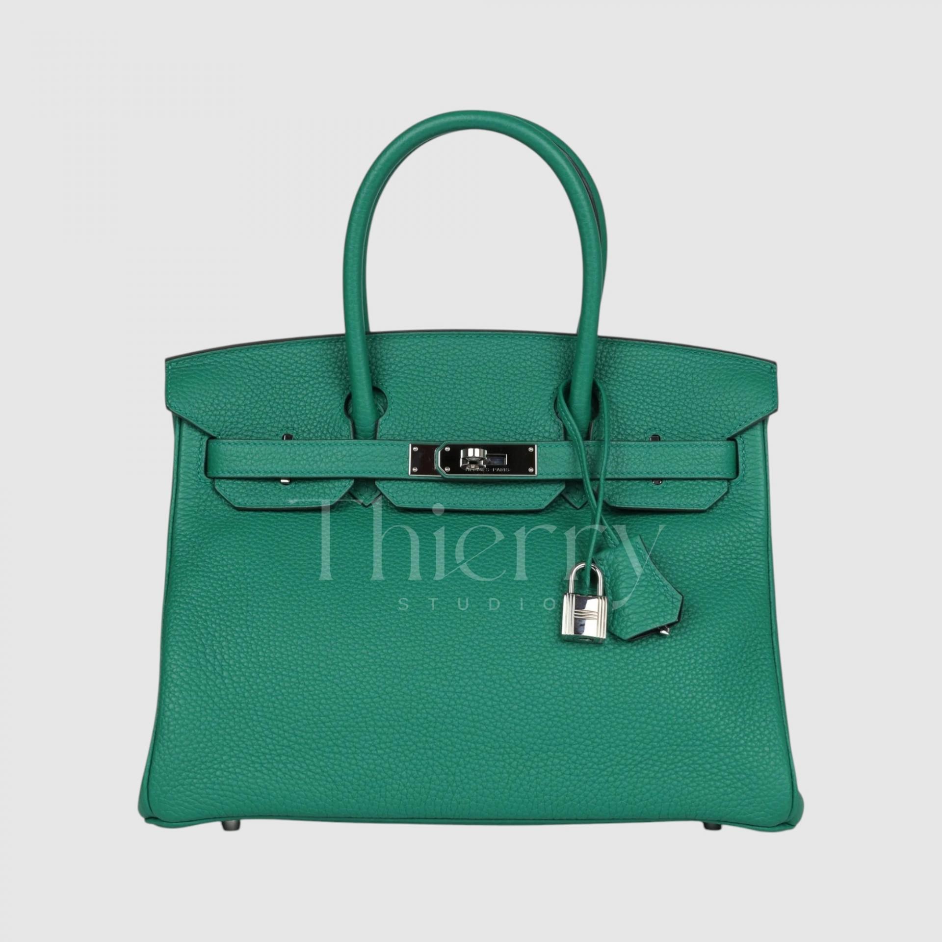
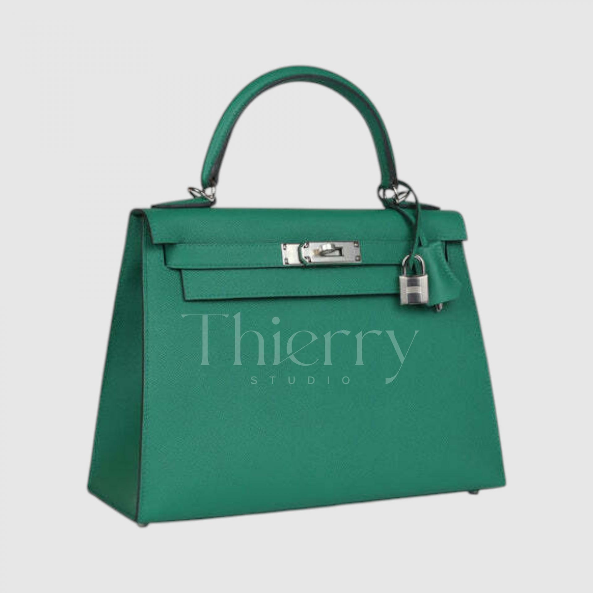
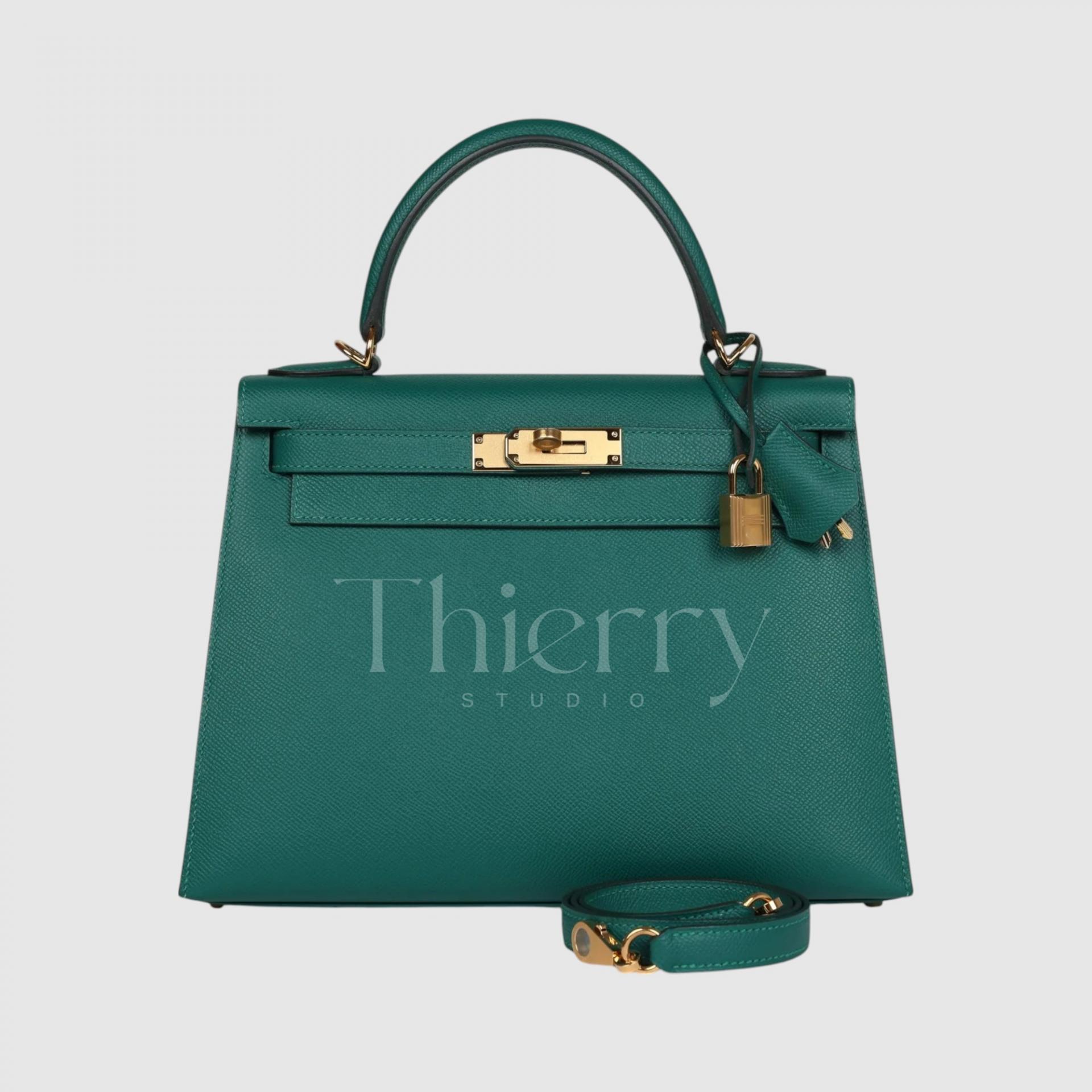
Malachite
"Malachite," named after the malachite gemstone, perfectly captures its rich emerald green hue. 💚✨
This deep yet vibrant green maintains both depth and saturation, making it one of the most luxurious and sought-after Hermès greens. Among the green family, Malachite stands out as the most popular shade.
Darker and more subdued than Vert Vertigo, it’s ideal for formal occasions, yet still retains the liveliness unique to green.
- For an elegant look, pair it with beige or brown outfits to enhance its sophistication.
- For a refined statement, style it with black or navy suits, adding an air of prestige.
Without a doubt, Malachite is the No.1 green in the Hermès lineup! 🍀💎
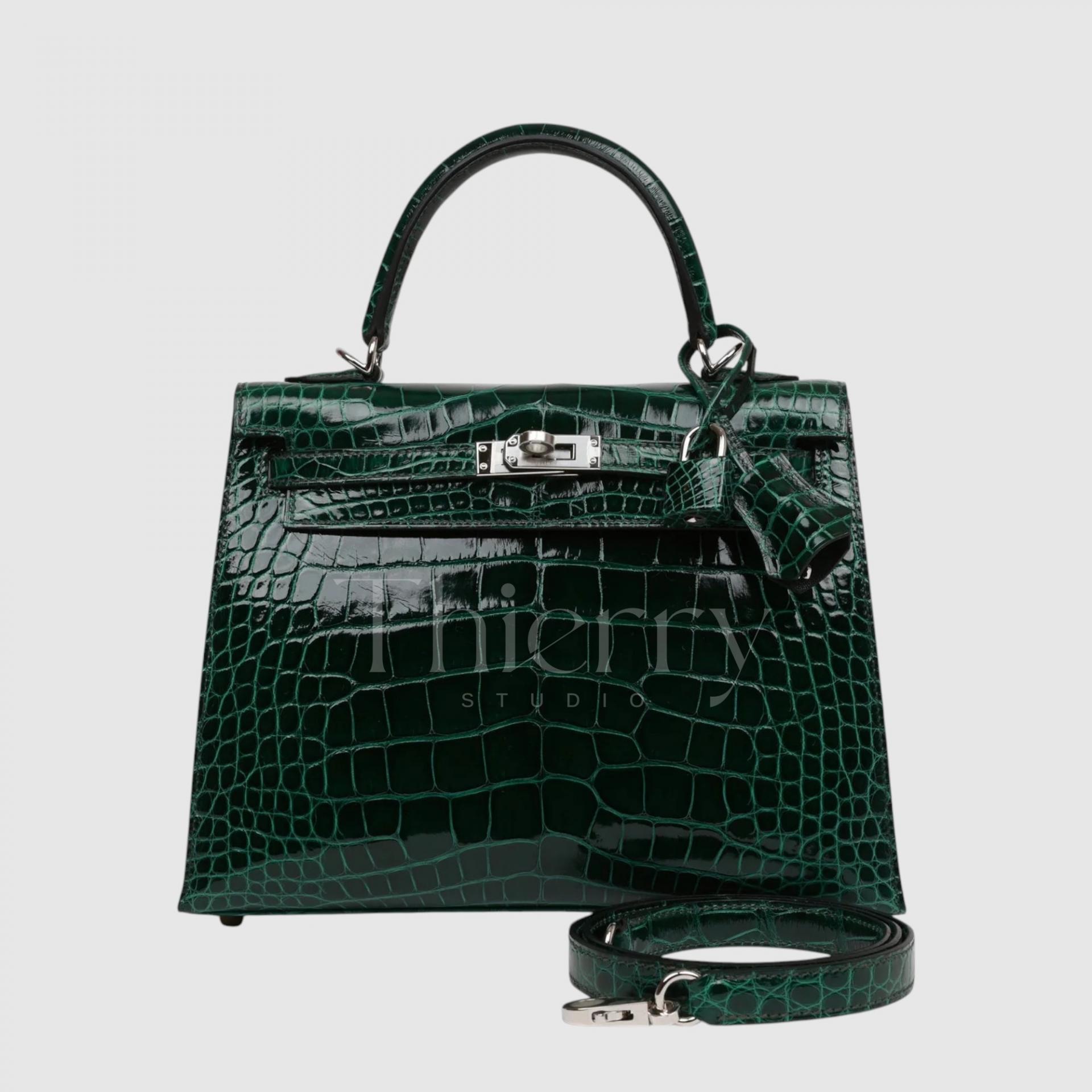
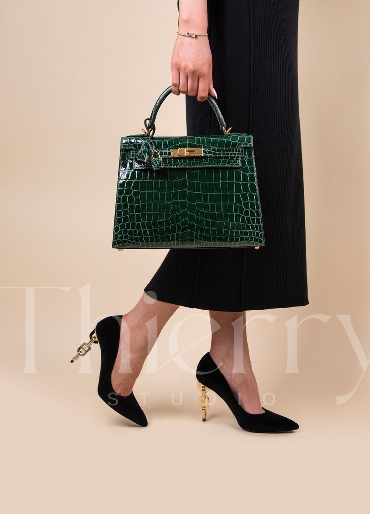
Vert Foncé
"Vert Foncé," meaning "dark green" in French, is a deep, forest-like green with a rich and subdued elegance. 🌲✨
Continuing the legacy of classic dark greens like Vert Anglais (British Green), this shade exudes a sophisticated and composed aura. Its understated yet refined nature makes it an excellent choice for formal attire and tone-on-tone styling, adding a polished touch.
Unlike other greens, Vert Foncé is most commonly seen in exotic leathers like crocodile or Box leather, rather than in Togo, Epsom, or Swift. Its luxurious depth and timeless appeal make it a true standout in the Hermès green family.
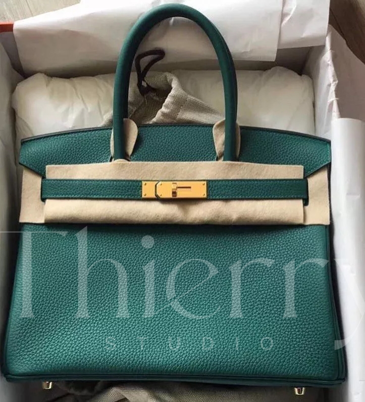
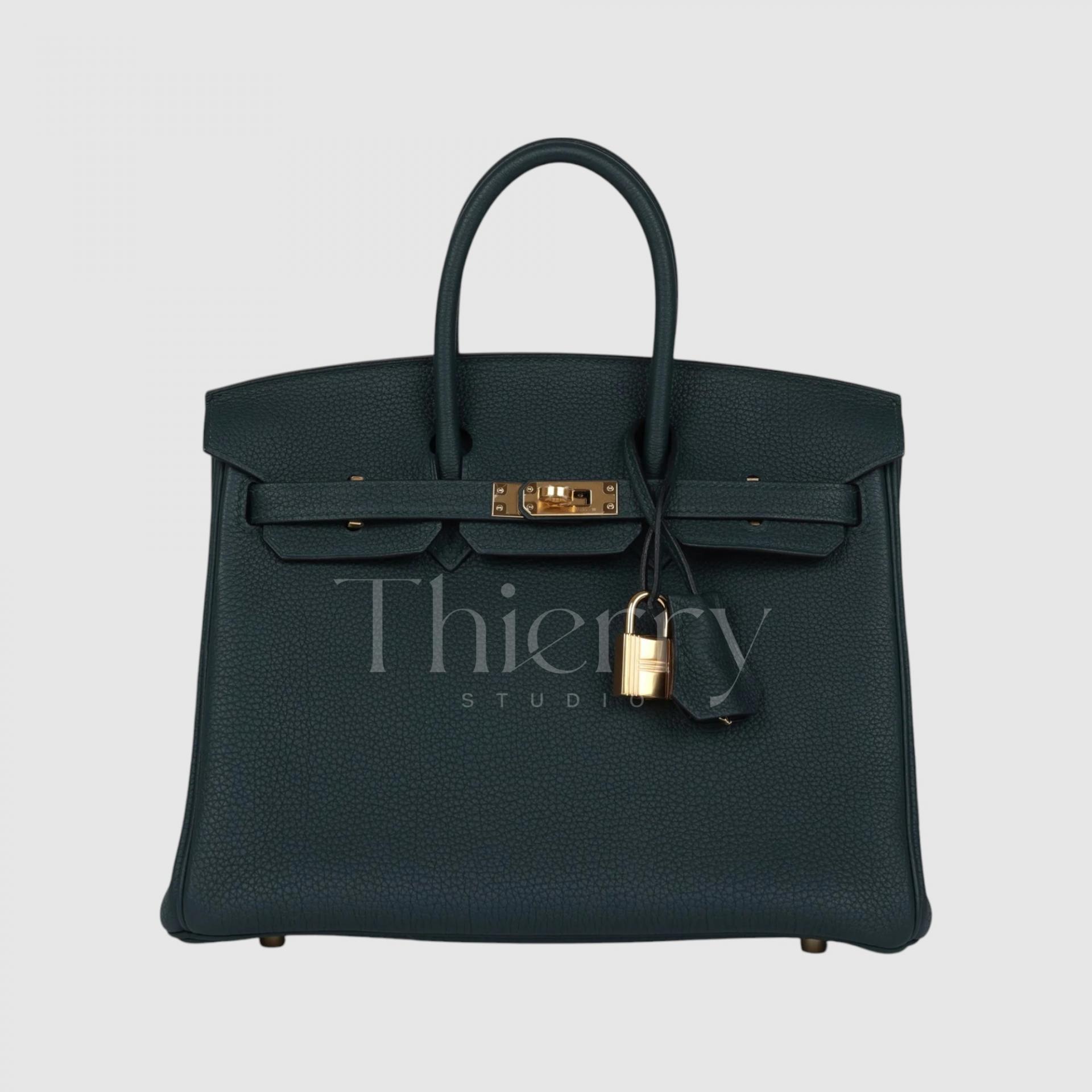
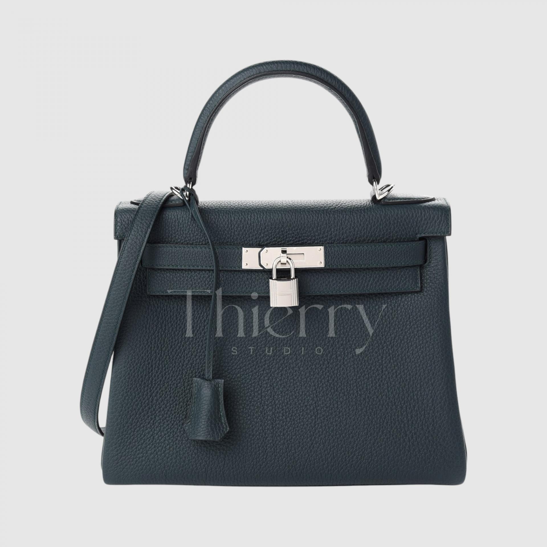
Vert Cypress
"Vert Cyprès," released in Fall 2018, is a deep green inspired by the rich foliage of cypress trees. 🌲✨
Often referred to as "Black Emerald," this near-black green carries subtle hints of dark teal and gray, giving it a sophisticated, mysterious depth.
When paired with gold or silver hardware, its dark green richness becomes even more pronounced, making it an elegant choice for formal occasions.
- Perfect for business attire or all-black outfits, adding a subtle yet refined touch of color.
- In photos, it may appear more green, but in person, it’s much darker, making it an understated yet striking choice in the Hermès green family.
Styling green tones effectively means playing to their unique characteristics:
-
Light tones like Fizz and Bamboo add a playful pop of color to simple outfits and bring liveliness to vacation looks.
-
Mid-tones like Vert Vertigo and Malachite strike the perfect balance between classic and sophisticated, making them highly versatile across different outfit color palettes.
-
Dark tones like Vert Foncé and Vert Cyprès are so deep they can almost substitute for black, making them ideal for formal, structured looks or for adding depth to monochrome fall and winter outfits. ✨
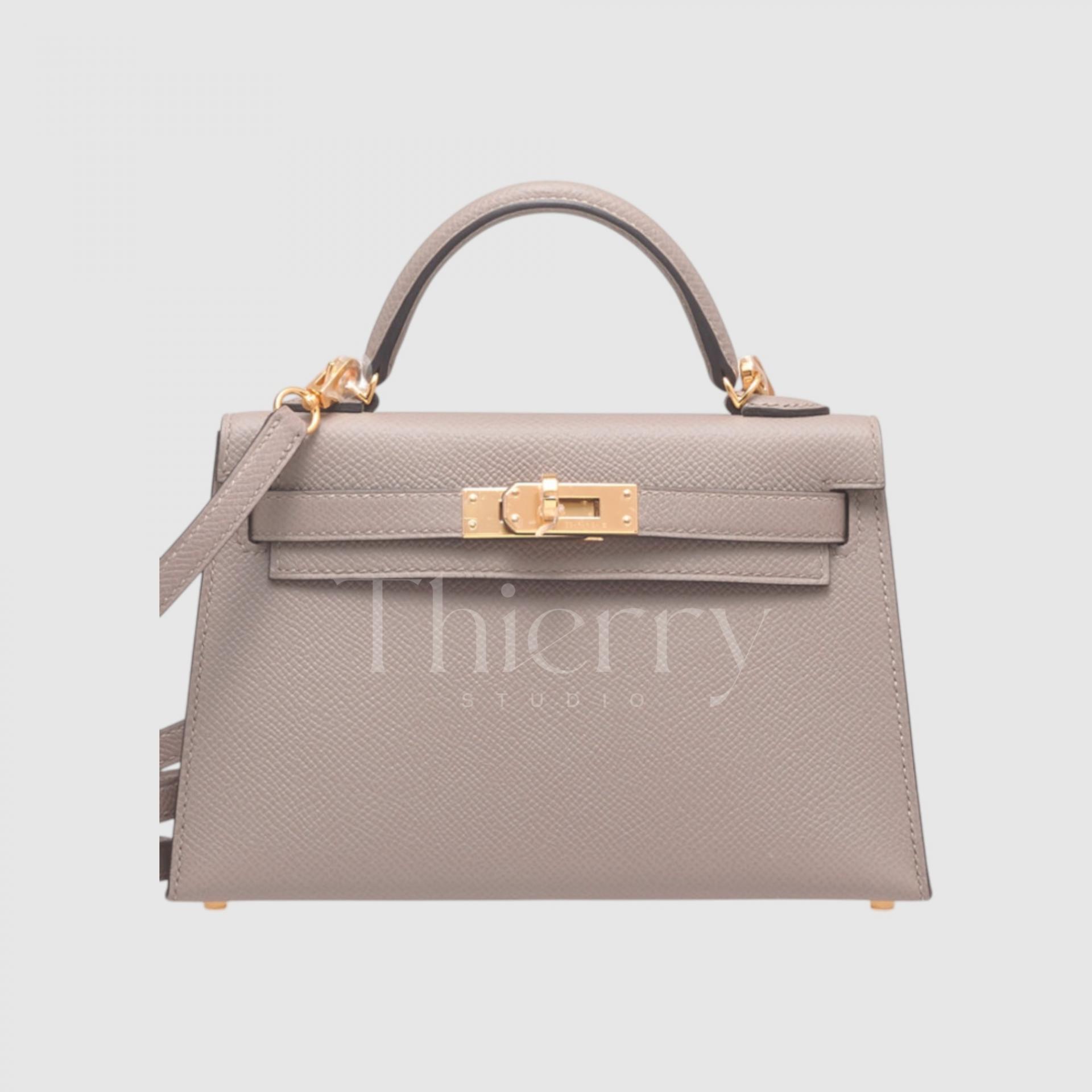
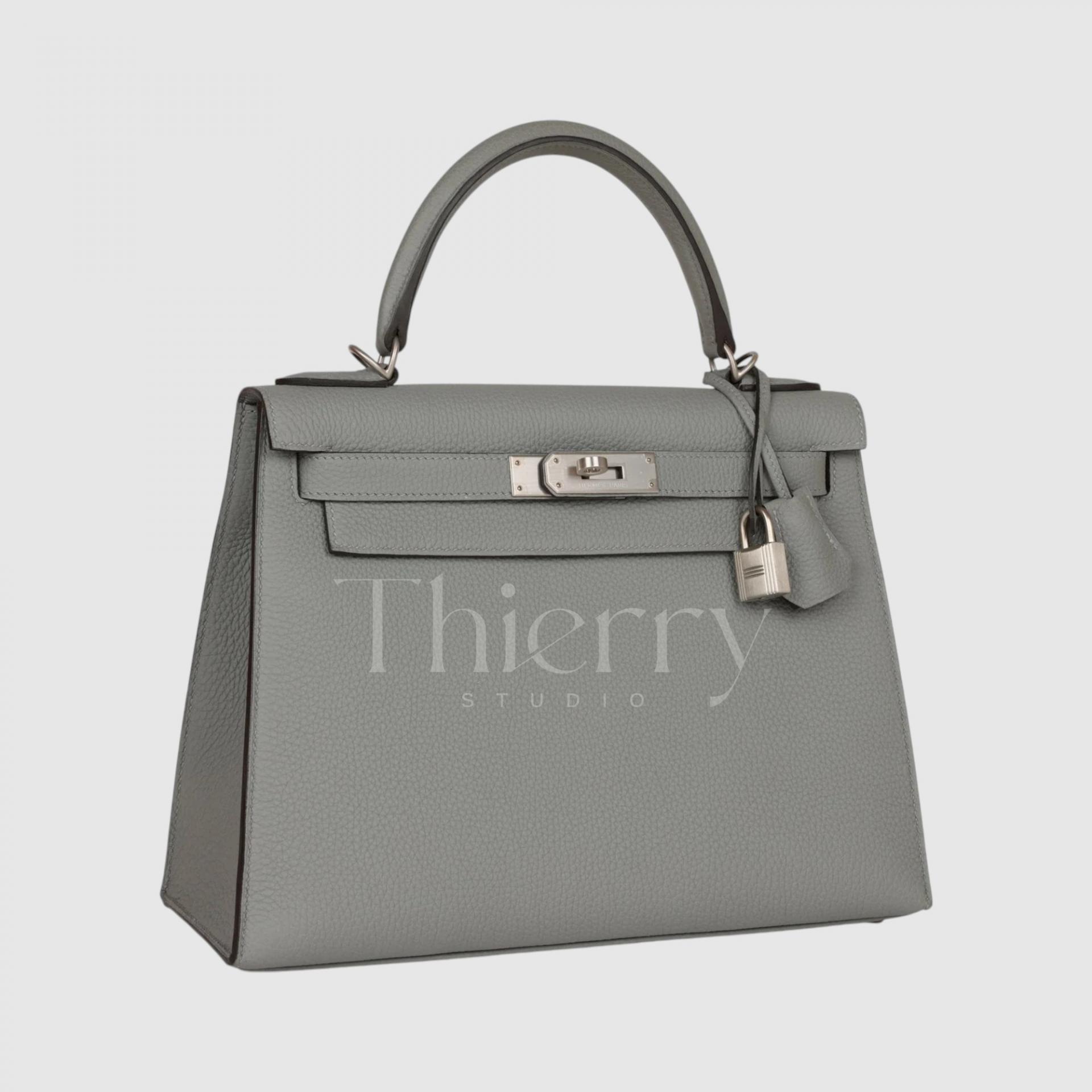
Gris Tourterelle
"Gris Tourterelle," meaning "Turtledove Gray," is a soft, light greige inspired by the delicate feathers of a turtledove. 🕊️
Lighter and more gray-toned than Etoupe, this shade can be described as a light taupe or warm gray.
Thanks to its subtle beige warmth, Gris Tourterelle doesn’t feel too cold and is highly coveted as a fresh neutral shade, especially for spring and summer.
- It pairs effortlessly with ivory linen sets and pastel dresses, adding an elegant softness.
- It also elevates everyday jeans-and-T-shirt looks with a refined, luxurious touch.
Since this color is only released in specific years, it’s considered a rare and highly sought-after shade that’s difficult to find in stores.
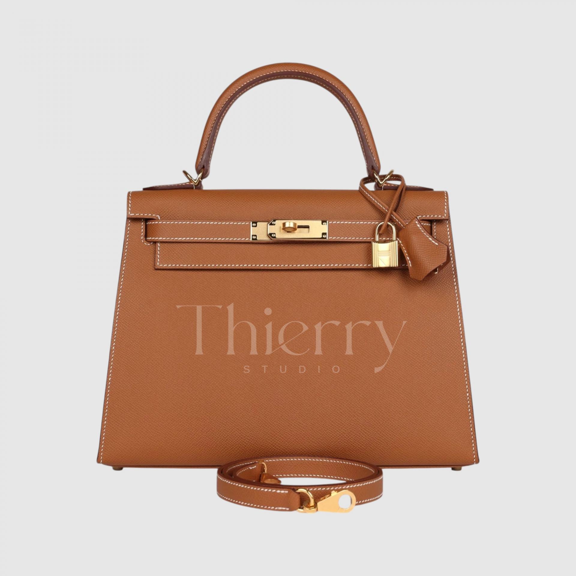
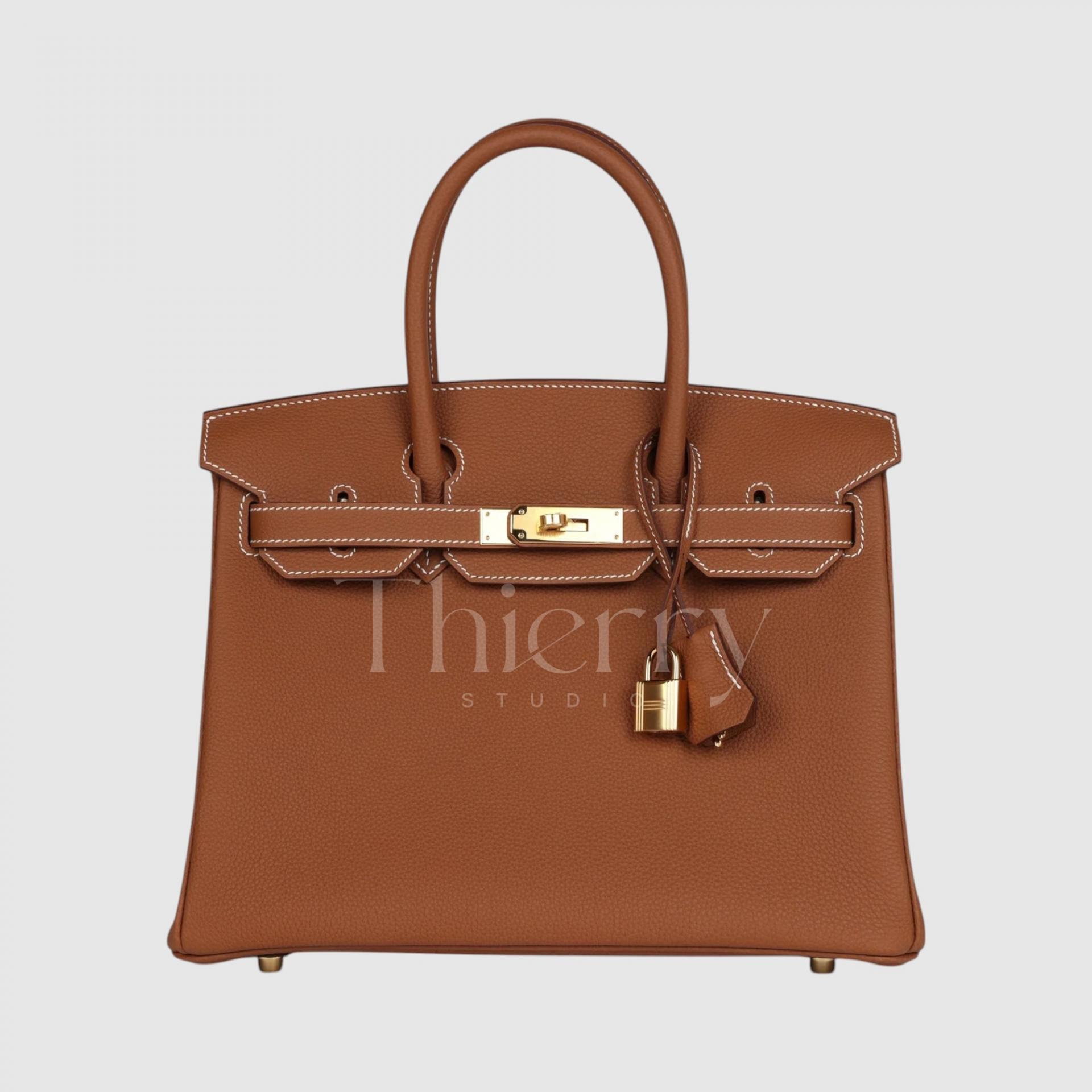
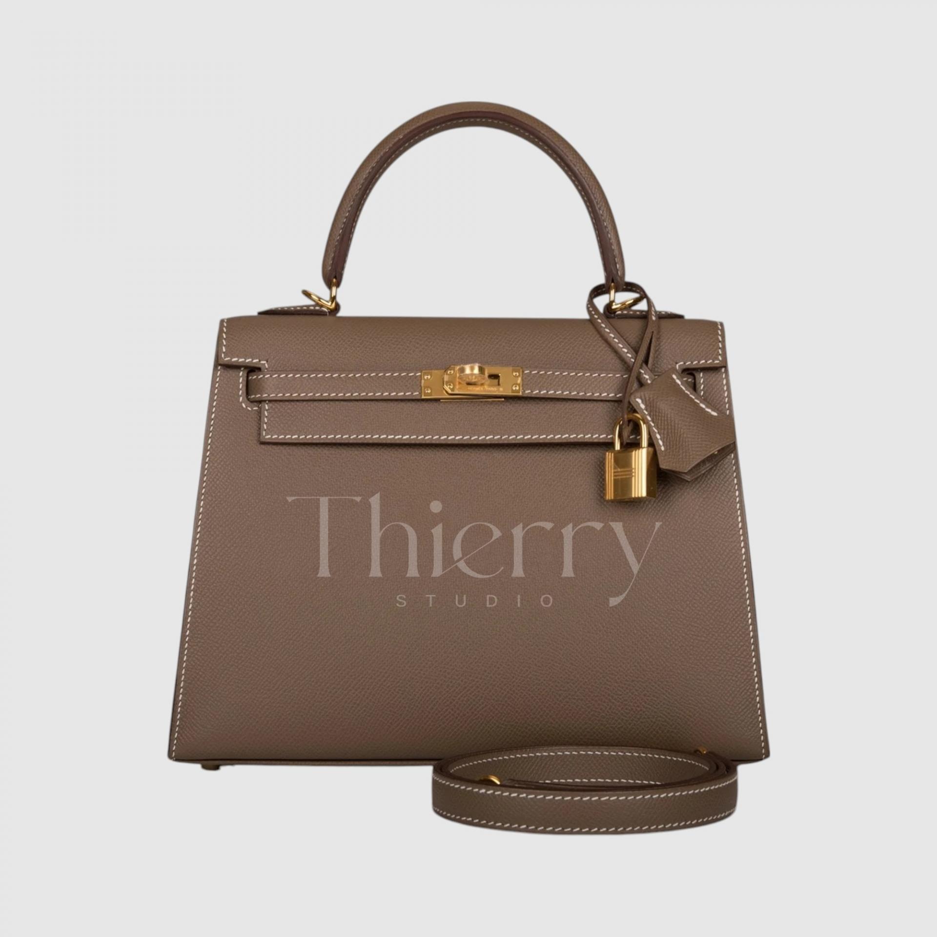
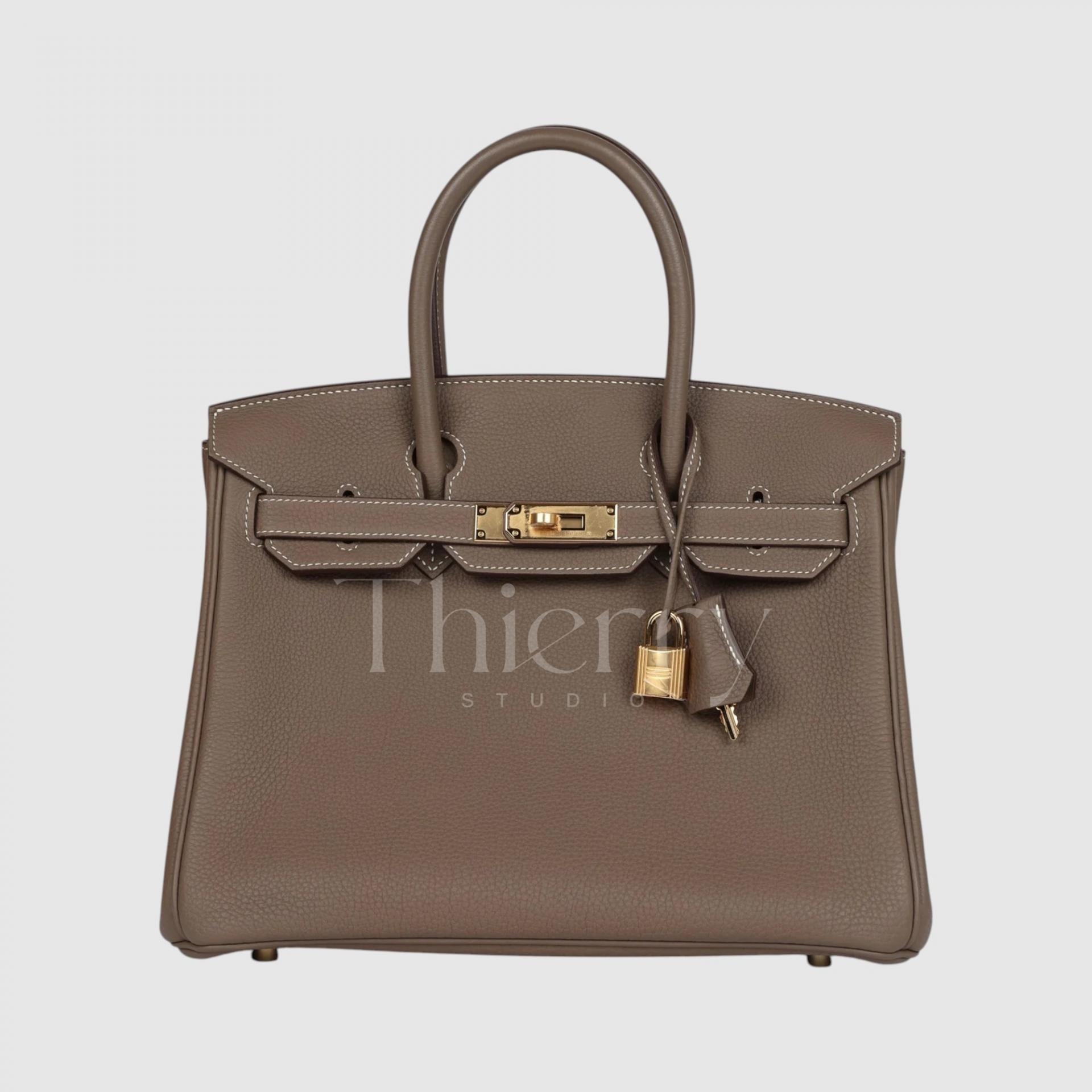
Gold
"Gold" is one of Hermès' most iconic colors, a warm camel brown inspired by the rich tones of equestrian saddles. 🐎✨
Rather than a metallic gold, it resembles melted honey and caramel, exuding a warm, earthy elegance.
A signature feature of Hermès Gold bags is their contrast white stitching, which enhances their refined yet casual charm. This makes Gold an incredibly versatile shade, seamlessly complementing everything from jeans and trench coats to formal attire.
- Its medium-depth brown tone is seasonless, pairing beautifully with linen dresses in summer and wool coats in winter.
- Gold Birkins and Kellys are highly sought after, partly due to their popularity among celebrities, making them a classic "entry" color for Hermès lovers.
Truly a timeless, must-have shade in the Hermès collection.
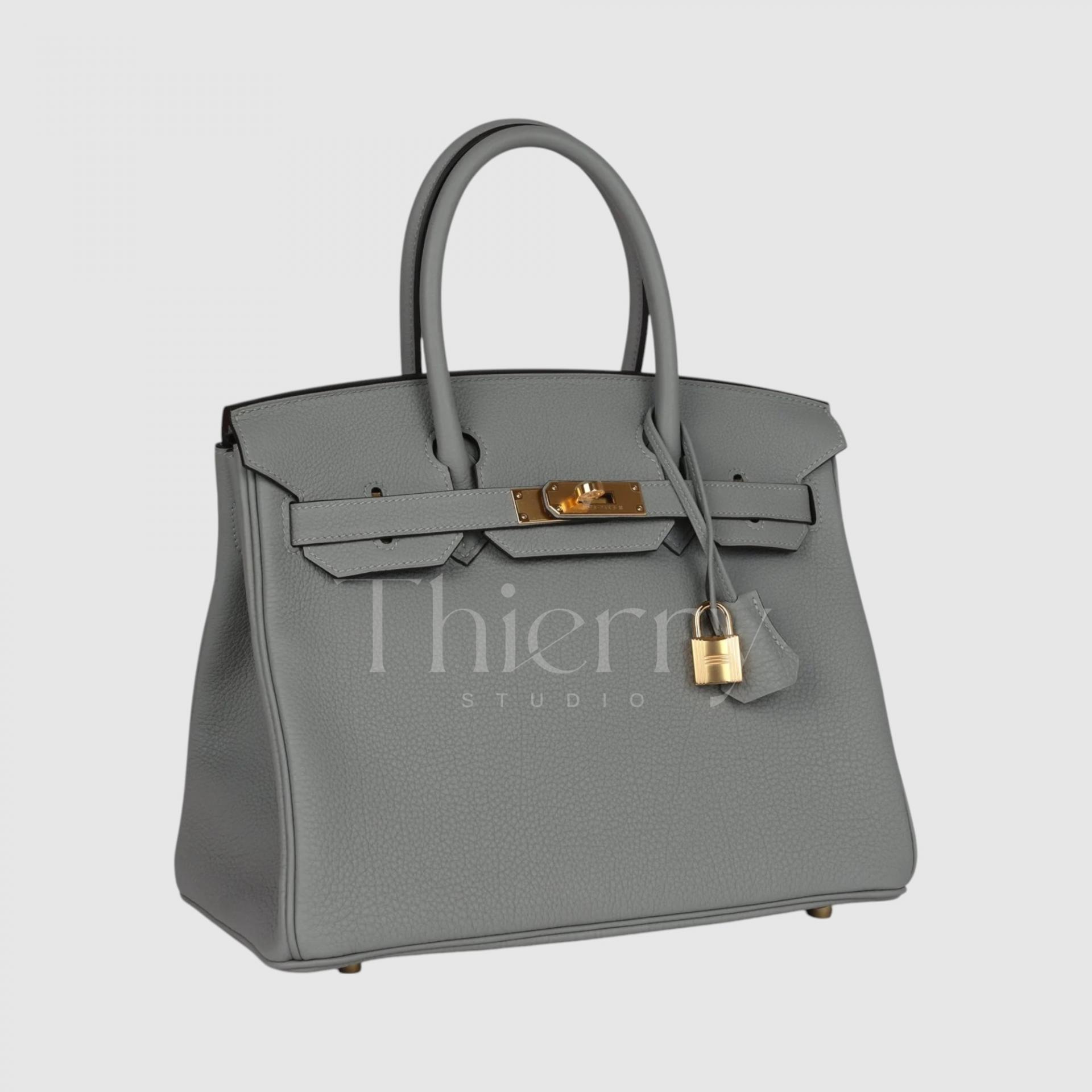
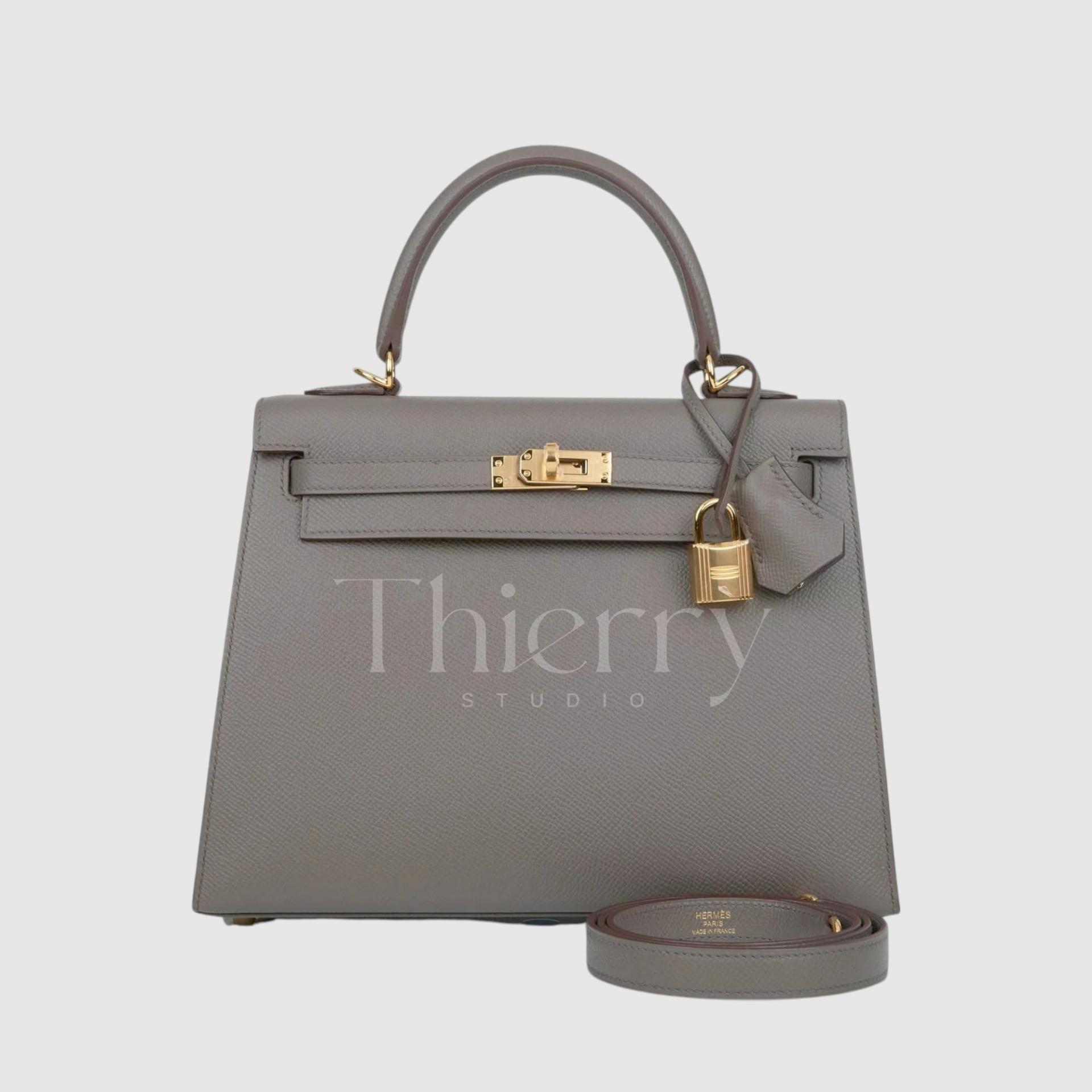
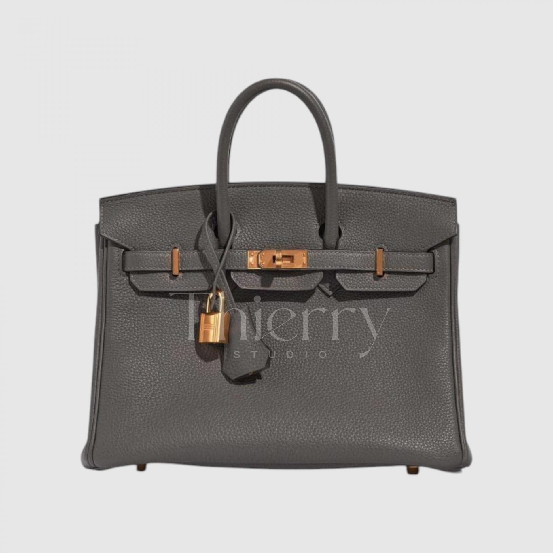
Gris Asphalt
"Gris Asphalt," introduced around 2017, is a deep, cool-toned gray taupe.
Darker and less brown than Gris Tourterelle, it carries a subtle hint of cool green, giving it a unique and sophisticated depth.
According to Hermès insiders, Gris Asphalt is slightly darker and cooler than Gris Tourterelle, particularly when seen in Swift leather, where its contemporary elegance stands out even more.
- Pairs effortlessly with charcoal gray or khaki-toned coats, creating a sleek tone-on-tone effect.
- Works beautifully with lighter outfits, offering a refined contrast without being too stark.
In person, this color is even more luxurious than in photos. 😊 A perfect choice for those who find Etoupe too familiar and want something just as versatile, yet more modern. 🤍✨
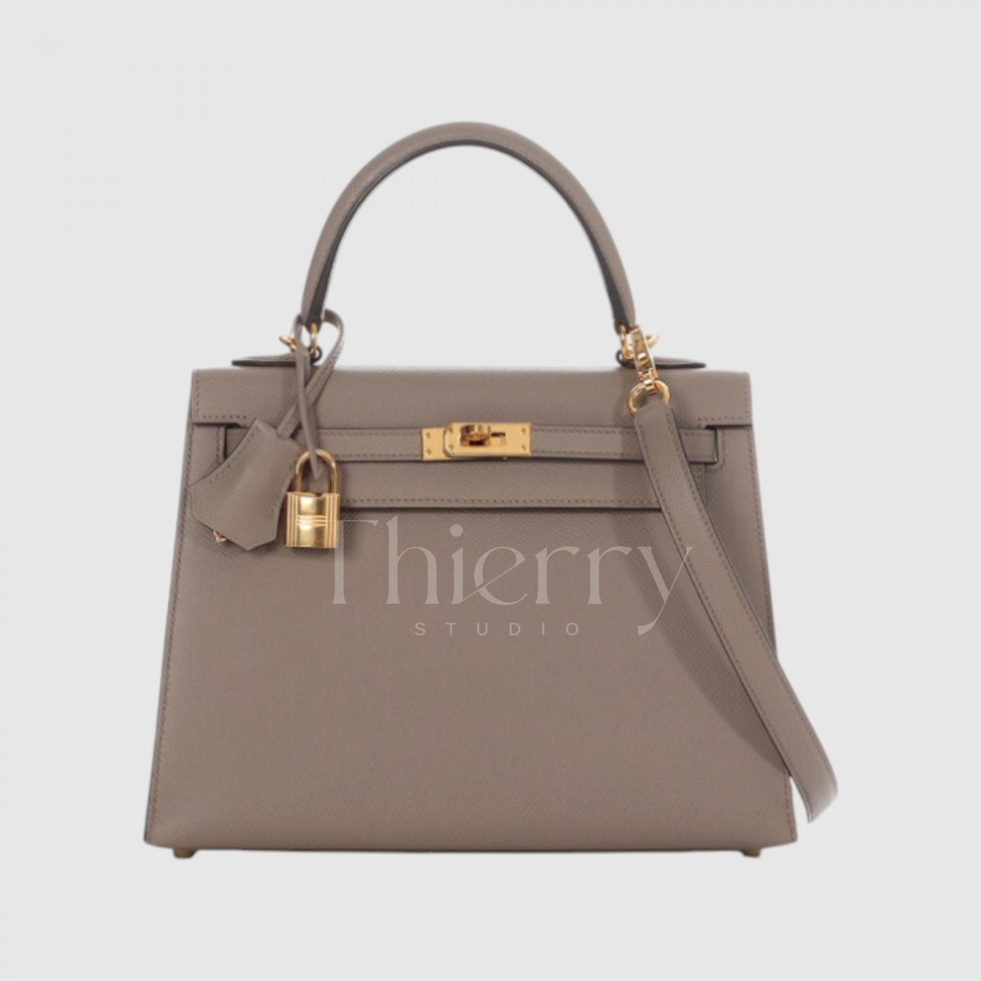
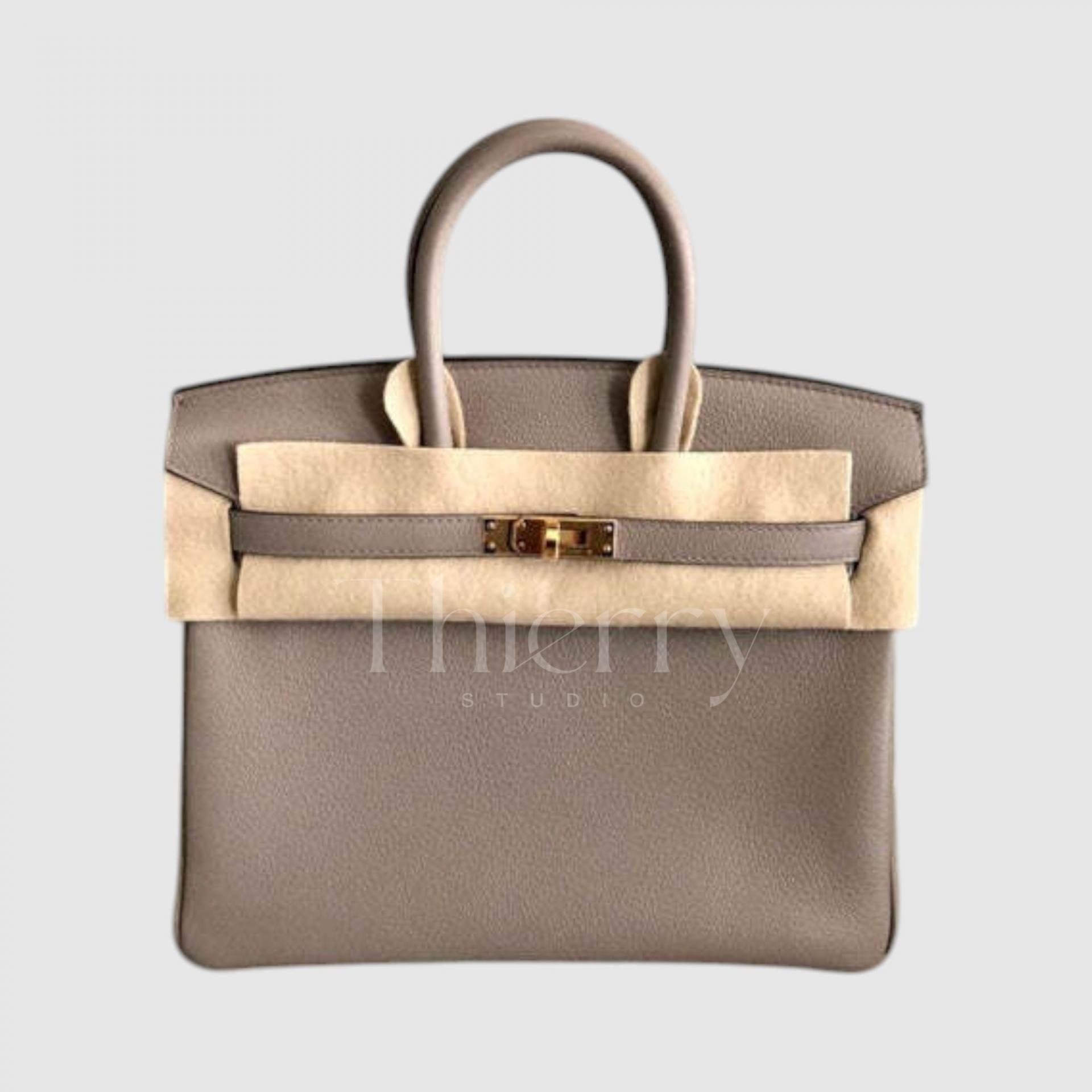
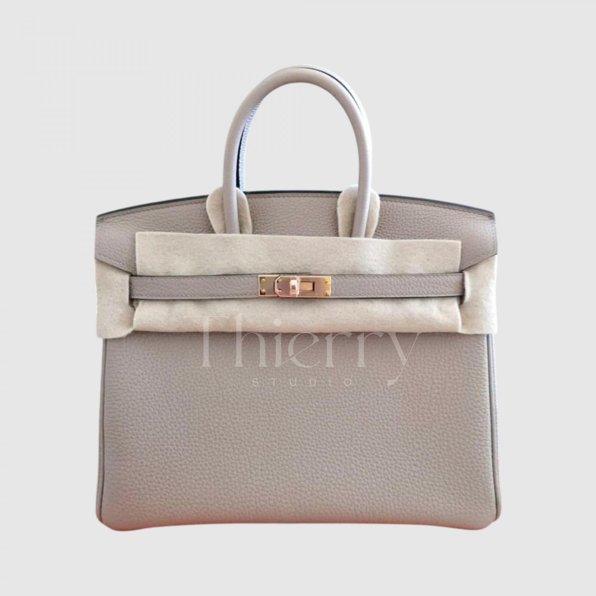
Etoupe
"Etoupe" is one of Hermès’ all-time bestsellers, a perfect blend of soft gray and brown.
With its mid-tone greige hue, Etoupe can be described as a warm gray-beige that strikes a balance between cool gray and warm brown undertones, making it effortlessly versatile.
Often regarded as the quintessential Hermès neutral, Etoupe adapts seamlessly to different styles:
- In casual outfits, it adds a sense of ease and understated luxury.
- In formal looks, it softens rigid black suits, bringing an air of refinement.
- It pairs naturally with white shirts and cotton trousers for an effortlessly chic vibe.
Thanks to this harmonious mix of gray and brown, Etoupe remains one of Hermès' most sought-after shades, holding strong value in both popularity and resale markets, alongside Gold.
While Gold, Etoupe, and Gris tones are all versatile neutrals, each shade has its own unique emphasis:
- Gold, with its warm camel hue, pairs beautifully with high-saturation casual looks, autumn check patterns, and ivory-toned outfits.
- Etoupe, as a grayish-brown, is a true all-rounder, seamlessly fitting into both formal suits and casual styles. 🤎
- Gris Tourterelle, the lightest of the group, is fresh and feminine, making it ideal for soft, elegant looks. 🕊️
- Gris Asphalt, with its cool and urban undertones, enhances modern monochrome chic outfits. 🌆
Each shade serves a different purpose, ensuring timeless elegance in any wardrobe. 🤍
Gris Pale
"Gris Pale," true to its name, is a delicate pale gray with a cool, crisp undertone.
With its subtle blue hint, this cool-toned light gray exudes a clean and modern elegance.
- It serves as a soft alternative to white, adding a refined touch without being stark.
- It enhances all-white outfits by adding depth and texture.
- It also balances pastel tones like pink and mint, creating a harmonious and sophisticated look.
A versatile, effortlessly chic shade that blends seamlessly into both minimalist and refined styles.
Gris Perle
"Gris Perle" is a soft pearl gray with a delicate hint of beige, creating a warm and elegant tone.
Unlike Gris Pale, which leans cooler with a bluish tint, Gris Perle carries a subtle beige undertone, giving it a refined and gentle feel.
- It pairs beautifully with cream knits and beige coats, enhancing a luxurious, sophisticated look.
- With its mix of gray’s intelligence and beige’s warmth, it transitions effortlessly from formal occasions to casual outfits.
A perfect choice for those who want a feminine, neutral shade that balances sophistication with softness.
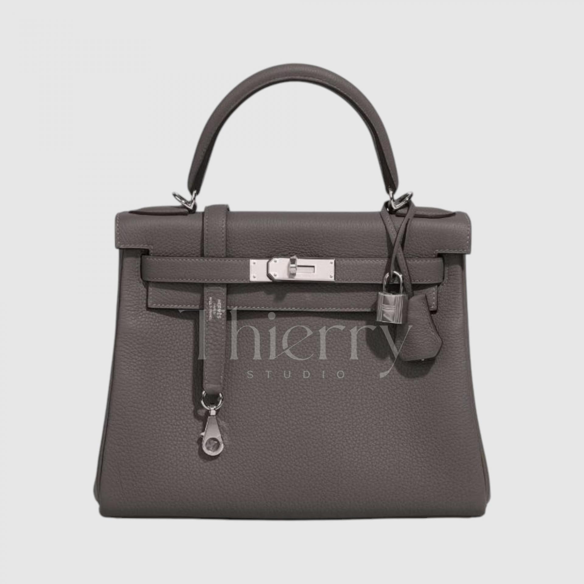
Gris Mouette
"Gris Mouette" (Seagull Gray) is a cool-toned medium gray that has been highly sought after since its debut in 2016.
With its icy blue undertone, this crisp and modern gray stands out as one of Hermès' most contemporary and refined shades. (It was immediately praised as “the most desirable gray” upon release!)
- Bright yet distinctive, it serves as a sophisticated color accent to navy suits or black dresses.
- When paired with light shirts and tailored slacks, it enhances a smart, polished image.
A perfect cool gray for those who appreciate sleek, elegant styling.
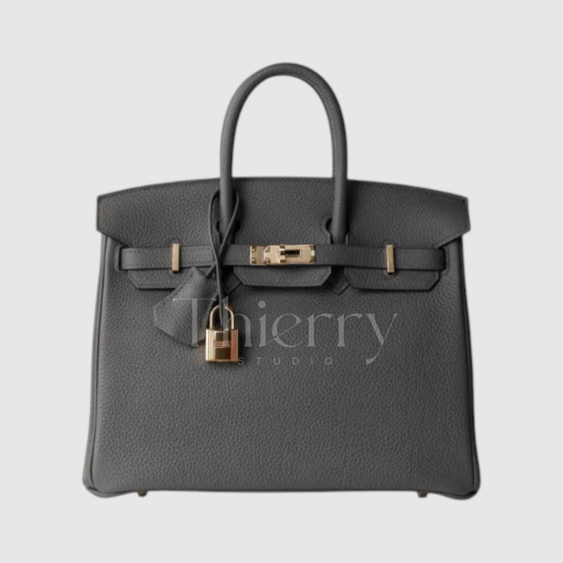
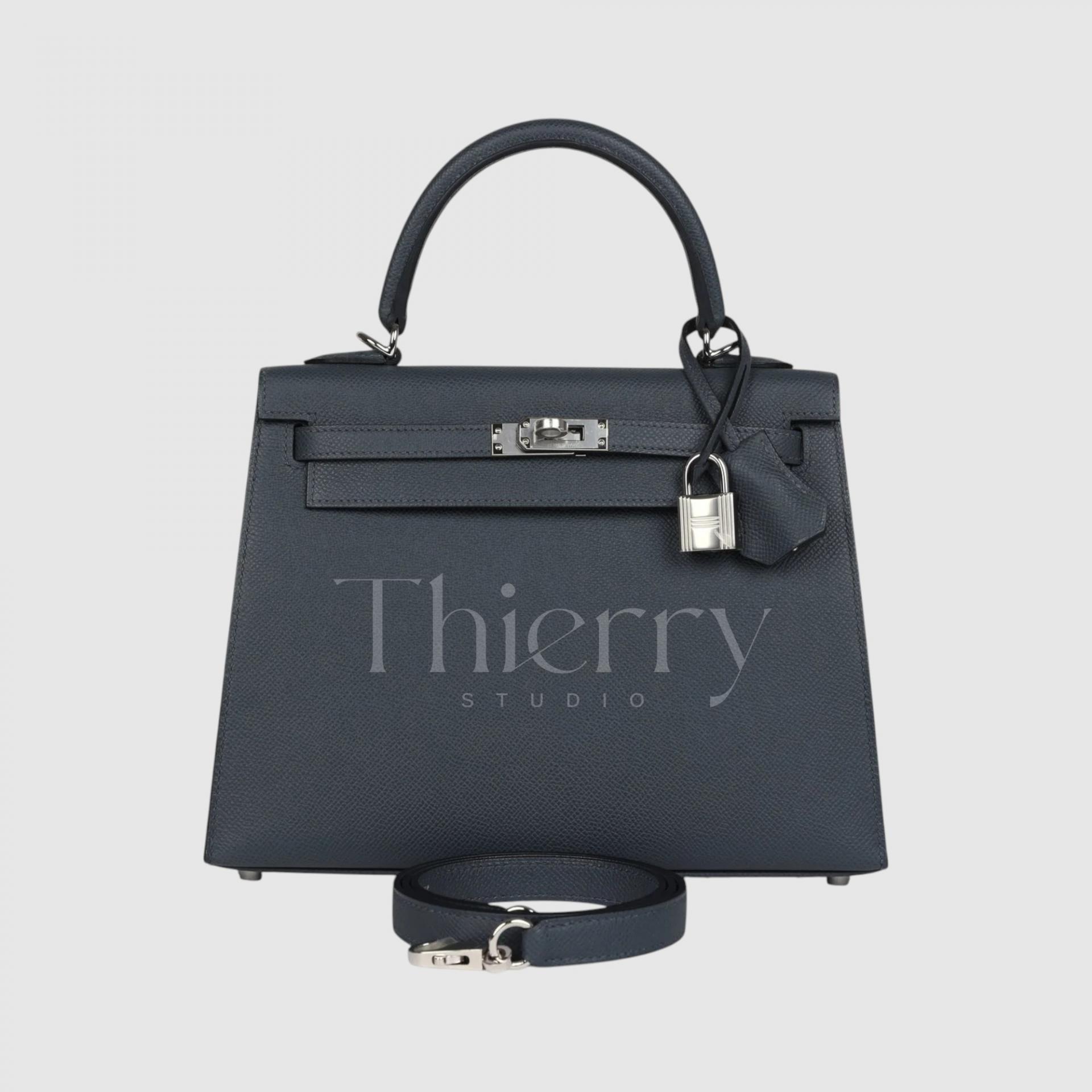
Etain
"Etain," meaning "tin" in French, is Hermès' signature dark gray with a unique blend of brown and beige undertones.
Unlike pure cool grays, Etain carries subtle warmth, giving it a rich and sophisticated depth. Despite its dark tone, it never feels harsh, maintaining a soft, elegant balance.
- Often described as "softer than black, yet more urban than brown," it is a refined alternative to classic black.
- Paired with an all-black suit, an Etain bag softens the look while adding a touch of individuality.
- In casual outfits, it blends effortlessly, offering versatility and understated luxury.
A truly timeless and highly functional neutral, perfect for both structured elegance and effortless chic. 😊✨
Gris Meyer
"Gris Meyer," introduced around 2022, is a versatile neutral gray that sits between Etain and Gris Mouette.
With a hint of tree bark undertones, it carries a soft brownish tint, making it a warm gray that still retains its balanced, subdued elegance.
- Lighter and softer than Etain, yet grayer than beige, it offers a refined, understated tone.
- Depending on the angle and hardware pairing, its character subtly shifts:
- With palladium (silver) hardware, it leans cool and muted.
- With gold hardware, its beige undertones become more pronounced, creating a warmer look.
This adaptability makes Gris Meyer an ideal year-round neutral, effortlessly complementing both gray and brown outfits.
- Paired with brown hues, its gray aspect stands out.
- Styled with gray tones, its beige warmth becomes more noticeable.
A beautifully complex and versatile shade, perfect for those who love subtle depth and elegant neutrality.
Gris Misty
"Gris Misty," a 2024 new release, is a deep, misty dark gray with a modern edge. 🌫️✨
This sophisticated dark gray carries a subtle blue undertone, making it a cooler and more intense alternative to Etain. It’s darker than Gris Meyer, resembling a dense fog with a bold, sleek presence.
- With its near-black depth, it serves as a refined and grounding color, perfect for formal occasions.
- When exposed to light, its cool-toned essence subtly emerges, making it an excellent match for navy and blue-toned outfits, creating a polished, contemporary look.
Gris Misty combines the timeless appeal of deep neutrals with a fresh, modern sophistication—an effortlessly chic alternative to black.
Hermès' gray tones offer a diverse range of styling options based on cool/warm undertones and brightness levels:
- Light and cool grays like Gris Pale add a refreshing touch to monochrome summer outfits.
- Warm-toned soft grays like Gris Perle pair beautifully with beige or pink outfits, creating a gentle, elegant harmony.
- Medium-toned Gris Mouette is perfect for chic, urban styling, offering a modern and polished aesthetic. 🌆
- Gris Meyer, with its balanced neutral warmth, blends effortlessly into soft and understated outfits.
For darker grays:
-
Etain and Gris Misty are excellent alternatives to black, exuding sophisticated depth.
- Etain leans slightly warmer, adding a subtle richness.
- Gris Misty is cooler and crisper, enhancing sleek, contemporary looks.
Each shade carries its own unique charm, making Hermès' gray collection incredibly versatile and timeless. ✨
That wraps up our introduction to Hermès' iconic colors! 🎨✨
Did any shades unexpectedly catch your eye? 😊
Of course, timeless staples like Black, Gold, Etoupe, and Craie will always be classic choices. But the true charm of Hermès lies in embracing color—curating unique shades to express your personal style.
If you've ever thought, “Would this color suit me?” or “How do I style this?”, don’t overthink it! This guide was carefully crafted to help you explore and enjoy the endless possibilities of Hermès colors.
If you're curious about any additional shades, feel free to ask. We are happy to help! 💕