
Article: Hermès Orange Box Guide: How to Spot Genuine Packaging
Hermès Orange Box Guide: How to Spot Genuine Packaging
Hermès Packaging: Details That Separate Genuine Boxes from Look-Alikes
This guide explains how to check Hermès packaging authenticity—especially the orange box—by focusing on print sharpness, box texture, label placement, and overall construction.
Hermès Orange Box: The Story Behind the Iconic Color
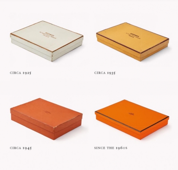

The signature orange color we associate
with Hermès today wasn't always the brand's choice.
In the 1920s, Hermès originally used
cream-colored boxes with gold borders.
In the 1930s, the boxes were changed to yellow.
It wasn't until the 1940s that Hermès began using orange.
By the 1960s, the orange box we now recognize
as an iconic Hermès symbol was fully established.
The Unexpected Origin of the Orange Box
After World War II, material shortages made it
impossible to source the luxurious cream and
yellow boxes Hermès had previously used.
With no other options available, Hermès had to settle for orange,
a color that had little demand at the time.
Although it wasn't their first choice, Hermès embraced the change.
Over time, the orange box became an iconic symbol of luxury.
 Mercedes-Benz G-Wagons
Today, "Hermès Orange" is so famous that it has even
been used in the interiors of high-end luxury cars like
Rolls-Royce and Mercedes-Benz G-Wagons.
A Hidden Feature Inside the Hermès Box
There's another interesting fact about Hermès boxes.


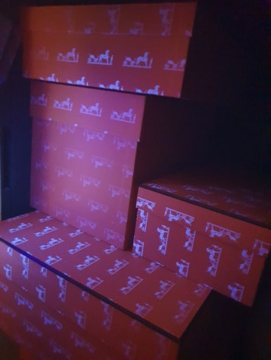
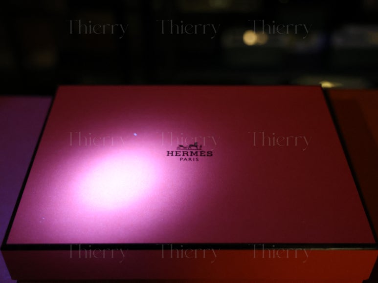
[Authentic Hermès boxes]
Under UV light,
authentic Hermès boxes reveal a hidden logo.
However, some counterfeit boxes now also feature a similar UV logo,
making it harder to distinguish real from fake.
Quick checklist:
Don’t rely on one sign—check color tone, UV logo clarity, print quality, and box construction together.
Box color & tone
At first glance, the most noticeable difference between orange boxes is the shade of orange. Photos can be misleading due to auto color correction, so the best check is always in person. In our comparison, some boxes look too bright (almost red), others appear too pale, and some show a deep orange that still feels slightly “off.” If the color is significantly different from the authentic tone, you can often spot a look-alike even before using a UV light.
UV light test: the hidden logo
Authentic Hermès orange boxes can reveal a hidden logo under UV light—a detail many people don’t expect. However, some look-alike boxes now include a similar UV logo too, which means this test is no longer “yes/no.” What matters is how well the logo is replicated: Does it appear clearly? Are the edges sharp? Do the details look refined or rough? This is why a UV test should be combined with detail quality checks, not used as the only standard.
Logo sharpness & detail under UV
When the UV logo appears, the next step is to evaluate clarity and precision. In our comparison, some boxes show no logo at all, while others show a logo that appears but looks faint, blurry, and lacking detail—and this is not a camera focus issue. By contrast, a well-made box shows a logo with crisp edges and recognizable fine detail, including the horse and carriage elements. If you’re receiving packaging for a high-end item, this level of refinement is what makes the difference feel immediately obvious.

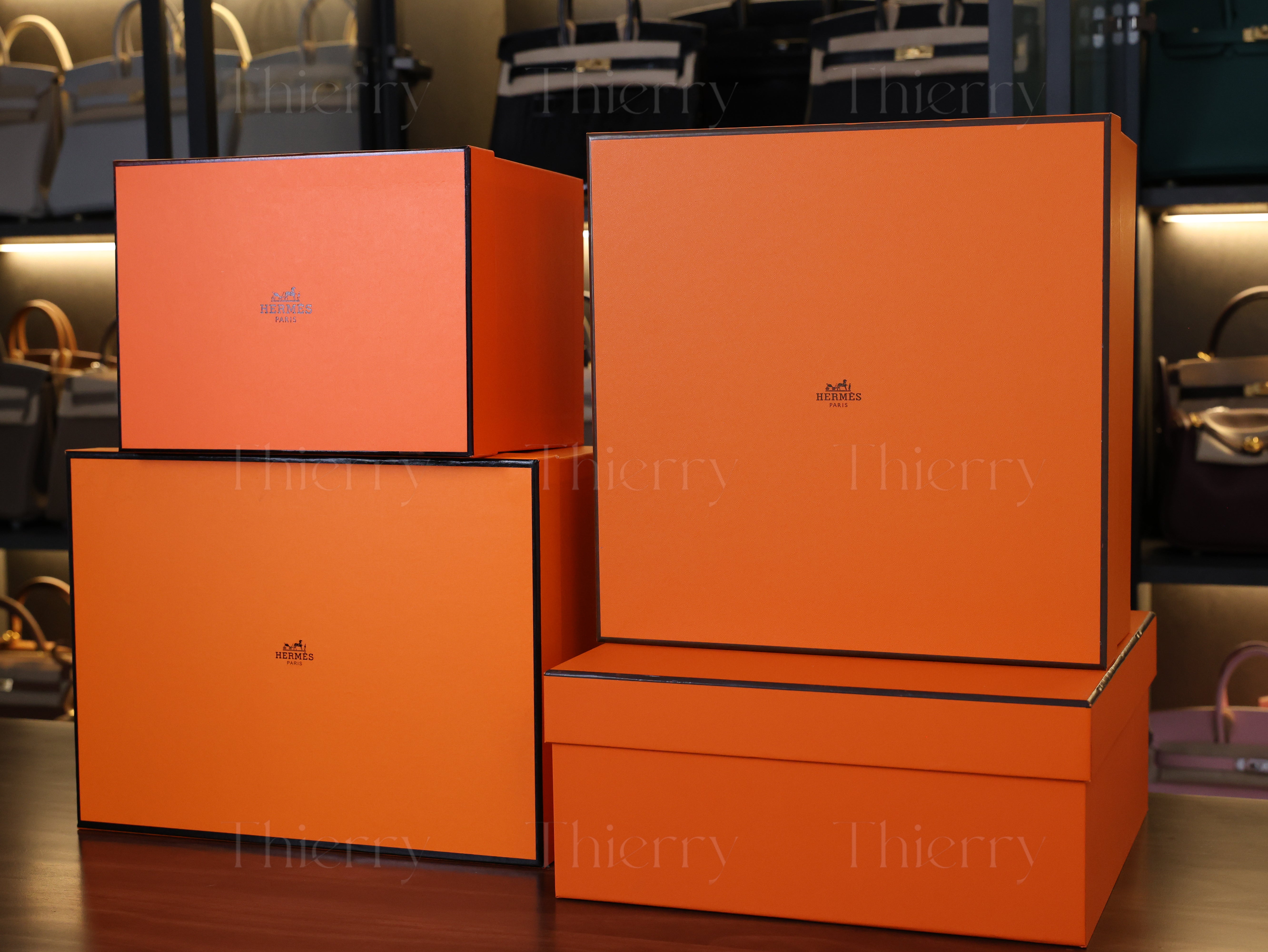
To address this, we've prepared a comparison of
Hermès boxes from different sources, including
Thierry Studio and three other manufacturers.
Comparing Different Orange Boxes
At first glance, the biggest difference is the shade of orange—and it’s easiest to judge in person, not in photos. If the tone looks clearly off, you can often spot a fake even before using UV light.
Although the colors may look similar in photos
due to automatic color correction,
the actual shades are quite different in person.
A Product: Too bright, almost red
B Product: Too pale
C Product: Deep orange but not quite right
If a box's color is significantly different from the
authentic shade, you can often spot a fake without even using UV light.
UV Light Test: How Well Is the Logo Replicated?
Let’s see how each box performs under UV light.
[A]

[B]

These boxes do not reveal any logo under UV light.
Despite their high price points (around $1,500 and $1,800 for a Birkin 25),
they fail this basic authenticity check.
[Thierry Studio]

The logo appears clearly and crisply,
just like an authentic Hermès box.
[C]


C Product (Sold for $2,400+)
The logo does appear, but the quality is poor.
The edges are blurry, and the details are not sharp.
Now, let’s compare Thierry Studio vs. C Product side by side.
[Left - Thierry / Right - C]

When placed next to Thierry Studio, the details of
C Product look somewhat rough and imprecise.
Let's take a closer look for a detailed comparison.
[C]

C Product: The logo appears faint and lacks detail.
The camera focus is not the issue here.
It may look blurry, but that’s actually how the logo appears.
While the UV light reveals the logo,
the details are completely lacking.
If you’re paying over 2000 USD for a product
and receive a box like this...
Wouldn't it be the same as receiving a box with no logo at all?
The difference would be obvious right away.
[Thierry Studio]

On the other hand, Thierry Studio’s logo is
precisely detailed, capturing the horse and
carriage with exceptional clarity.
When exposed to UV light, this level of refinement is
necessary to ensure an authentic look.
Of course, not everyone will check their box under a UV light,
But if you’re going to receive one,
wouldn’t you prefer a perfectly crafted version?
Now, let’s take one last side-by-side comparison of
Thierry Studio and Product C.

Printing sharpness (outside print)
Even without UV light, the external printing quality is a strong indicator. On a genuine-looking box, typography and logo printing tend to appear clean and consistent, with stable ink density and sharp edges. On look-alike packaging, printing often looks slightly soft, fuzzy, or uneven, especially when you zoom in around letter edges and spacing. If the print feels “blurred” or inconsistent, it often aligns with other issues you’ll see under UV.
Construction & corners
Another quick check is overall construction: how straight the edges look, how clean the folds are, and how well the lid fits on the base. A well-made box tends to feel structured and stable, while a weaker box can show uneven corners, imperfect folds, or a lid that feels loose. Even if color looks close, poor structure often gives away a lower-quality box the moment you hold it.
Label placement (if included)
Not every box will have the same label situation, but when a label is present, it should look intentionally placed and neatly applied—not randomly positioned, crooked, or bubbling. If you notice a label that looks rushed or inconsistent, treat it as a supporting signal and compare it with the other checks (tone, UV logo quality, and construction).
FAQ
Q1) Can the box color vary by year?
Yes—slight variation can happen due to production batches, storage, and lighting conditions. However, differences are usually subtle. If the box looks dramatically neon, overly red, or unusually pale, it’s worth checking other factors together, especially the UV logo clarity and overall construction.
Q2) Is the UV logo test enough to prove authenticity?
Not anymore. Some look-alike boxes now show a UV logo too. The key is quality, not just presence: a strong box shows a logo that appears clear, crisp, and detailed, while others may look faint, blurry, and rough. Use UV as one step in a checklist, not a single “final answer.”
Q3) What’s the fastest way to spot a look-alike box?
Start with the orange tone in person, because photos can hide differences. If something feels off, use UV light and check whether the logo is not only visible but also sharp and refined. When you combine tone + UV detail quality + structure, you can usually make a confident judgment quickly.
At Thierry Studio, we are committed to perfection,
not just in our products, but down to the packaging itself.
We appreciate your trust and attention to every detail! :)